seen + learned
Showing posts with label information architecture. Show all posts

Mind and Life Institute information architecture and UX design

Posted: Monday, November 17, 2014 | Posted by Debby Levinson | Labels: , , , , , 0 comments

The Mind and Life Institute researches and supports interest in contemplative science, bringing together scientists and scholars from contemplative traditions to investigate topics such as addiction, ethics, and emotions. As part of repositioning itself based on a new set of initiatives (ethics, education, and human development; craving, desire, and addiction; and mapping the mind), MLI wanted to redesign its website to promote deep investigation into the wealth of research the organization has funded and encouraged.

We began by drafting scenarios for the three primary audiences – scientists, scholars, and "interested laymen" – relying on MLI's experience with those groups, as well as our own interviews with interested laymen, to define desired interactions. Based on those scenarios, we developed a site structure and wireframes for a responsive experience that used curated promotions to expose relationships between multiple types of site content, allowing visitors a complete picture of the latest insights in contemplative science. We consulted with the visual designer and the development team through site launch to ensure that our layouts were accurately translated to the final site.

Services provided:

  • User experience conceptualization and design
  • Information architecture
  • User interface design
  • Visual design consultation


MLI home page wireframe


MLI initiative page wireframe with related content links at right


MLI featured editorial page wireframe with related content links and fat navigation dropdown


MLI home page. Visual design by John Hall Design Group; development by pixelslam.


Mobile phone view of home page


Featured editorial page

Increasing appeal for LoveToKnow

Posted: Tuesday, April 1, 2014 | Posted by Debby Levinson | Labels: , , , , , , , , 0 comments

LoveToKnow provides advice on everything from beauty tips and pet health to travel recommendations and party-planning. We helped LoveToKnow provide more consistency and a better user experience by first analyzing their taxonomy as part of a larger search engine marketing project with Nine By Blue. LoveToKnow returned to us to redesign their site to improve its appeal and apply the new taxonomy to an updated, easier-to-use menu system.

As we translated wireframes into visual design, we ran remote usability tests to determine whether our approach resonated with the target audience. LoveToKnow's revenue model is ad-driven, and we paid close attention to this as we wireframed possible design approaches and feature refinements. Test results confirmed that the new designs helped people better understand the breadth of LoveToKnow's content, and that the new article page design better achieved the goal of site exploration.

Work included:

  • Taxonomy analysis
  • Visual redesign
  • Heuristic review
  • Usability testing

Usability test screenshot

Usability test screenshot
Remote usability tests used a split screen to display a survey and relevant page designs (top: current design; bottom: new design).


Original home page page design.


New home page design.


New article page and fat navigation.

Focusing on the future – website planning for the International Development Innovation Network

Posted: Monday, March 31, 2014 | Posted by Debby Levinson | Labels: , , , , , , , 0 comments

The International Development Innovation Network, led by MIT’s D-Lab, provides training and resources for innovators worldwide to create new processes and products that improve the lives of people in poverty. IDIN works from the ground up by serving local innovators; community members are most familiar with their own situation, and most motivated to improve it.

We helped the IDIN team organize and narrow down its goals for a new site by developing user scenarios with the team and mapping goals to specific audience needs. Through an interview with the program's sponsors at USAID, as well as a paper prototype review session with summit alumni, we gathered audience feedback on valuable features and expected usage, which provided further insights into how to structure the site and design key interactions.

Moving from audience and feature analysis into information architecture, we led a collaborative workshop with IDIN staff to map content and features into page types and a high-level site organization. This groundwork helped prepare IDIN for usability testing and a full site redesign.

Work included:

  • stakeholder and user interviews
  • user scenarios – based on real people and interactions
  • prototype development
  • site map
  • content inventory and planning
  • high-level wireframes

whiteboard noteswhiteboard notes
Whiteboard notes from content mapping session.

home page wireframe (mobile view)project page wireframe (desktop view)
Left: home page wireframe (mobile view). Right: project page wireframe (desktop view).

CafePress information architecture and user experience

Posted: Thursday, May 9, 2013 | Posted by Tania Schlatter | Labels: , , 0 comments

CafePress is an established custom printing e-tailer. We worked with the product marketing team to improve how people find products on their site. We conducted a heuristic review to identify IA, visual design, and usability issues, and showed options for changes that addressed UX in schematic layouts (visual wireframes).

Follow-on work included exploring identity options and visual site design.

CafePress' home page at the time (left) and our wireframed recommendations (right), which included simplifying the header area to highlight search, making main product navigation more prominent, and improving promotion display to spotlight new and hot products in a clean, uncluttered layout.


CafePress' existing search engine results page (left) and our wireframed recommendations (right). To help welcome shoppers and guide them effectively, we suggested eliminating redundant links and limiting the number of subcategories displayed.

Science Festival Alliance website refresh

Posted: Thursday, April 18, 2013 | Posted by Debby Levinson | Labels: , , , 0 comments

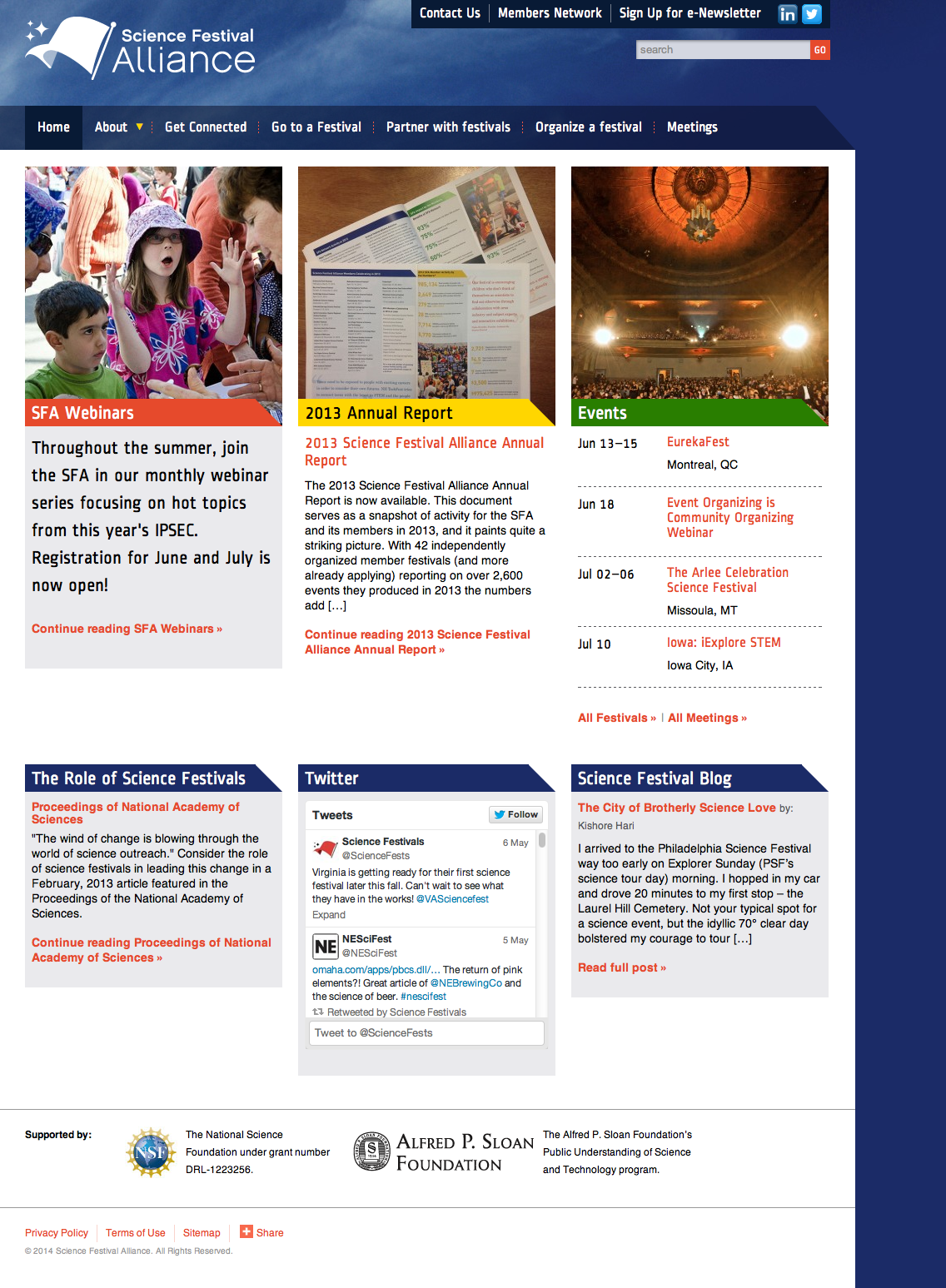
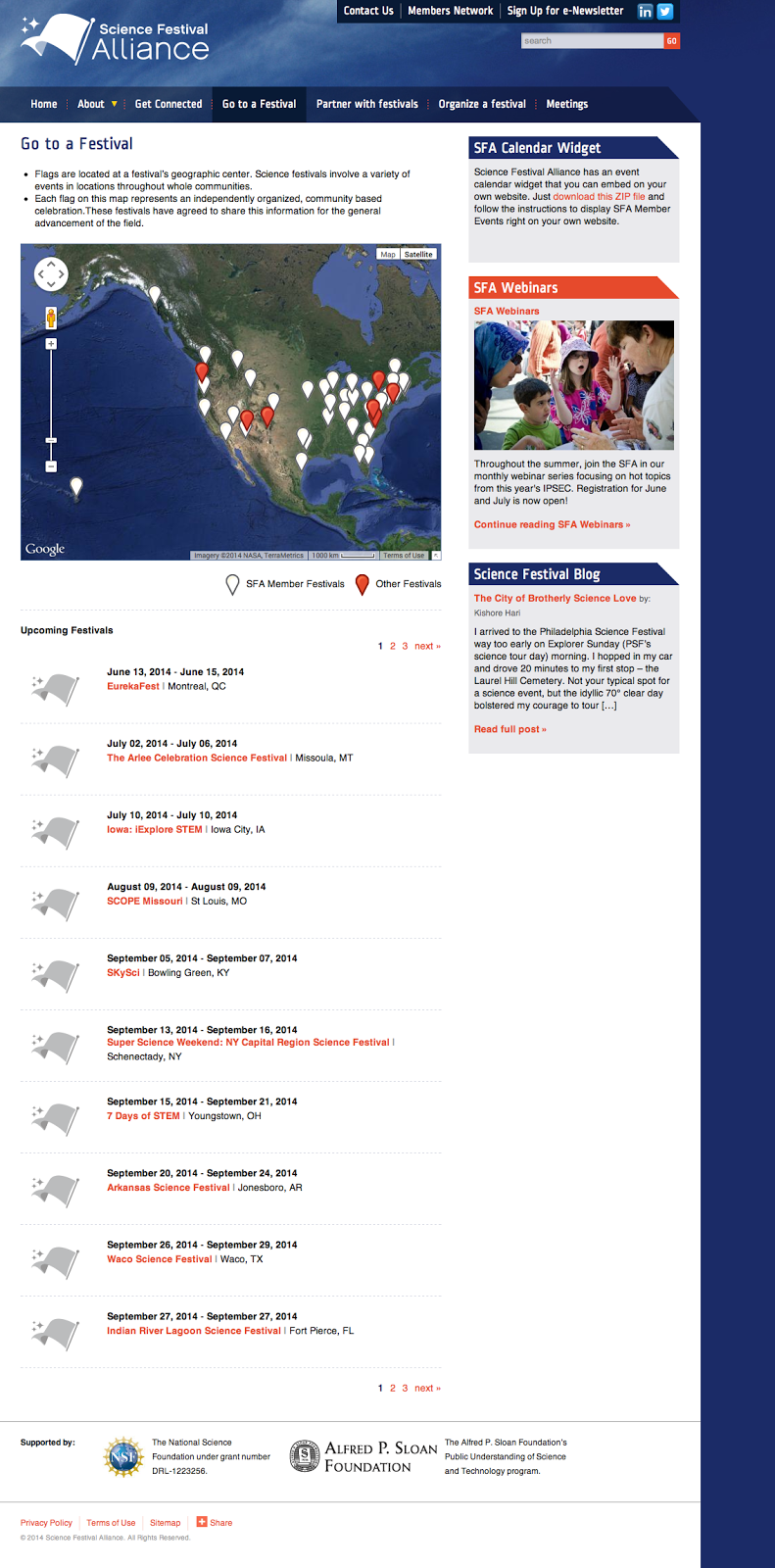
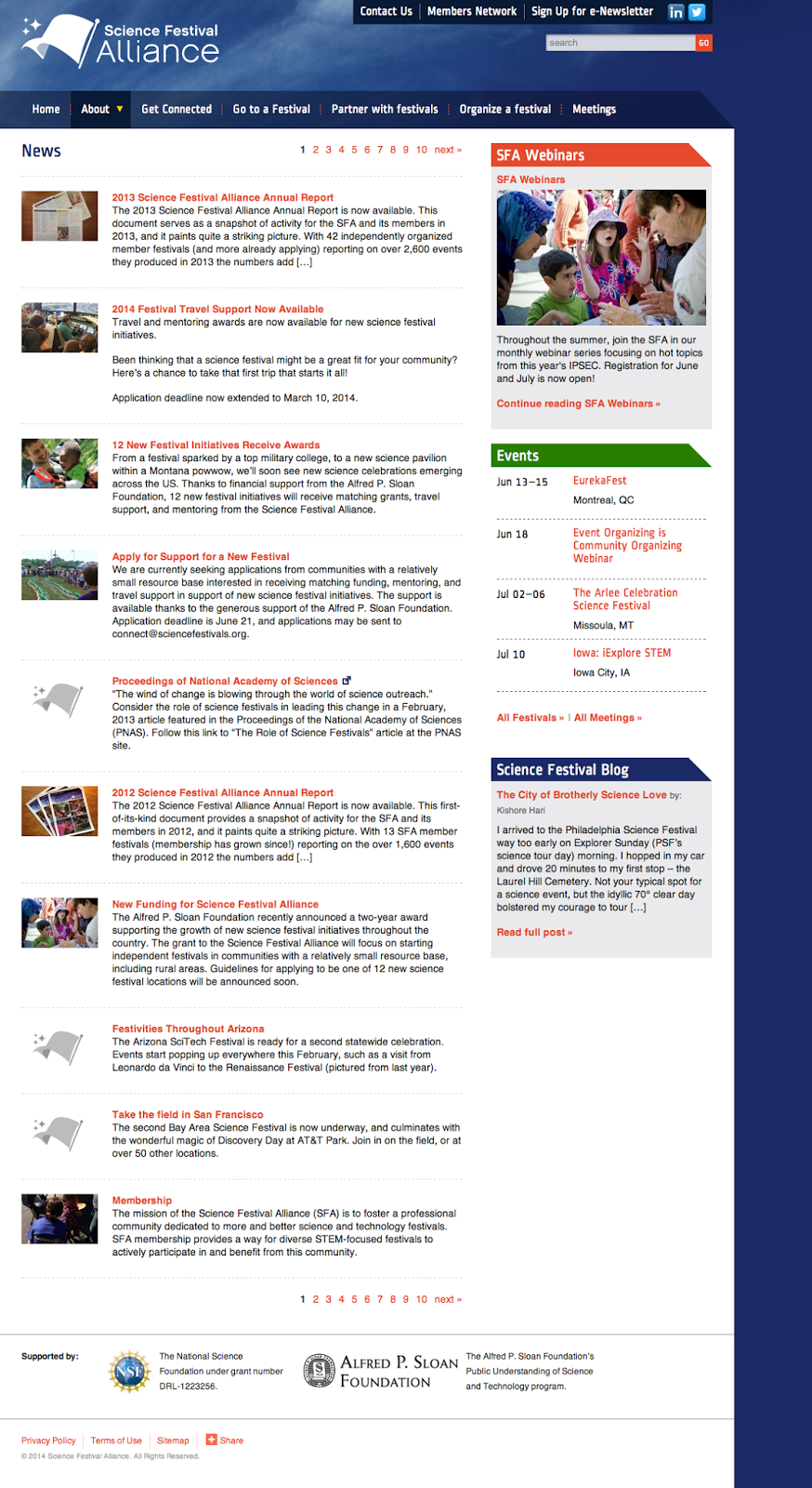
The Science Festival Alliance supports the development and promotion of science festivals worldwide. We worked with the SFA to reorganize their existing website, design a new home page, and extend elements of the redesign throughout the site. We also improved their dynamic map to display member and non-member science festivals around the world, and designed a downloadable calendar widget anyone could install on their own site to keep up with where and when the latest festivals take place.

We provided:

  • Information architecture
  • Visual design

SFA home page
SFA home page

Festival map page
Map of member and non-member festivals worldwide

News page
SFA news page

Evidence for Action – UX & IA for MamaYe websites

Posted: Wednesday, September 19, 2012 | Posted by Tania Schlatter | Labels: , , , , 0 comments

Evidence for Action (E4A) is a five-year program designed to improve maternal and newborn survival in Ethiopia, Ghana, Malawi, Nigeria, Sierra Leone, and Tanzania.

We worked with E4A to develop the user experience for six country sites and one umbrella site, defining content and interactions to serve NGOs, local advocacy workers, and pregnant women, among others. Since some audiences would primarily access the site through mobile phones with slow connections, the sites had to keep performance and usability in mind while providing critical features, such as publishing tools and a dynamic catalog of downloadable advocacy materials.

Wireframe for MamaYe "parent" site home page, left, and country home page, right. The parent site provides an overview of the initiative and aggregates downloadable resources from all six countries.

Final parent site home page, left, and Sierra Leone home page, right. Designed by Georgia Lee and Jordan Chatwin of Advocacy International and developed by Catch Digital based on our wireframes and information architecture.

MIT Biology information design and user testing

Posted: Wednesday, June 1, 2011 | Posted by Debby Levinson | Labels: , , , , , , 0 comments

MIT’s Biology Department wanted to redesign its website to offer prospective and current students a better overview of the research, collaborative mentoring, and career skills the program provides. Having already completed a survey of its students, faculty, and staff, the department had an initial sense of the most urgent problems they needed to solve in the site; specifically, how to drive people to the right content in a site comprising more than 150 pages.

Nimble Partners identified key scenarios of use for the site, analyzed its content, and developed a new information architecture that addressed key user priorities like identifying deadlines and locating faculty and staff. We also designed several rounds of wireframes to dive deeper into content and feature needs. The wireframes served as the foundation for an interactive prototype we reviewed in talking-protocol usability tests with students, faculty, and staff to confirm assumptions and refine site organization and features before visual design began.

Work included:

  • Content inventory and analysis
  • Scenario development
  • Information architecture
  • Usability testing


Home page wireframe


Interior page wireframes for category home (top) and degrees (bottom)


Faculty and staff directory with faceted search


Biology website visual design by Stoltze Design. Development by Indigo Digital and Common Media.

MIT Sloan Faculty Expertise Guide UX, usability testing, and visual design

Posted: Tuesday, October 26, 2010 | Posted by Debby Levinson | Labels: , , , , , , , 0 comments

The MIT Sloan Office of Media Relations connects reporters and members of the media with appropriate Sloan School of Management faculty, researchers, and noteworthy School news and events. To help Media Relations move its printed expertise guide online, we designed an HTML prototype that included faceted search as well as multiple paths into the guide content. We also talked with reporters as they used the prototype and designed features that supported their work habits.

The final site allows reporters to search and browse for experts in multiple ways. Visually, it incorporates elements of the parent Sloan site while serving as a useful and appealing stand-alone application for reporters who go directly to the Guide on a frequent basis.

A year later, as Media Relations launched a blog to support their public relations efforts, we extended the Expertise Guide visual design to a WordPress theme.

Work included:

  • User research and usability testing
  • User interface and user experience design
  • Visual design


Guide home page


Expert detail page


Categories by discipline

User scenarios beyond the web

User scenarios have been widely adopted by web designers as a useful tool for helping ensure sites provide what visitors need and expect. Less well-known is that they are also a great tool for ensuring offline communications do the same.

Recently I was in Sears. They have created central checkout kiosks at my local store (Cambridge, MA) which is a step forward, because previously, it was impossible to find a cash register and a salesperson at the same time. Now there's a large checkout hub at the exit/entrance to the connecting mall. When I entered the store I came from downstairs – not from the mall. I did not pass a kiosk. I shopped and could not find where to pay. I looked for signs, and found this (pardon the fuzzy, surreptitiously shot image).


The sign points to a wall. There's no pay kiosk on either side of the wall.

This could be blamed on a number of things, but for the sake of this post I'm going to pin it on a lack of user scenarios when the store was planning the pay kiosks. If, when someone in Sears corporate offices was thinking about or planning the kiosks, the context of shoppers making purchases came up, hopefully they would have realized that finding where to pay is just one part of a flow that ends with paying – that paying is a part of a larger scenario.

A few years ago, we worked with the marketing team at Sloan Executive Education. They run programs that are attended by professionals from all over the world. Aware that there was a flow of information, and that it needed to be consistent to ensure that expectations were met, we mapped out scenarios related to how potential participants found out about the programs, registered, made travel plans and arrived at the program. After listing all the recipient types and situations, we could evaluate the communications and see where information needed to be changed, added or made more consistent.

There are hybrid online/offline situations that call for scenarios as well. Hospitals can have complex and inconsistent technical setups that send healthcare workers back and forth between paper and electronic files. Working with a client who provides software to streamline hospital discharge, we needed to design a fax form that would literally connect paper and digital correspondence. Care facilities received faxes from hospitals to let them know there was a potential patient for them. Included in the fax was a unique code that, when entered on a website, would provide the patient details and acceptance information. We used scenarios that captured the full flow of contact – online and offline. Because we looked beyond the web interactions we were able to design a complete system that worked, not just a form or site that only addressed part of the situation.

Using card sorts with storytelling to get off to a great start

Posted: Sunday, March 22, 2009 | Posted by Tania Schlatter | Labels: , , , , , 0 comments

Working with non-profits often means large teams with multiple stakeholders, each with a list of desired features and improvements that may have been in the works for years. The expectation level is high – funding has finally been approved, a target launch date planned and everyone knows just what they want – in fact, a site map has been developed. While each stakeholder is trying to address the perceived needs of their audience, when it all gets put together the results can be unprioritized and sprawling. The team may have been meeting for months and are looking for the designers to pick up the ball and run. However, committee-driven IA can be so democratic that it can miss providing the information that site visitors are looking for in the way they expect to find it. Our favorite path to a successful project with multiple stakeholders is holding card sort/participatory design sessions with storytelling as soon as possible.


Traditional card sort sessions involve gathering data from participants by having them sort terms into groups that make the most sense to them. These sessions are a valuable tool for creating navigation that makes sense to the people who will use the site. A large numbers of participants (>30) is needed to provide the data, and software to sort the responses is helpful. While traditional sorts are not difficult to do, we have found that having sessions with fewer participants (5-12) and mixing approaches provides input that covers several areas beyond defining appropriate navigation categories.

When sessions include prompting participants to tell stories about a specific time they used a site, perform a card sort, and use cards to position content and features on a page the way they'd like to see it the data is deep and rich. The results provide a clear picture of each person's mindset, and how that mindset affects how they think about content, categories and what they value. Patterns emerge that point to pretty clear user group needs. While it doesn't provide deep statistical data, it does provide rich scenarios of use and an understanding of needs and values that is just what we need to get buy in from stakeholders to prioritize the feature list and focus the IA on the top issues and most common situations.

MIT Human Resources IA & visual design

Posted: Sunday, July 20, 2008 | Posted by Debby Levinson | Labels: , , , 0 comments

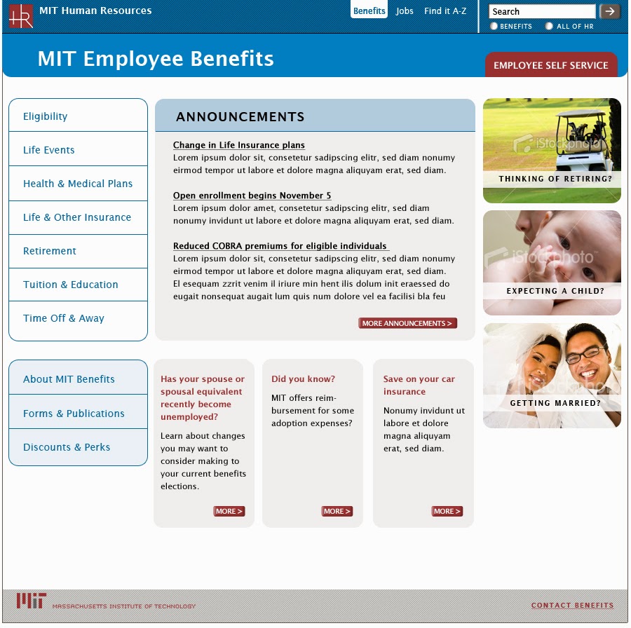
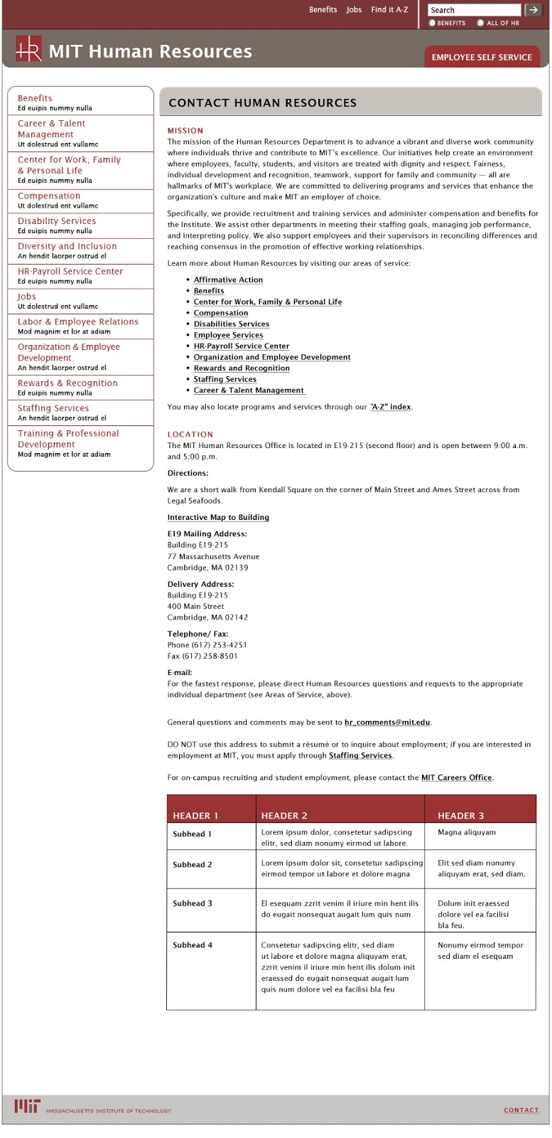
MIT Human Resources encompasses many groups, each with their own site and content and promotional needs. The Benefits Office, HR’s largest and most frequently used website, needed a template system they could use to provide structure for the vast amount of content they publish. The system had to be flexible enough to allow Benefits to promote time-sensitive news in multiple ways, while at the same time establish conventions for navigation and information hierarchy to improve usability.

Nimble Partners designed a visual system that establishes conventions for all sites such as a grid, typography, and navigation. Each site uses its own color palette and can display unique elements, like logos, but still appears part of the HR family and can be easily edited in Drupal's CMS. As the HR Communications Manager said to us: "Hope you’re as pleased by your labors as we are!"

Benefits home page
Benefits Office home page

Benefits lower-level page
Benefits Office lower-level page

HR home page
Human Resources home page

HR lower-level pages
Human Resources lower-level page

color palette
color palette applied to subsite templates
Human Resources site color palette (top); palette applied to subsite templates (bottom)