seen + learned

Visual Design Tips for Web App Developers:
#2 - Use a small set of UI affordances, and apply them consistently

Posted: Friday, October 29, 2010 | Posted by Debby Levinson | Labels: , , 0 comments

Note: As of June 2013, this post is out of date. To learn more about selecting affordances and using them consistently, we recommend chapter 1, "Consistency," and chapter 8, "Controls and affordances" of our book Visual Usability: Principles and Practices for Designing Digital Applications. You can find out more about Visual Usability in our blog post about the book.
When developing a complex application, using the fewest interface elements and behaviors consistently is critical to make your application look organized and behave as expected. For example, this version of an older application has three separate ways of closing a window:


Users must close the leftmost popup by mousing out of it, the center popup by clicking a link or a nearby button, and the top popup by clicking a link that looks completely different from the one in the center popup. Having one way to close a window rather than three would reduce the number of visual cues, improving the appearance, and would help the user know what to expect from the affordance, improving usability.

Here’s another example, the editing interface from the latest version of Microsoft's Photo Gallery software.


It looks like the design and development team tried to introduce some consistency by using an “x” icon for deletion. The problem is that not all the “x” icons do the same thing – the brushstroke icons at top left and bottom delete the photo, the heavily stroked red x at upper right closes the photo file without deleting it, and the small gray x at right closes the metadata pane. All of these actions have very different consequences – especially deletion and file closure! – so their icons should not feel so closely related, or should at least be more clearly identified than they are.

Consistency can be hard to achieve when different teams are working on different parts of an application, and when features are in flux. Set logical rules for where and how interface elements appear based on knowledge of how most people will use the application and existing conventions of any related application UIs. Work to maintain the consistent language as features gel. The payoff will be an application that looks and feels professionally designed, and rules that when documented can serve to guide further development.

For more information:

MIT Sloan Faculty Expertise Guide UX, usability testing, and visual design

Posted: Tuesday, October 26, 2010 | Posted by Debby Levinson | Labels: , , , , , , , 0 comments

The MIT Sloan Office of Media Relations connects reporters and members of the media with appropriate Sloan School of Management faculty, researchers, and noteworthy School news and events. To help Media Relations move its printed expertise guide online, we designed an HTML prototype that included faceted search as well as multiple paths into the guide content. We also talked with reporters as they used the prototype and designed features that supported their work habits.

The final site allows reporters to search and browse for experts in multiple ways. Visually, it incorporates elements of the parent Sloan site while serving as a useful and appealing stand-alone application for reporters who go directly to the Guide on a frequent basis.

A year later, as Media Relations launched a blog to support their public relations efforts, we extended the Expertise Guide visual design to a WordPress theme.

Work included:

  • User research and usability testing
  • User interface and user experience design
  • Visual design


Guide home page


Expert detail page


Categories by discipline

Visual Design Tips for Web App Developers:
#1 - Align elements

Posted: Tuesday, October 19, 2010 | Posted by Debby Levinson | Labels: , 0 comments

Note: As of June 2013, this post is out of date. To learn more about alignment and layout, we recommend chapter 4, "Layout," of our book Visual Usability: Principles and Practices for Designing Digital Applications. You can find out more about Visual Usability in our blog post about the book.
We've worked with a lot of great developers who not only want to make their apps work well – they want them to look good, too. We’ve put together a list of tips for developers who don't have a designer to work with when needed, who want to improve the aesthetics (and the usability) of their apps or who want to have a bit of insight into the designer's approach. This post is the first in an occasional series.

1. Align elements
If you have a UI that has a lot of elements on it, one way to improve the look is to align elements "flush left" or along the left of the lines of a grid. We’re not talking about selecting or designing and using a grid – that needs to be done in advance of development, is more in the designer’s skill set and can be more than a developer wants to deal with. We’re talking about a quick and simple rule of thumb that can be done late in the game – aligning elements flush left to the fewest possible number of vertical lines.

Lines and grids aren’t literal representations of vertical and horizontal lines across the page; they’re virtual guides to help you place elements consistently and logically, which can present the illusion of fewer elements and create less visual activity for the eye. They just plain make your UI look “cleaner.” If you want the gory details of grid design and usage, there are plenty of places to look – see links at the end of this post. In the example image, not all elements align, but enough do to make this busy layout look organized and not chaotic.


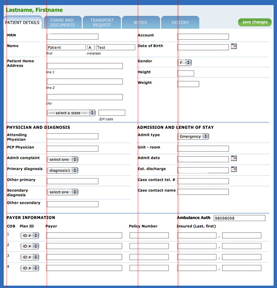
To illustrate further, we’ve taken an old UI and reduced the number of left vertical “lines.” This decreases the visual “activity” created by the ragged white space created by aligning form labels right. The change increases the distance from field label to field, but the gaps created are not as distracting to the eye.

Before


After


More information about aligning page elements:

Notes from FutureM Boston: “The Future of the Web User Experience”

Posted: Tuesday, October 12, 2010 | Posted by Tania Schlatter | Labels: , 0 comments

On October 6, I attended part of MITX's FutureM program, where Bill Albert, director of Bentley University's Design and Usability Center, and Moira Dorsey, an analyst at Forrester, spoke with Weymouth Design President and CEO Tom Anderson about what the future might hold for web user experience design and content. Here are my notes from the talks.


Moira Dorsey

  • New forms of technology start by emulating older forms (like the "horseless carriage"), and then evolve.
  • Online experience has yet to find its true form.
  • 70% of US consumers prefer "rich" interactions (Forrester statistic).
  • Framework for the future: CARS - Customized, Aggregated, Relevant, Social.
  • Cool example: Wikitude augmented reality travel guide
  • User research is the key to knitting together experiences across channels.
  • Customer experience maps are a good tool used to help as well.
Moira's presentation is posted here on the Forrester site.

Bill Albert
  • There are a lot of new tools to help collect quantitative and qualitative data – help designers and businesses get a clearer picture.
  • New tools facilitate micro-studies – can test at the pixel-level.
  • Do users trust your site? Find it attractive? The devil is in the details.
  • In the UX industry, Bill sees a shift from usability to persuasion – usability beyond the web to all communications.
  • "Usable" is no longer enough.
  • Studies on user experiences – example of four ads for Fidelity. The promotion that was the least ad-like (no image, no background color) got the most clicks
Bill's presentation in a .pdf is here

Thoughts and question

These were very solid presentations that complemented each other well. Both talked about how design is no longer about the web – it goes beyond to all channels, and research with users is key to getting the UX across channels right.

At the end, I was thinking about the 70% that Moira mentioned prefer "rich experiences" and the majority of testers Bill mentioned who selected the Fidelity ad that was the most plain, and asked, "How can the difference between these seemingly extreme examples be reconciled?"

Bill and Moira's answer was that the plain ad was central to helping people accomplish a task – a serious one about retirement planning. It goes back to data. An example of "rich" is Google Maps. If the "richness" is too fancy that is a problem. My take away is this: data + rich + simplicity = happy users.

Gourmet Live: fun to read, a pain to use

Posted: Friday, October 8, 2010 | Posted by Debby Levinson | Labels: , , 0 comments

I subscribed to Gourmet magazine for nearly twenty years. My parents subscribed for forty. So when Condé Nast abruptly pulled the plug on the magazine a year ago, we, like many other subscribers, were upset about losing a connection to the food world we'd had for a very, very long time.

So I was thrilled when I discovered earlier this year that Gourmet Live would be released. If you haven't heard of Gourmet Live yet, it's a free iPad application that brings back key aspects of the Gourmet experience: the professional, engaging food writing; the crisp design and mouthwatering photography; and most important, the recipes. It also incorporates gameplay aspects – something I was initially dubious about, and remain so – that open up new content when readers finish looking at certain articles.

When I downloaded Gourmet Live last week and read my first issue, I was beside myself with joy. Here was my magazine, back from the dead! But the deeper I got into it, the more I began to notice the seams, the places where things didn't fit together perfectly or work the way I expected. In an early release – as of October 6th, they're up to a (buggy and iPad-crashing) version 1.02 – I expect there to be kinks to work out. But I don't expect basic user experience blunders.

Gameplay is fine for those who enjoy it, but I want my content.
I enjoy playing games and solving puzzles, but a pixel hunt isn't much of a game. And that's essentially what Gourmet Live requires you to do to unlock extra content – scroll to the end of the articles, which sometimes rewards you with new content, and sometimes doesn't. How do you know how many rewards you can win in a given issue? You don't. How can you guess which articles might offer a reward? You can't. "Gameplay" runs smack up against the basic usability principle of making it easy for people to figure out what they can do next, and there's nothing satisfying about being left wondering if you have to scroll through every article or recipe, even the ones you might not be interested in, for the possible hope of finding something you else you might or might not enjoy.

I've got my content – now, how do I find it again?
Content you download or unlock is displayed as cover thumbnails on "bookshelves" in a Library area. Given how terrific Gourmet's photography has always been, this is a visually appealing interface, but it makes finding information harder than it needs to be.

In the screenshot below, I've got two "issues": "Great Chefs, Great Ideas" and "Nouveau Cajun and More."


I've also got three problems:

  • Three of the recipe rewards are related to content in "Nouveau Cajun and More," but the only way to tell is to know that those items appear between their parent issue and "Great Chefs, Great Ideas."
  • What if I remember there was an interesting-looking pinto bean mole chili recipe in one of the rewards? How do I figure out which one? Without a search engine – which I sincerely hope is an upcoming feature – I must open "Soups" or "Fall Recipes," the most likely candidates, to see if one of them has the recipe. With Gourmet Live scheduled to publish new content at least once a week, this screen is going to fill up quickly, and the longer the app goes without a search feature, the less useful it becomes.
  • The substitute for a search feature, the "Your Favorites" area, too closely resembles an issue of the magazine, even with its yellow highlight. Although this solution was implemented to simplify the even clunkier Favorites navigation in a previous version of the software, it's still not quite right – it should be called out as secondary navigation, not masquerading as a content item.

Great recipes! I'd love to share them with my friends ... but I can't.
Gourmet Live connects to Facebook and Twitter, which makes perfect sense; after all, people are going to want to share recipes, articles, and restaurant reviews with their friends, right? I know it's what I did with the print version, and there are plenty of food sites out there now, including Condé Nast's own Epicurious, that offer this feature.

But what can you share on Gourmet Live? The fact that you've unlocked a reward. That's it. If you've set up the app to share reward information, it sends a banal, faux-cheerful message to your social network whenever you unlock something, and where does the link in the message take your friends? Not to an online version of the article you were reading (even an abridged one), but rather to a page encouraging people to download Gourmet Live. As implemented, sharing in Gourmet Live is a business-centered feature, not a user-centered one.

Where to next?
To the development team's credit, they're taking user feedback from social networks and iTunes reviews into account to help shape future software revisions. I can only hope that as the application matures, it addresses these basic usability issues and becomes as easy to use as the print version was.

I want to love Gourmet Live as much as I loved the original magazine. But right now, it feels like a pale imitation of what it used to be.

Speaking to Students on Designing the User Experience

Posted: Monday, October 4, 2010 | Posted by Debby Levinson | Labels: , , 0 comments

For the past six years, I've been a guest-speaker in Ed Barrett's MIT class 21W785, "Communicating With Web-Based Media." Years earlier, when it was still called "Communications in Cyberspace," I helped informally TA the class, which led to co-authoring The MIT Guide to Teaching Web Site Design with Ed, as well as Suzana Lisanti. (The book is now woefully out of date on the technical side of things, but still has good information about how to plan and organize a class like 21W785.)

I always enjoy speaking to Ed's class, because for many of these students, this is probably their first exposure to a user-centered view of how to develop a complex website or application. Few, if any, have previously had to think about how their site's design – both its user interface and its visuals – needs to please anyone other than themselves.

My goal is to give them tools they can use to get quick feedback, such as sample user interview questions, as well as tools to help turn that feedback into something more concrete to guide them through design and development, such as scenarios, site maps, and clickable wireframes. Given the short timeframe students have to create their projects, Ed and I don't expect that they'll use every tool I give them – but just getting them to start thinking about the people who'll be using what they build is a big step forward, and one that should help them succeed in the professional world.

Slides from this year's presentation are visible below or downloadable from Slideshare.