Recently, Google launched its new Flights service. It's got a nice, clean UI that falls in line with Google's new design approach for all its applications: crisper typography and bolder colors that guide the eye and enhance readability, and layouts that work smoothly across multiple web and mobile platforms.

For the most part, I like the interface. The map interactions are obvious, and there's a refreshing simplicity to the few controls on the page. But there's one part that's still suffering from Google's classically engineer-driven approach: the Levels widget meant to help you optimize flight time vs. price.
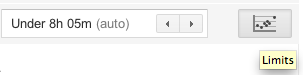
Problem #1: A name like "Limits" is no incentive to click. I clicked only because I was looking around the interface for the first time and had professional curiosity about what Google was up to here. At minimum, the tooltip should use a verb to encourage clicking: "Set flight limits." Better: "Limit flight times and prices."
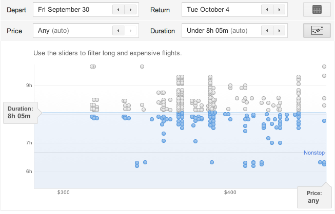
Problem #2: What the heck is it? Okay, the little icon implies I'm going to get a chart of some kind, and sure enough, it's a scatter plot. But I spent longer staring at this chart trying to figure out how to use it than I should have, and I believe most people will have this same huge "stop and think" moment. Highly informal polling of my Twitter followers, most of whom are in the 25-45 age range and comfortable enough with computers to be regular Twitter, Facebook, and Google application users, confirmed that my most nontechnical followers had "no idea" (a direct quote) what they were looking at. Only the two friends who were heavy Google tool users figured out the widget and its interactions immediately.
In fairness, this tool may have been designed for a more technically minded audience. But a few simple fixes could open it up to a wider audience and help make it indispensable.
Problem #3: How do I use it? Where do I start? The slider handles that don't even look like clickable, draggable slider handles until you roll over them? The dots that only give you information on rollover if they're inactive? The badly written, almost invisible help text that implies you're filtering to find the longest, most expensive flights? My two Google-veteran followers knew what to do, but everyone else was stymied at least for a little while.
Possible fixes:
- Rewriting the help text. For example, "Drag Duration and Price bars to filter your results below."
- Make the Duration and Price bars feel inviting and clickable. Change the color to the Google blue and/or add a little dimensionality to them; both design choices look valid under Google's new design scheme.
- While you're at it, make the blue bars draggable, too.
- Add rollovers for the active dots – even just the airline name, flight duration, and price would be enough to reinforce the dots' relationship to the results below.
Flights is a very young Google product. I'm sure Google plans to keep updating it, and hopefully future versions of the Limit tool will be revised to improve its ease of use. I know I'll be keeping an eye on it.

