Hello, all!


Early images of Apple's iOS 7.1 UI changes show Apple making aesthetic decisions that affect usability. In particular, changes involve making key buttons (end call, answer call) smaller.
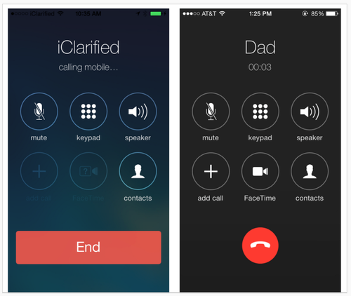
Left: iOS 7. Right: 7.1 beta.
From a graphic design standpoint, the changes elevate screens to the level of mini-Swiss posters – they are sharp and clean. Differentiating the end call button with color and white (black) space sets it apart from the other buttons, as it should. Is the phone icon clear to users under 30? Is it easy enough to hit the smaller "end" button? What about colorblind users? Is Apple betting that the design is so lovely everyone will just adapt, as with the early iPod touch?
A lot more people use the iPhone than the early iPod touch, however, and rely on it to get things done, including making calls. Judging from the comments on the TechCrunch article, not everyone finds the changes lovely. Some Apple fans are having a hard time – first Apple took away the gradients that helped make buttons look tappable, and now the buttons are smaller. Where will it end? I'm enjoying the battle.

