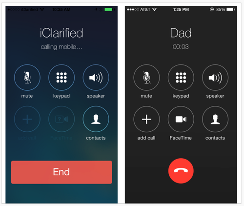
Early images of Apple's iOS 7.1 UI changes show Apple making aesthetic decisions that affect usability. In particular, changes involve making key buttons (end call, answer call) smaller.

Left: iOS 7. Right: 7.1 beta.
From a graphic design standpoint, the changes elevate screens to the level of mini-Swiss posters – they are sharp and clean. Differentiating the end call button with color and white (black) space sets it apart from the other buttons, as it should. Is the phone icon clear to users under 30? Is it easy enough to hit the smaller "end" button? What about colorblind users? Is Apple betting that the design is so lovely everyone will just adapt, as with the early iPod touch?
A lot more people use the iPhone than the early iPod touch, however, and rely on it to get things done, including making calls. Judging from the comments on the TechCrunch article, not everyone finds the changes lovely. Some Apple fans are having a hard time – first Apple took away the gradients that helped make buttons look tappable, and now the buttons are smaller. Where will it end? I'm enjoying the battle.
Apple iOS 7.1 - getting closer to a graphic design/usability showdown
Posted:
Tuesday, January 14, 2014 |
Posted by
Tania Schlatter
|
Labels:
Apple,
mobile UI,
usability,
user interface,
visual design,
visual usability
Subscribe to:
Post Comments (Atom)
About seen + learned
An archived blog by Deborah Levinson and Tania Schlatter, formerly of Nimble Partners, about what we learned and did as user experience designers (creating human-centered websites and applications: information architecture, prototyping, usability and visual design) from 2008-2014.
Labels
Monthly Archive
- Nov 2014 (2)
- Jun 2014 (3)
- May 2014 (3)
- Apr 2014 (1)
- Mar 2014 (1)
- Jan 2014 (2)
- Nov 2013 (1)
- Oct 2013 (1)
- Sep 2013 (2)
- Aug 2013 (2)
- Jul 2013 (1)
- Jun 2013 (2)
- May 2013 (2)
- Apr 2013 (3)
- Jan 2013 (1)
- Oct 2012 (1)
- Sep 2012 (1)
- Dec 2011 (1)
- Oct 2011 (2)
- Sep 2011 (1)
- Jul 2011 (2)
- Jun 2011 (1)
- May 2011 (1)
- Mar 2011 (1)
- Jan 2011 (1)
- Nov 2010 (1)
- Oct 2010 (6)
- Sep 2010 (2)
- Jul 2010 (3)
- Apr 2010 (1)
- Mar 2010 (2)
- Feb 2010 (1)
- Nov 2009 (2)
- Sep 2009 (2)
- Aug 2009 (1)
- Jul 2009 (1)
- Mar 2009 (4)
- Jul 2008 (1)


1 comments:
Some great examples there - looking to produce some dashboards for internal use and will use some of the design on display here.
Other data design I'm a fan of - the "Stocktouch" app and Nike + web. Both are beautifully designed with a high level of interaction and customisation.
Clipping Path Service
Post a Comment
Note: Only a member of this blog may post a comment.