Error messaging is visual discipline. It has to walk a fine line: drawing attention to problems without doing more harm than good. Designing effective error display is about more than providing clearly worded messages describing what went wrong and how to fix the problem; it's an opportunity to express the voice of the system, and show your app's personality. Successful error messages combine wording and design to be noticeable, actionable, and appropriately expressive.

When the user rolls over a warning symbol in wordpress.com's CSS panel, the software provides a polite, in-context warning about thoughtful use of the !important declaration to force a style override.

Error messaging from an older version of Converse's custom shoe-design application is playful and whimsical, in keeping with the funky, independent personality of their brand.
How do you know when you have too much error messaging, or that your messaging is too strong? Is it this?

Orbitz's flight search interface
Or these form errors?

Qualtrics survey error message

Yelp! signup error
And surely it's this:
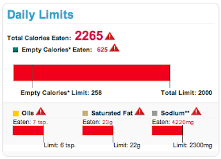
USDA SuperTracker food- and fitness-tracking application warnings displayed if a user exceeds daily limits for calories, fats, and sodium.
Color, a critical part of a site's visual language, is often tied to error messaging interface patterns. Using red for errors makes sense conceptually; an error is the right place to take advantage of contrast to attract the eye. However, use of this pattern can be heavy-handed and jarring, interrupting an application’s personality. Too much contrast in a warning that isn’t life-threatening or data-erasing can feel like a “visual spanking” – like the two form error screens, or SuperTracker's alert that a user has exceeded daily calorie, fat, and sodium limits. Calling so much attention to an error overwhelms the design and tells the user, "You've been very naughty. Go sit in a corner and think about what you've done."
Instead of overusing red, consider a small amount of a different contrasting hue to draw the eye, or a pale tint for your message instead of a solid, saturated color. In an urgent situation, such as a hospital setting, two levels of contrast, such as a light background tint and contrasting text style, may be necessary.

Polite error messaging on a login form
Your goal is the visual equivalent of a polite tap on the shoulder to provide guidance and redirection – not a spanking.
Error messaging – avoiding visual spankings
Posted:
Friday, October 11, 2013 |
Posted by
Debby Levinson
|
Labels:
design tips for web app developers,
user experience,
visual design,
visual usability
0
comments
Subscribe to:
Posts (Atom)
About seen + learned
An archived blog by Deborah Levinson and Tania Schlatter, formerly of Nimble Partners, about what we learned and did as user experience designers (creating human-centered websites and applications: information architecture, prototyping, usability and visual design) from 2008-2014.
Labels
Monthly Archive
- Nov 2014 (2)
- Jun 2014 (3)
- May 2014 (3)
- Apr 2014 (1)
- Mar 2014 (1)
- Jan 2014 (2)
- Nov 2013 (1)
- Oct 2013 (1)
- Sep 2013 (2)
- Aug 2013 (2)
- Jul 2013 (1)
- Jun 2013 (2)
- May 2013 (2)
- Apr 2013 (3)
- Jan 2013 (1)
- Oct 2012 (1)
- Sep 2012 (1)
- Dec 2011 (1)
- Oct 2011 (2)
- Sep 2011 (1)
- Jul 2011 (2)
- Jun 2011 (1)
- May 2011 (1)
- Mar 2011 (1)
- Jan 2011 (1)
- Nov 2010 (1)
- Oct 2010 (6)
- Sep 2010 (2)
- Jul 2010 (3)
- Apr 2010 (1)
- Mar 2010 (2)
- Feb 2010 (1)
- Nov 2009 (2)
- Sep 2009 (2)
- Aug 2009 (1)
- Jul 2009 (1)
- Mar 2009 (4)
- Jul 2008 (1)

