Note: As of June 2013, this post is out of date. To learn more about alignment and layout, we recommend chapter 4, "Layout," of our book Visual Usability: Principles and Practices for Designing Digital Applications. You can find out more about Visual Usability in our blog post about the book.
We've worked with a lot of great developers who not only want to make their apps work well – they want them to look good, too. We’ve put together a list of tips for developers who don't have a designer to work with when needed, who want to improve the aesthetics (and the usability) of their apps or who want to have a bit of insight into the designer's approach. This post is the first in an occasional series.1. Align elements
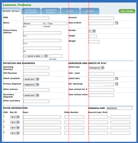
If you have a UI that has a lot of elements on it, one way to improve the look is to align elements "flush left" or along the left of the lines of a grid. We’re not talking about selecting or designing and using a grid – that needs to be done in advance of development, is more in the designer’s skill set and can be more than a developer wants to deal with. We’re talking about a quick and simple rule of thumb that can be done late in the game – aligning elements flush left to the fewest possible number of vertical lines.
Lines and grids aren’t literal representations of vertical and horizontal lines across the page; they’re virtual guides to help you place elements consistently and logically, which can present the illusion of fewer elements and create less visual activity for the eye. They just plain make your UI look “cleaner.” If you want the gory details of grid design and usage, there are plenty of places to look – see links at the end of this post. In the example image, not all elements align, but enough do to make this busy layout look organized and not chaotic.

To illustrate further, we’ve taken an old UI and reduced the number of left vertical “lines.” This decreases the visual “activity” created by the ragged white space created by aligning form labels right. The change increases the distance from field label to field, but the gaps created are not as distracting to the eye.
Before

After

More information about aligning page elements:
- Luke Wroblewski's web application form design page goes into detail regarding the pros and cons of form alignment.
- The ultimate guide for designing with grids – overview, techniques, examples and tools.
- The best old-school graphic design manual on grids is The Grid by Allen Hurlburt.


0 comments:
Post a Comment
Note: Only a member of this blog may post a comment.