seen + learned

Doodle4 heuristic review and interface consultation

Posted: Monday, November 17, 2014 | Posted by Debby Levinson | Labels: , , , , 0 comments

Doodle4 is a new app for promoting causes through making and sharing doodles. Pitched at teen Facebook users, the app’s powerful doodling tool and easy sharing process make it simple and fun to build awareness of a cause by creating doodling “challenges” for friends to pass around.

Nimble Partners collaborated with the Doodle4 team to first provide a heuristic review of an alpha interface on web and mobile devices. We walked through the app as “Ione,” a lightweight persona we developed of a teen interested in banning styrofoam containers in her community. The walkthrough uncovered opportunities to improve the flow of use, wording, and engagement. We followed up the review with rapid iterations of sketches to provide specific recommendations for improvements. We remained on the team as iterations were made through beta launch.

Services provided:

  • Heuristic review
  • UI sketches
  • User experience consulting

Doodle4 designer Ryen Leung provides a great overview of this fun tool in the first five minutes of this video:

Mind and Life Institute information architecture and UX design

The Mind and Life Institute researches and supports interest in contemplative science, bringing together scientists and scholars from contemplative traditions to investigate topics such as addiction, ethics, and emotions. As part of repositioning itself based on a new set of initiatives (ethics, education, and human development; craving, desire, and addiction; and mapping the mind), MLI wanted to redesign its website to promote deep investigation into the wealth of research the organization has funded and encouraged.

We began by drafting scenarios for the three primary audiences – scientists, scholars, and "interested laymen" – relying on MLI's experience with those groups, as well as our own interviews with interested laymen, to define desired interactions. Based on those scenarios, we developed a site structure and wireframes for a responsive experience that used curated promotions to expose relationships between multiple types of site content, allowing visitors a complete picture of the latest insights in contemplative science. We consulted with the visual designer and the development team through site launch to ensure that our layouts were accurately translated to the final site.

Services provided:

  • User experience conceptualization and design
  • Information architecture
  • User interface design
  • Visual design consultation


MLI home page wireframe


MLI initiative page wireframe with related content links at right


MLI featured editorial page wireframe with related content links and fat navigation dropdown


MLI home page. Visual design by John Hall Design Group; development by pixelslam.


Mobile phone view of home page


Featured editorial page

Visual design tips for app developers – consistency in the big picture: beyond where to place the button

Posted: Thursday, June 26, 2014 | Posted by Tania Schlatter | Labels: , , , , , 0 comments

In the book Visual Usability, we introduce what we call the "meta-principles" – three principles that are fundamental to the success of user interfaces. Consistency, hierarchy, and personality are not new to UI design. Considered primarily, however, they provide a structure for assessing and making decisions about the large and small visual characteristics of a UI design. When designing, keeping these principles in mind helps focus thinking about the effect of visual characteristics on how people interpret what they see from both the functional and aesthetic standpoints.

Interfaces have a big job to do. They need to provide information on multiple levels – convey content, communicate interactivity, and provide feedback. Before they can do that, they need to help someone know, or reinforce expectations of, what they are looking at. In Visual Usability, we go into detail about how visual characteristics of layout, type, color, imagery, and controls affect perception of consistency. Our goal is to raise awareness of these details and their effects. We want to help teams understand how people perceive visual characteristics, and make conscious decisions about them.

This post begins to address consistency in the big picture – as a principle for considering the approach to an interface rather than its details – concepts on a different strategic plane than where to place a button. From this perspective, it helps frame thinking about UX, and align UX with how it is represented through UI.

Internal consistency
Humans are wired to identify patterns in what we see and assign meaning to them. When establishing consistency within an application, lack of attention to consistent placement, color, styling, imagery (including symbols and icons), and typography can indicate difference to users, breaking the patterns they've perceived, and making them "stop and think."


This version of an older application had three separate ways of closing a window, forcing users to remember different paradigms every time they interacted with it.

Making sure a UI is internally consistent – that all the close buttons are styled similarly and placed similarly within a screen and from screen to screen within an application, for example – is familiar territory. Making sure that the patterns you choose to adopt and make consistent are in line with your users’ expectations is also familiar territory. What is different is calling out and thinking about the role consistency plays in affecting perception at the UI framework level.

External consistency
When Google created and launched Google Docs, the interface adopted symbols and patterns familiar to people who use desktop word-processing programs. This was a smart move strategically; consistent symbols reinforced similarities between the desktop and cloud word processing experiences, making Google Docs seem familiar and approachable. This helped Google transition users to word processing in the cloud. Consistency across platforms or applications is external consistency.


Google Docs UI, top; Microsoft Word 2010, bottom.

750words.com is also an application used for writing, but it has a different goal, and targets different users. Its tag line is "Private, unfiltered, spontaneous, daily," and the site focuses on people who want to write regularly. The UI provides only essential visual information – where to type – and the number of words written. The screen shows optional visual feedback for how often people are writing. UI elements and design characteristics do not say "word processing," but still encourage people to write. The decision to design the UI framework to be inconsistent with word processing applications helps the app show how it is different from – and better suited to – helping people write regularly.
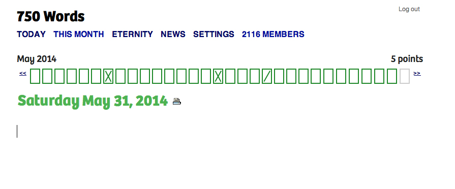
750words
750words.com only indicates where to write, and supports writing regularly.

Consistency and novelty
Advertising and promotional media in general rely on inconsistency – or novelty, as it's known in communication theory – to get people's attention. Novelty can be a differentiator. Novelty as an approach can succeed when it’s authentic and effectively represents and reflects a difference that people find valuable. 750words.com takes a novel approach to writing online, and the choices made in its interface reflect that. Novelty can make visual information more memorable, as several studies,including this October 2013 one [PDF], have found.

While there’s nothing wrong with using platform standards as the initial foundation for a design, relying on them for the final design inevitably results in an app that lacks unique visual appeal. An app designed this way may get to market more quickly than an app that doesn’t, and provides interface characteristics consistent with other apps, rendering it easy to pick up and use. But without key visual differentiators that distinguish it from its competitors and help audiences build affinity, it risks falling behind the pack by not standing out.

For example, compare OpenMBTA (below left), an app for Boston’s public transportation system, to Grocery Gadget (below right), a grocery shopping app:

OpenMBTAGrocery Gadget

The apps serve completely different purposes, but because both rely almost entirely on iOS 6 visual conventions, they look so similar that they might as well be the same app. Even the custom “prepare/shop” toggle at the top of the Grocery Gadget screen isn’t enough to visually distinguish it from OpenMBTA.

By contrast, public transportation app CG Transit, while basing some of its look and feel on iOS 7 flat design standards, applies simple visual upgrades that push it beyond the base set of rules. Color bullet points connect a list of stops, a gradated map gives a high-level overview of the subway line’s path through the city, and a side menu with icons and color highlights combine to create classic visual appeal that make CG Transit feel fresher and friendlier than OpenMBTA.

CG Transit subway line screenCG Transit side menu

Striking a balance between consistency and novelty is at the heart of designing an effective and desirable user experience and interface. As one of the key visual principles behind what people notice and why, we hope you'll reconsider consistency, be aware of it, and use it when making decisions about how to approach and design visual interfaces.

Deborah A. Levinson also contributed to writing this blog post.

Using semantic differentials to evaluate visual design preferences

Posted: Monday, June 9, 2014 | Posted by Debby Levinson | Labels: , , , 0 comments

We recently completed a redesign for LoveToKnow, a site that provides advice on everything from beauty tips and pet health to travel recommendations and party-planning. LoveToKnow wanted a clean, clear design that welcomed users while also feeling believable and authoritative. The new designs had to reveal the site’s wealth of content without being overwhelming, encouraging people to spend more time browsing relevant articles, and ultimately, turning to LoveToKnow as a trusted source for help with all kinds of topics.

LoveToKnow wanted to test designs before finalizing them for launch. A/B testing was our first choice, but wasn’t an option for technical reasons. How could we confirm whether users preferred the new look and feel?

Visual design preferences are by definition subjective. However, tools like semantic differentials and Likert scales give people the terms they need to describe subjective opinions by choosing from a range of possible answers between two opposing statements. With this data, researchers can quantify what otherwise seems unquantifiable.

semantic differential scales
Sample semantic differential scales

Designing the test
LoveToKnow had questions they were hoping testing would help answer. We knew who our audience was: primarily middle- to upper-income women with some college education and moderate internet experience. We then broke the tests into three groups: one that set a baseline by evaluating the current designs before the new ones, and two that only saw the new designs, albeit in different orders in case viewing order affected preference.

We began by setting up a scenario so that test participants would all approach the designs with the same mindset: Imagine you have a puppy, and are wondering how much bigger it will get. You type “is my dog full-grown?” into a search engine, and click through to this page. Beginning with a scenario familiar to the dog owners we recruited immediately made the article page designs relevant, and a more realistic scenario is more likely to yield honest results.

Once users had the right mindset, we asked open-ended questions to gather general impressions of the page and website: what did people think the page offered? What did they think the site offered? What would they click on?

We also provided three semantic differential scales:

  • credible / not believable
  • inviting / unappealing
  • helpful / waste of time

Finally, we provided the same scales for three home page design options to help us choose a winner.

Building the test
Designing the questions, as it happened, was the easy part. The much trickier part was creating a test that would help us get answers through remote testing. We’ve had good experiences with usertesting.com before and believed we could make it work here, too; it was just a matter of linking our questions and designs to guarantee that users would proceed in a straight line instead of accidentally meandering off into the woods.

We settled on a split-screen approach: the questions would be coded in SurveyMonkey and show up in a left-hand frame. In a larger, right-hand frame, we’d display the page designs so that people would have them to refer to as they answered the questions. We also set things up so that clicking anywhere on a design would take people to the next one to review.

Over and over through our dry runs, though, we found that people got off-track immediately. They couldn’t help but click on what looked like a real web page to them, and no amount of written instructions stopped that basic behavior. (A real-life reminder of the usability truism that people often ignore written instructions!)

What did eventually curb the clicks was presenting test participants with a thumbnail of the appropriate page design in the survey, and asking them to confirm they were looking at the right design before answering questions. The colorful image broke up the survey’s wall of text and grabbed enough attention for people to stop, read, and understand.

split-screen test image

After that, it was just a matter of watching test videos and analyzing our SurveyMonkey data, which the site helpfully provides as charts and free text.

The final results
Some of what we discovered:

  • The new article page design was slightly more likely to encourage exploring the site. While participants found both old and pages credible, design had little to no effect on perception of credibility, and there was scant difference in design appeal.
  • However, the new design unquestionably helped people understand that LoveToKnow provided information far beyond just dog content, an important improvement.
  • Results for all three home pages were largely positive and equal, but our second design had an edge over the others, particularly in terms of credibility.

Big data UX, UI and IA

Posted: Friday, June 6, 2014 | Posted by Debby Levinson | Labels: , , , , , 0 comments

For the past three and a half years, Nimble Partners has worked with a big data company to design two suites of web and mobile-friendly applications investigating multiple aspects of the labor market, including demand, supply, job posting, job search, and career exploration. The applications serve a wide user base: job seekers of all ages and backgrounds, the state and local government officials assisting them, public- and private-sector employees researching labor market opportunities, and others.
We worked directly with customers, product management, and developers to redesign some applications, while building others entirely from scratch. Our work included both the customer-facing user experience as well as the tools administrators rely on daily to help job seekers and manage the applications. Customers were delighted with the results: one said we’d “nailed Jell-O to a tree.”

We provided:

  • User experience conceptualization and design
  • Information architecture
  • User interface design
  • Visual design
  • User testing

We can't show this work publicly. Contact us for access to samples via our demo site.

Product strategy vs. UX strategy – thoughts from UXPA Boston 2014

Posted: Friday, May 16, 2014 | Posted by Tania Schlatter | Labels: , , , , 0 comments

Note: this post was updated June 10, 2014. I read Jeff Gothelf's post "There is no such thing as UX strategy" after seeing tweets about it a while ago, and didn't think too much about it. Recently, however, I've been thinking about how (and if) UX strategy manifests in UI design decisions, so I decided to attend the UXPA Boston 2014 conference session "UX Strategy exists, but what is it?" with this in mind.

Gothelf's post, which claims "[T]here is no such thing as UX strategy. There is only product strategy," inspired the session, moderated by Diana DeMarco Brown. It was great to hear stories from panelists Sarah Bloomer, Eva Kaniasty, and Lori Landesman. During Q&A, one attendee said he agreed with Gothelf, but unfortunately, there was not much time left to explore the statement. With a night to sleep on it, I realized that statement was crucial to helping me define my own thoughts on the topic.

To me, UX strategy is the goals and plan established for helping and delighting end-users, as well as meeting the needs of stakeholders, and in the case of enterprise applications, purchasers. Stakeholders and purchasers are types of users. My bias as a designer is to go the extra mile for end users – the people who use what I design. In the case of a consumer app, the user and the purchaser are the same, so in these situations I agree that product and UX strategy are the same. In the case of enterprise applications, user and purchaser goals and needs are often vastly different. Like so many answers to UX design questions, the answer to the question of whether UX strategy is different from product strategy is, "it depends." It depends on who your users are, who the organization is, and what the goals for the product are.

Focusing on the purchaser has led to dreadful and compromised enterprise application experiences. I've worked on enterprise applications for ATG (now Oracle), Endeca, (also now Oracle), and Curaspan, to name a few. In those cases, UX was part of product strategy, both functionally and conceptually. That in itself was not a problem. However, while stakeholders and product managers believed in UX, when it came down to coding and shipping, their focus was on meeting the needs of buyers. This makes sense given how enterprise product management success is measured – in sales, obviously. Like an oldest child in a family, enterprise product strategy takes up a disproportionate amount of stakeholders' time and attention. UX is the younger sibling, wanted and adored, but left to its own devices due to the focus on the oldest child. With intermittent support, UX for enterprise applications often lacks the resources it needs to sustain it and help it thrive.

Follow up note - June 10, 2014: With more thought and reading, I want to add that I think enterprise product strategy can be the same as UX strategy, it is just that it often isn't. If/when enterprise product strategy focuses on providing value to purchasers by developing software that is designed to succeed by helping the people who use the applications do so effectively, efficiently, and with appropriate delight, product strategy is aligned with and subsumes UX strategy.

This brings up more questions: are stakeholder and purchaser needs for enterprise applications really so different from end users, and if so, why? Also, if business stakeholders and product purchasers are types of users (as I consider them to be), then is the discussion of UX vs. product strategy really about end user-focused strategy vs. stakeholder and purchaser-focused strategy specifically in the realm of enterprise applications?


Speaking the Language of Meta-Principles: Consistency, Hierarchy, and Personality

Posted: Wednesday, May 14, 2014 | Posted by Debby Levinson | Labels: , , , 0 comments

I recently returned from beautiful Portland, Oregon, where I spoke as part of the Computer-Human Interaction Forum of Oregon (CHIFOO) annual lecture series. The 2014 series focuses on storytelling, which can take many forms in user experience, user interface, and visual design.

My talk, "Speaking the Language of Meta-Principles: Consistency, Hierarchy, and Personality," covered how to use the meta-principles described in Visual Usability to effectively "tell a story" by using good design to guide users through their desired pathways and tasks in an application. We think of these meta-principles as if they’re part of a language. Consistency and hierarchy are the grammar people learn while using an application: the basic elements that define how a language is spoken. The “words” we speak – that is, the visual design characteristics we choose to convey a message – create an application’s personality. These principles are so fundamental to creating successful interfaces that we call them “meta-principles.” While technology that affects interfaces changes, the underlying meta-principles hold true.

I'd like to thank Emily Mahood Bowman, Clodine Mallinckrodt, Fellene Gaylord, and everyone else at CHIFOO for bringing me to Portland and giving me such a warm welcome. I'll be happy to return anytime!