seen + learned

Science Festival Alliance website refresh

Posted: Thursday, April 18, 2013 | Posted by Debby Levinson | Labels: , , , 0 comments

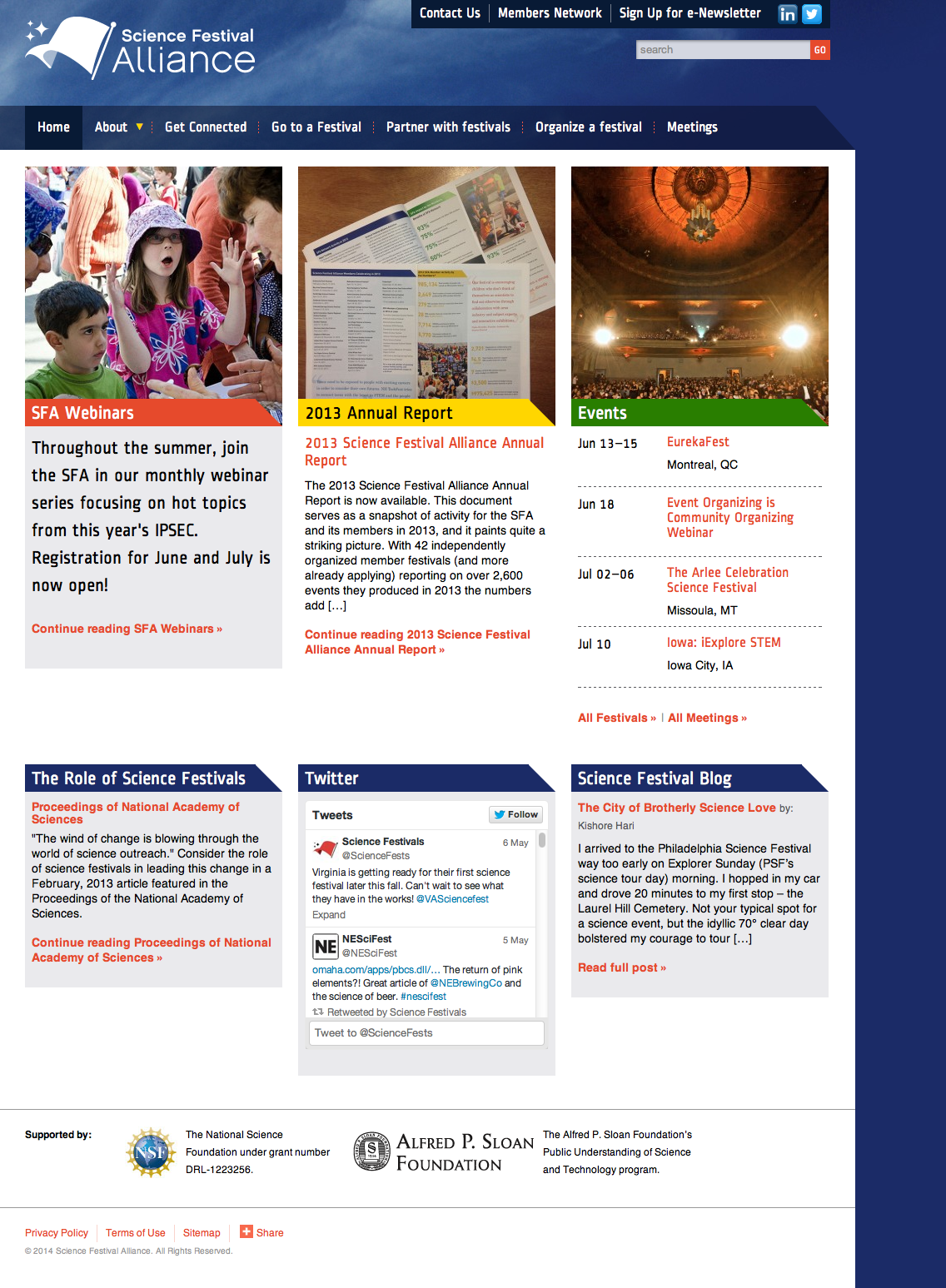
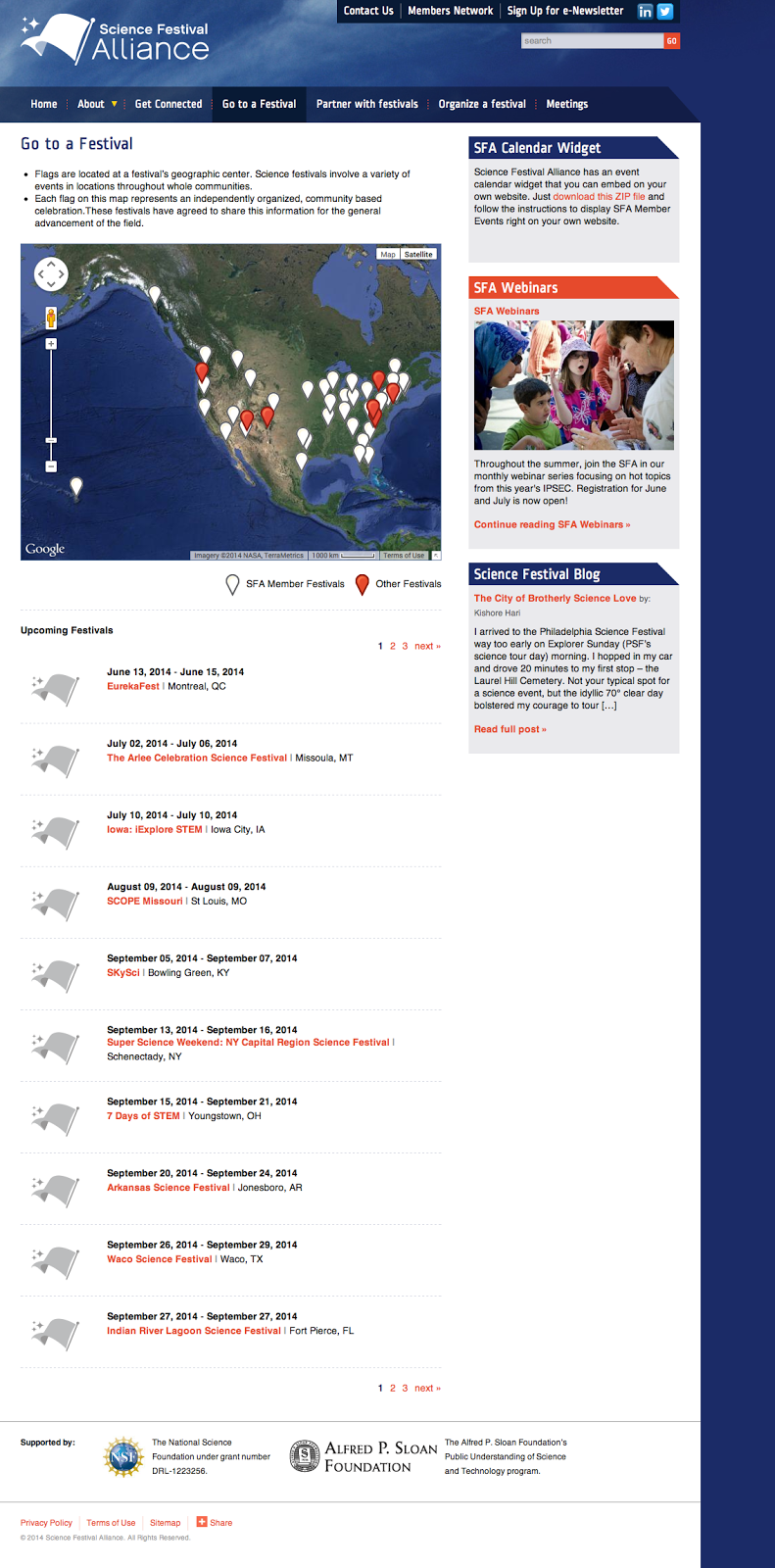
The Science Festival Alliance supports the development and promotion of science festivals worldwide. We worked with the SFA to reorganize their existing website, design a new home page, and extend elements of the redesign throughout the site. We also improved their dynamic map to display member and non-member science festivals around the world, and designed a downloadable calendar widget anyone could install on their own site to keep up with where and when the latest festivals take place.

We provided:

  • Information architecture
  • Visual design

SFA home page
SFA home page

Festival map page
Map of member and non-member festivals worldwide
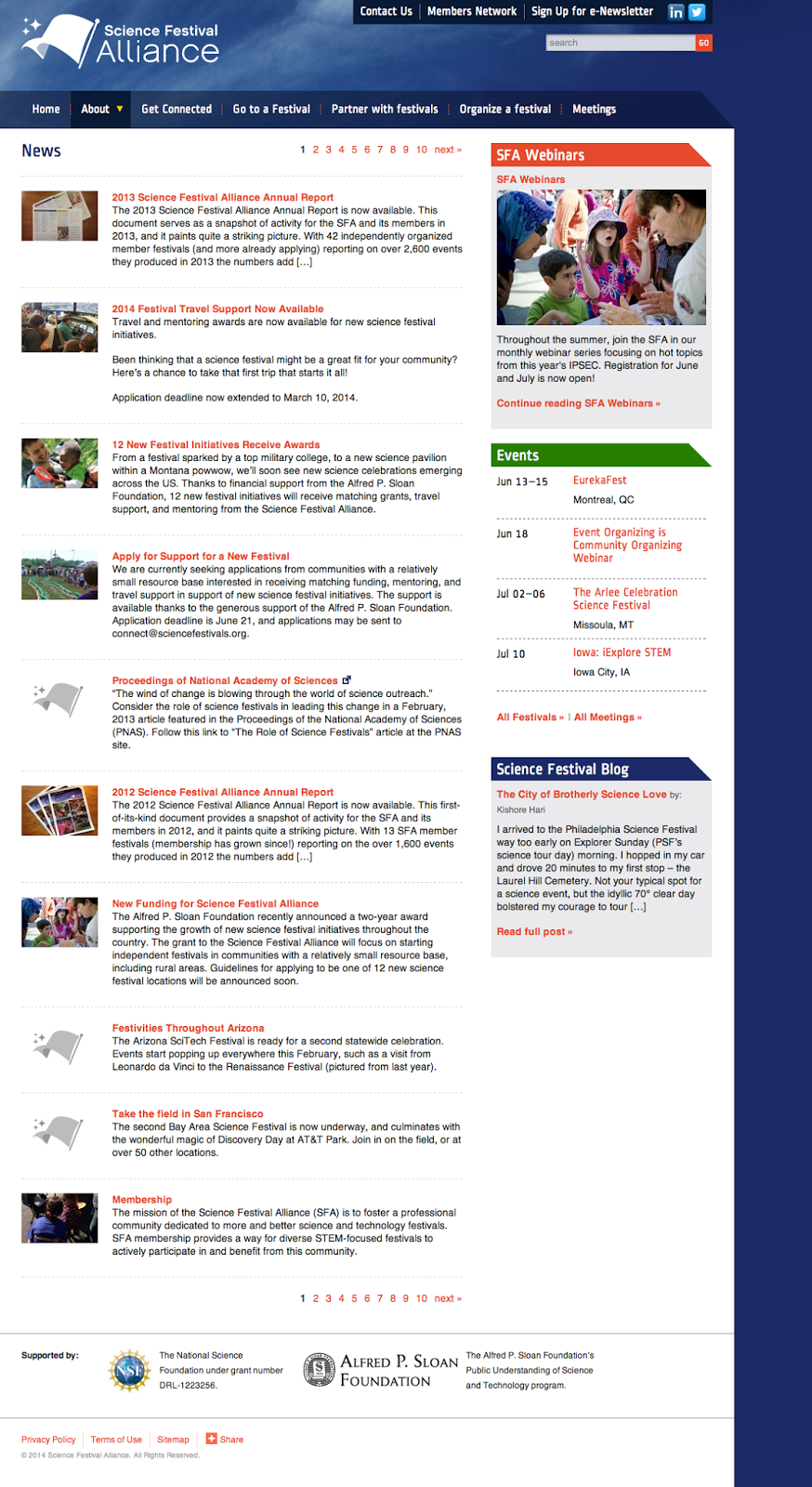
News page
SFA news page

MIT Annotation Studio UI

Posted: Monday, April 8, 2013 | Posted by Debby Levinson | Labels: , , , 0 comments

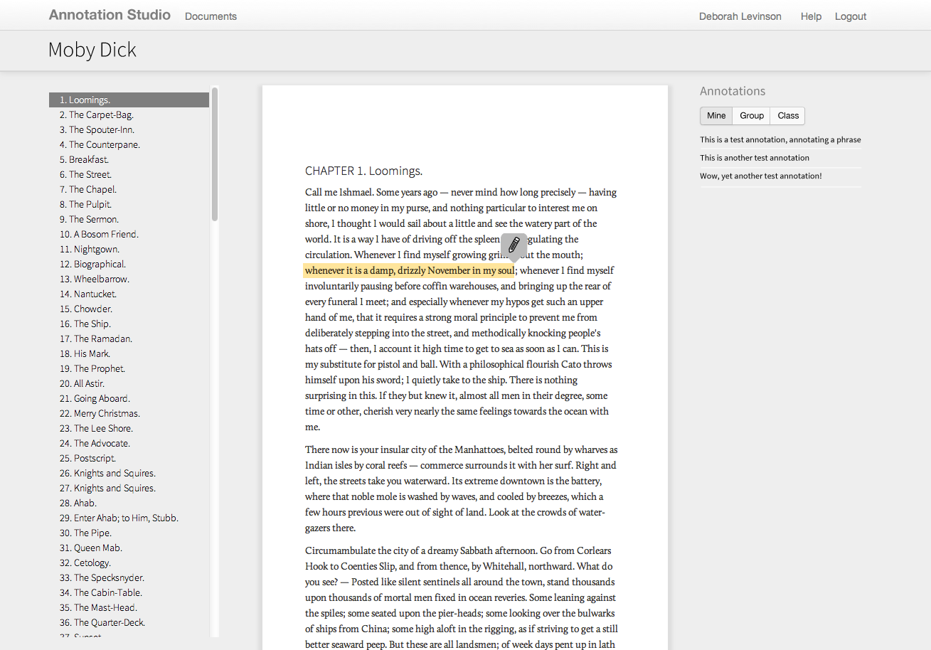
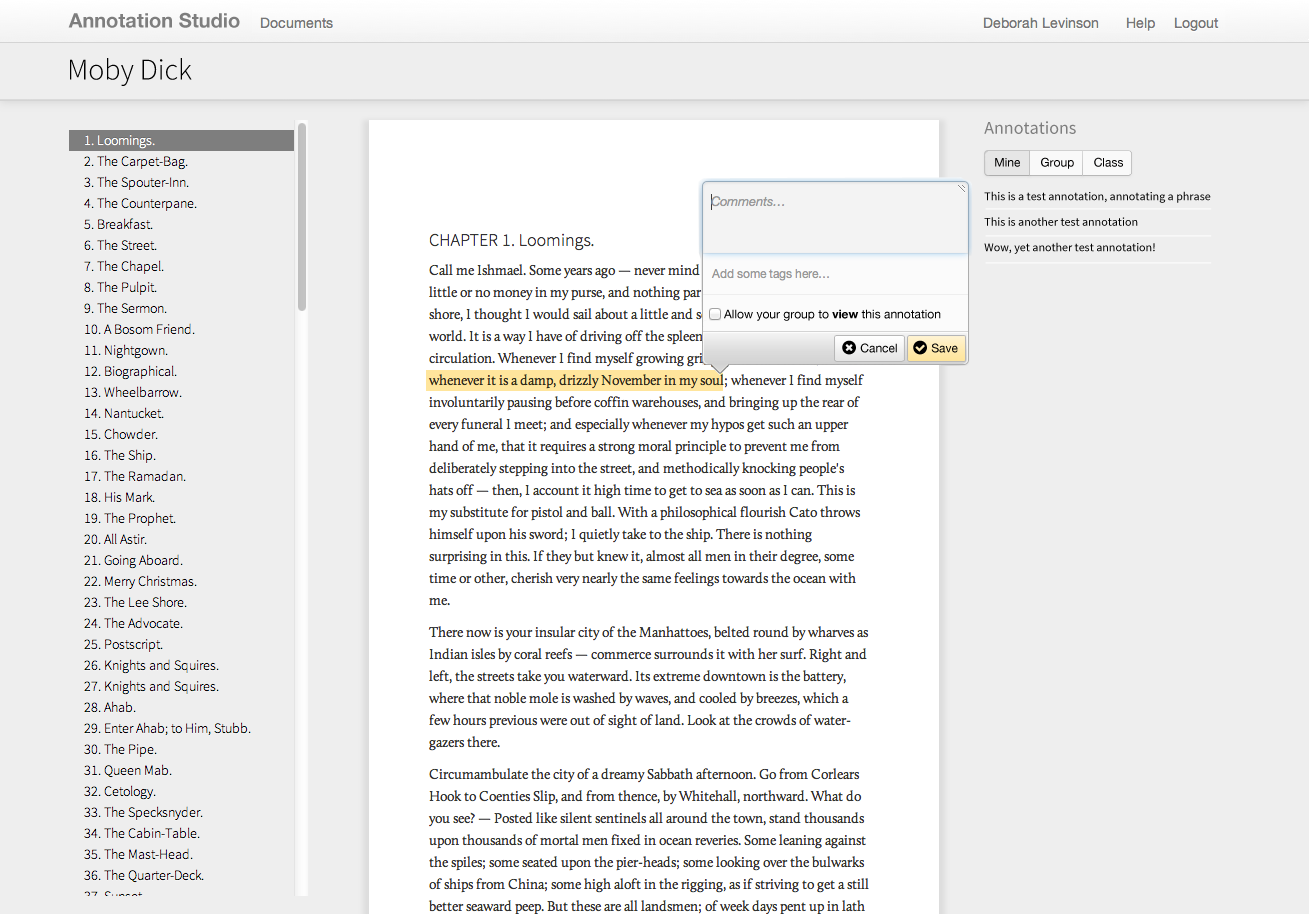
Annotation Studio is a set of collaborative online annotation tools developed by MIT’s HyperStudio program. The software allows students to annotate literary texts and other documents with text, video, audio, and hyperlinks. Students may also view and build upon each other’s notes, allowing for a more participatory experience than traditional solo book review and annotations.

MIT approached us to refine Annotation Studio’s color palette, typography, iconography, and visual approach to displaying annotations and other metadata. To meet technical requirements, we designed styles and visual elements that could quickly be implemented within Twitter Bootstrap.

Work included:

  • Heuristic review
  • Visual design refinement

Annotation Studio documents list
List of documents

Highlighting text to annotate

Saving an annotation

Juniper internal app research & concept

Posted: Wednesday, April 3, 2013 | Posted by Debby Levinson | Labels: , , , , 0 comments

Juniper Networks uses multiple internal tools to keep track of sales-related technical documentation. In an effort to consolidate those tools, Juniper approached us to design a proof-of-concept for a new, mobile-friendly application. We interviewed sales engineers as well as the people who manage and support them to understand the different situations and patterns of use. Based on those interviews, we designed multiple approaches for an intuitive, intelligent, and responsive search interface that guided users to the most recent and relevant information.

Work included:

  • User research
  • UX design

Happy 2013! UX & UI fortune teller

Posted: Wednesday, January 2, 2013 | Posted by Tania Schlatter | Labels: 0 comments

Hello all!
Wishing you good fortune in the new year
[fortune-teller image -- click me!]

from Debby and Tania at Nimble Partners
Directions for your fortune teller:
1. Click the image to download and print at 100% on letter paper.
2. With image facing down, fold corners to the center.
3. Flip over and fold corners to the center again.
4. Fold in half once each way.
5. Put fingers in "pockets."
Enjoy!

Catapult.org user experience

Posted: Wednesday, October 3, 2012 | Posted by Tania Schlatter | Labels: , , , 0 comments

Catapult.org is a Webby-nominated crowdfunding website devoted to projects that improve the lives of girls and women worldwide. Nimble Partners worked with Catapult's founding team from concept to launch to define the overall user experience, specify all content and interactions, and work with visual design and development.

UX work included exploring engaging ways to find projects, testing an interactive prototype, and specifying all administration features for the site.

We're thrilled that in the first year 286 projects were funded, and that the site is going strong!

Home page wireframe:


Home page, designed by Hyperakt and developed by Mindgrub based on our wireframes and information architecture.


Working out content and features for the project page:


Project page, designed by Hyperakt and coded by Mindgrub:


Teams page wireframe:


Teams page, designed by Hyperakt and coded by Mindgrub:


Sample administrative interface screens:


Evidence for Action – UX & IA for MamaYe websites

Posted: Wednesday, September 19, 2012 | Posted by Tania Schlatter | Labels: , , , , 0 comments

Evidence for Action (E4A) is a five-year program designed to improve maternal and newborn survival in Ethiopia, Ghana, Malawi, Nigeria, Sierra Leone, and Tanzania.

We worked with E4A to develop the user experience for six country sites and one umbrella site, defining content and interactions to serve NGOs, local advocacy workers, and pregnant women, among others. Since some audiences would primarily access the site through mobile phones with slow connections, the sites had to keep performance and usability in mind while providing critical features, such as publishing tools and a dynamic catalog of downloadable advocacy materials.

Wireframe for MamaYe "parent" site home page, left, and country home page, right. The parent site provides an overview of the initiative and aggregates downloadable resources from all six countries.

Final parent site home page, left, and Sierra Leone home page, right. Designed by Georgia Lee and Jordan Chatwin of Advocacy International and developed by Catch Digital based on our wireframes and information architecture.

MIT Hyperstudio US-Iran document archive UX and visual design

Posted: Monday, December 12, 2011 | Posted by Debby Levinson | Labels: , , , , 0 comments

MIT’s Hyperstudio developed a faceted database that archived correspondence between the United States and Iran from the 1980s through the late 2000s. Nimble Partners designed an appealing, usable, and culture-neutral interface to help scholars search the database, view documents, and make online annotations.

Home page

Faceted search interface

Document detail view, including annotations area