seen + learned

Speaking the Language of Meta-Principles: Consistency, Hierarchy, and Personality

Posted: Wednesday, May 14, 2014 | Posted by Debby Levinson | Labels: , , , 0 comments

I recently returned from beautiful Portland, Oregon, where I spoke as part of the Computer-Human Interaction Forum of Oregon (CHIFOO) annual lecture series. The 2014 series focuses on storytelling, which can take many forms in user experience, user interface, and visual design.

My talk, "Speaking the Language of Meta-Principles: Consistency, Hierarchy, and Personality," covered how to use the meta-principles described in Visual Usability to effectively "tell a story" by using good design to guide users through their desired pathways and tasks in an application. We think of these meta-principles as if they’re part of a language. Consistency and hierarchy are the grammar people learn while using an application: the basic elements that define how a language is spoken. The “words” we speak – that is, the visual design characteristics we choose to convey a message – create an application’s personality. These principles are so fundamental to creating successful interfaces that we call them “meta-principles.” While technology that affects interfaces changes, the underlying meta-principles hold true.

I'd like to thank Emily Mahood Bowman, Clodine Mallinckrodt, Fellene Gaylord, and everyone else at CHIFOO for bringing me to Portland and giving me such a warm welcome. I'll be happy to return anytime!

Redesigning Northeastern University's College of Professional Studies B.S. in Graphic Design Degree

Posted: Tuesday, May 13, 2014 | Posted by Tania Schlatter | Labels: , , , 0 comments


Founded to advance the careers of working students, Northeastern University's College of Professional Studies (CPS) grants doctoral, master's and undergraduate degrees. I've enjoyed teaching Interactive Information Design 2 and advising CPS graduate digital media students for the past few years.

I love systems and design, and am anxious to help higher ed better prepare students for the complex design work that we do today. I was excited to be asked to participate in a review of CPS' BS in Graphic Design degree last summer, followed by a redesign effort in the fall. The review was required for accreditation purposes, and the redesign was long overdue.

While the accreditation process was written in academic language, much of the work involved what I think of as design thinking. I (re)defined a clear mission for the program based on graphic design skills that are needed today, outlined desired outcomes for students and a system for measuring results, reviewed current courses in a structured way for strengths and weaknesses against goals, and analyzed student performance data over time to understand trends and gaps. Once the required accreditation materials were complete, it was great to take all I had learned and defined and work on redesigning the degree program overall.

The result of the effort is a roadmap for a revised BS in Graphic Design degree program. There are six new courses and six revised courses, which will begin to be phased in this fall. The new program maintains its practical focus and provides a stronger foundation in the traditional "roots" of graphic design, such as typography. When in place, courses and course projects will help prepare students by beginning in black and white and two-dimensional design principles, and carry through to using visual design principles to help people understand, enjoy and use visual information in static and interactive applications.

Increasing appeal for LoveToKnow

Posted: Tuesday, April 1, 2014 | Posted by Debby Levinson | Labels: , , , , , , , , 0 comments

LoveToKnow provides advice on everything from beauty tips and pet health to travel recommendations and party-planning. We helped LoveToKnow provide more consistency and a better user experience by first analyzing their taxonomy as part of a larger search engine marketing project with Nine By Blue. LoveToKnow returned to us to redesign their site to improve its appeal and apply the new taxonomy to an updated, easier-to-use menu system.

As we translated wireframes into visual design, we ran remote usability tests to determine whether our approach resonated with the target audience. LoveToKnow's revenue model is ad-driven, and we paid close attention to this as we wireframed possible design approaches and feature refinements. Test results confirmed that the new designs helped people better understand the breadth of LoveToKnow's content, and that the new article page design better achieved the goal of site exploration.

Work included:

  • Taxonomy analysis
  • Visual redesign
  • Heuristic review
  • Usability testing

Usability test screenshot

Usability test screenshot
Remote usability tests used a split screen to display a survey and relevant page designs (top: current design; bottom: new design).


Original home page page design.


New home page design.


New article page and fat navigation.

Focusing on the future – website planning for the International Development Innovation Network

Posted: Monday, March 31, 2014 | Posted by Debby Levinson | Labels: , , , , , , , 0 comments

The International Development Innovation Network, led by MIT’s D-Lab, provides training and resources for innovators worldwide to create new processes and products that improve the lives of people in poverty. IDIN works from the ground up by serving local innovators; community members are most familiar with their own situation, and most motivated to improve it.

We helped the IDIN team organize and narrow down its goals for a new site by developing user scenarios with the team and mapping goals to specific audience needs. Through an interview with the program's sponsors at USAID, as well as a paper prototype review session with summit alumni, we gathered audience feedback on valuable features and expected usage, which provided further insights into how to structure the site and design key interactions.

Moving from audience and feature analysis into information architecture, we led a collaborative workshop with IDIN staff to map content and features into page types and a high-level site organization. This groundwork helped prepare IDIN for usability testing and a full site redesign.

Work included:

  • stakeholder and user interviews
  • user scenarios – based on real people and interactions
  • prototype development
  • site map
  • content inventory and planning
  • high-level wireframes

whiteboard noteswhiteboard notes
Whiteboard notes from content mapping session.

home page wireframe (mobile view)project page wireframe (desktop view)
Left: home page wireframe (mobile view). Right: project page wireframe (desktop view).

Happy 2014!

Posted: Thursday, January 16, 2014 | Posted by Debby Levinson | Labels: 0 comments

Hello, all!
Click for a special greeting for our clients and friends in the spirit of the times.
Debby and Tania – Nimble Partners

Apple iOS 7.1 - getting closer to a graphic design/usability showdown

Posted: Tuesday, January 14, 2014 | Posted by Tania Schlatter | Labels: , , , , , 1 comments

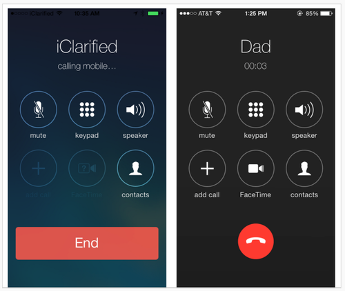
Early images of Apple's iOS 7.1 UI changes show Apple making aesthetic decisions that affect usability. In particular, changes involve making key buttons (end call, answer call) smaller.
iOS comparison images
Left: iOS 7. Right: 7.1 beta.

From a graphic design standpoint, the changes elevate screens to the level of mini-Swiss posters – they are sharp and clean. Differentiating the end call button with color and white (black) space sets it apart from the other buttons, as it should. Is the phone icon clear to users under 30? Is it easy enough to hit the smaller "end" button? What about colorblind users? Is Apple betting that the design is so lovely everyone will just adapt, as with the early iPod touch?

A lot more people use the iPhone than the early iPod touch, however, and rely on it to get things done, including making calls. Judging from the comments on the TechCrunch article, not everyone finds the changes lovely. Some Apple fans are having a hard time – first Apple took away the gradients that helped make buttons look tappable, and now the buttons are smaller. Where will it end? I'm enjoying the battle.

Talking with health communications students about visual design for healthcare site and app UX

Posted: Tuesday, November 19, 2013 | Posted by Tania Schlatter | Labels: , , , , , , 0 comments

This week I presented updated thinking about visual design in digital health communications to Emerson and Tufts health communications students in Lisa Gualtieri's Online Consumer Health course. It was a chance for me to test three frameworks for discussing what design can do for digital heath communications, and hear if they were helpful for students. We evaluated parts of these sites:


Our evaluation included discussing the meta-principles consistency, hierarchy, and personality – how and if they were evident on the pages we reviewed and to what effect. We used the terms expressive and classical to evaluate each site's general visual approach, as well as individual details such as logos. We also looked for evidence of desirable qualities for healthcare communications by asking the following questions:

Credible

Is it professional?

  • Is it organized? Are there visible systems for use, styling, and behavior of navigation, type, color, and controls?
  • Is the up-front value proposition clear? Can I quickly see what the site or app is about and what can I do?
  • Are the visual characteristics appropriate? Do stylistic decisions fit the topic? Do they fit the organization of origin?

Do I trust it?

  • Who is this organization? Are the professional identity and any credentials presented appropriately?
  • What is the organization's goal? Is the emphasis on information or advertising?
  • Does it feel specific or generic? Do the photos feel real or generic? Are colors and styles appropriate for the content and organization of origin?

Helpful

Does it help me understand the site or application purpose?

  • Can I read/use it? Is the type appropriate? Do colors contrast sufficiently with the background?
  • Can I skim and get the gist to help me decide if I want to read?
  • Does it show and tell? Are there images or video that help explain the content?

Does it make sense?

  • Can I see where I am?
  • Can I see where to click? Are the actions and links clear?
  • Can I tell what will happen if I click? Do control designs indicate what will happen? Can I see feedback from what I did?