seen + learned

User experience for software and service updates

Posted: Thursday, October 20, 2011 | Posted by Tania Schlatter | Labels: , , , 0 comments

Changes to the things we use every day affect us and how we feel about the organizations that push change on us. Every time we decide to allow an update or buy a new release, we are taking a leap of faith. Sometimes those leaps are rewarded, and sometimes they are not.

Regardless, our time is required to relearn, and this investment is not acknowledged or appreciated. I've read that brand loyalty is at an all-time low. People are happy to try new restaurants and services with a coupon from Groupon, but vendors report that coupon use is not translating into repeat business. I don't know statistics about mobile and computing software specifically, but based on my extremely limited and unscientific example of myself I can only imagine that maintaining a positive customer experience after purchase is valuable.

Four tips for better software update experiences:

  • Show me what I can expect. Let me preview what will change visually, not in a readme file after the fact. Google is doing this well with its beta interfaces.

  • Let me choose. Give me a choice to retain an old interface. Twitter, Yahoo!, and Google have all allowed users the choice between new beta interfaces and the familiar old ones, even if eventually these choices were taken away.


  • The UI should always be a high priority. I've seen more beautiful launches than I can count that degrade with the second release. It's great that the UI/UX were stunning at first, but if feature fixes and additions compromise the UI in subsequent rounds, the initial effort truly was for naught.

  • Assume people will hate it. Your organization may think that the update is great and fixes all kinds of issues, but chances are users aren't aware of the problems; they're only aware of the change. If you keep in mind that people will hate the update, it's more likely that changes will be made in a way that has less negative impact on consumers – and communications will be less about what the organization thinks is better, and more about what people can expect.

Where's this coming from?
Recently, I downloaded an update for my Android mobile phone. I didn't think about it much before doing it. I saw the prompt, figured I had enough connection strength and time for the update, pushed the button and put the phone back in my bag.
image source: http://gadgetian.com/5770/verizon-moto-
droid-pro-software-update/

Taking a glance later, it was immediately clear that the interface had changed. One of my favorite things about the phone was the lovely graphic that reflects the time of day. Now, instead of late afternoon sunlight, I saw a generic blue screen and the time. Sigh. A few taps and I saw that the entire black-background, high-contrast interface had been brightened, buttons outlined with white hairlines, more prompts added. Clearly someone was trying to improve something, but even though I am usually on the designer's side in this situation, I was just annoyed that things had changed, that the changes appeared to be for the worse, and that I hadn't been warned. The thought crossed my mind that I could change to another carrier with another phone with a more appealing interface. If I have to adapt, I might as well adapt to something else.

No one likes change, even when it's for the best; it takes time and reflection to realize and appreciate change. A few years ago, I facilitated a working session for an organization to help them decide what values were important to convey as part of a new visual identity. In the session, there was a lot of excitement about the future for the group and its ability to be thought of as cutting-edge. When it came time to review logos that had been designed to reflect the key adjectives the organization wanted to portray, the same group overwhelmingly favored the identity that was least changed and most conservative. Asked to explain their choice, they cited the history of the organization and the need to appear consistent – the opposite of what they previously wanted to convey.

Consumer products and services are user experience-crazy right now, with everyone across all levels of organizations getting that experience matters. (Thanks, Steve!) Despite the desire to create products and services that people love, the software world manages product changes extremely poorly. The phone is one recent example; Netflix's proposed service changes are another. I know graphic designers who are running an operating system and software from 2005 because they are so afraid of the interface changes and the time needed to remaster the software with each release.

Helping customers manage software update changes is a seemingly small way organizations can go beyond saying customers matter and show customers that they matter.

4INFO admin UI design

Posted: Tuesday, October 11, 2011 | Posted by Debby Levinson | Labels: , , , , , 0 comments

4INFO, a mobile ad delivery and analytics company, needed help evaluating a mobile ad campaign management platform's alpha interface for potential UX design issues. Nimble Partners reviewed the interface in progress and honed its feature set and application flow through multiple rounds of discussion and wireframing. We also designed visuals for the application and consulted with the development team as they applied the new look and feel.

Work included:

  • UI and UX analysis and design
  • Wireframing
  • Visual design

campaign page wireframe
Campaign edit flow wireframe
Wireframes for campaign page (top) and campaign edit flow (bottom)

campaign page visuals
campaign edit flow visuals
Visual designs for campaign page (top) and campaign edit flow (bottom)

color usage guide
Application color usage guide

Improving the usability of Google Flights' Limits tool

Posted: Wednesday, September 21, 2011 | Posted by Debby Levinson | Labels: , , 0 comments

Recently, Google launched its new Flights service. It's got a nice, clean UI that falls in line with Google's new design approach for all its applications: crisper typography and bolder colors that guide the eye and enhance readability, and layouts that work smoothly across multiple web and mobile platforms.

Google Flights home page

For the most part, I like the interface. The map interactions are obvious, and there's a refreshing simplicity to the few controls on the page. But there's one part that's still suffering from Google's classically engineer-driven approach: the Levels widget meant to help you optimize flight time vs. price.

Levels icon

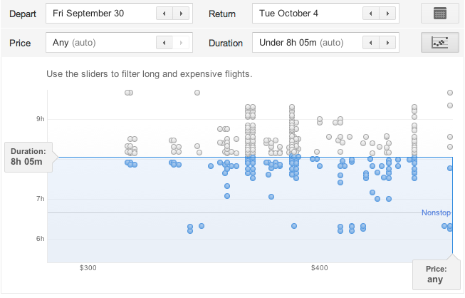
Levels widget

Problem #1: A name like "Limits" is no incentive to click. I clicked only because I was looking around the interface for the first time and had professional curiosity about what Google was up to here. At minimum, the tooltip should use a verb to encourage clicking: "Set flight limits." Better: "Limit flight times and prices."

Problem #2: What the heck is it? Okay, the little icon implies I'm going to get a chart of some kind, and sure enough, it's a scatter plot. But I spent longer staring at this chart trying to figure out how to use it than I should have, and I believe most people will have this same huge "stop and think" moment. Highly informal polling of my Twitter followers, most of whom are in the 25-45 age range and comfortable enough with computers to be regular Twitter, Facebook, and Google application users, confirmed that my most nontechnical followers had "no idea" (a direct quote) what they were looking at. Only the two friends who were heavy Google tool users figured out the widget and its interactions immediately.

In fairness, this tool may have been designed for a more technically minded audience. But a few simple fixes could open it up to a wider audience and help make it indispensable.

Problem #3: How do I use it? Where do I start? The slider handles that don't even look like clickable, draggable slider handles until you roll over them? The dots that only give you information on rollover if they're inactive? The badly written, almost invisible help text that implies you're filtering to find the longest, most expensive flights? My two Google-veteran followers knew what to do, but everyone else was stymied at least for a little while.

Possible fixes:

  • Rewriting the help text. For example, "Drag Duration and Price bars to filter your results below."
  • Make the Duration and Price bars feel inviting and clickable. Change the color to the Google blue and/or add a little dimensionality to them; both design choices look valid under Google's new design scheme.
  • While you're at it, make the blue bars draggable, too.
  • Add rollovers for the active dots – even just the airline name, flight duration, and price would be enough to reinforce the dots' relationship to the results below.

Flights is a very young Google product. I'm sure Google plans to keep updating it, and hopefully future versions of the Limit tool will be revised to improve its ease of use. I know I'll be keeping an eye on it.

Quickie "Valued Features" Prototype Test

Posted: Wednesday, July 13, 2011 | Posted by Tania Schlatter | Labels: , , , 0 comments

We were recently part of a team redesigning a student services department website for MIT. A lot of ideas for home page features were discussed at the kickoff meeting. The question quickly became, which of these features, if any, would students value?

Since it was the end of the semester, we had limited access to students. The client team suggested that a lot of students would be at an upcoming event, so we designed a test that they could take in a few minutes at a table near the event entrance.

We created a very simple prototype using OmniGraffle that included a simple black and white mockup of a bare home page frame, and several cutouts of proposed paper features and content elements.


For the test, students selected the paper elements that interested them most and placed them on the paper home page frame while telling us why they'd chosen those elements. We photographed each student's selections as documentation and asked two direct questions from our test plan. With two test facilitators each conducting one-on-one tests, we had 15 responses in less than 20 minutes!


The students got the idea of the paper prototype right away and had no problems understanding the test or the interactivity suggested by the paper features. We heard stories of how they imagined using the new site and the proposed features. The test provided simple data for the "what" and the "why," which helped the group make decisions.

One test gem was that about half of the participants interpreted one of the features differently than intended – they saw a pair of small photos as staff member photos rather than student photos. Since they commented about how nice it would be to see a staff member and click on their contact information, we learned they valued a feature that we hadn't anticipated.

After the test, we tallied which features were selected most, reviewed the reasons students gave us for their choices, and created OmniGraffle wireframes showing proposed content and features based on what we learned.

This test could be adapted to be run remotely via screen-sharing software, such as GoToMeeting. Hand over the keyboard and mouse, and participants can place content and feature elements on an onscreen frame. Either way, it was a quick and effective method to determine what users value.

Adding NOT selections to checkbox interfaces

Posted: Friday, July 1, 2011 | Posted by Debby Levinson | Labels: , 0 comments

We've recently come across questions online and in our own work about how to deal with negative selections in a checkbox UI. Usually, a checkbox's on/off status in something like faceted nav is enough to convey that you're not interested in seeing results from the unselected items. But what if you specifically want to select items to exclude?

Grafting NOT functionality into a checkbox UI can make the UI feel overly complicated and unintuitive. But a couple days ago, quite by chance, I found a site that's doing it well.

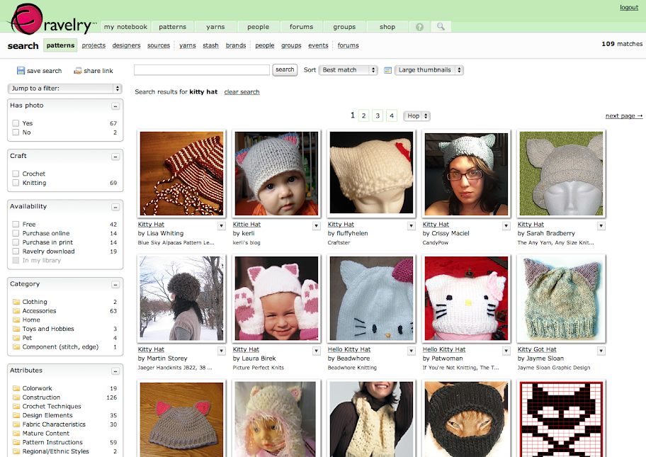
I was searching for a knitting pattern on Ravelry, an online community for people interested in fiber arts. Ravelry's search uses a standard faceted UI to help narrow results:

Ravelry search results

Since I don't crochet, I clicked on "knitting" in the Craft box to limit the number of patterns. That's when this additional dropdown appeared:

Ravelry faceted UI dropdown

I pulled it down to explore further:

Ravelry faceted UI dropdown

Ravelry's use of simple Venn diagrams to convey what can be confusing search concepts to nontechnical users is a great idea, and using soft colors and a light gradient to help the dropdown feel friendly and accessible is also a smart choice. But I was especially pleased to see them take things one step further once you actually select an item in a NOT search:

Ravelry NOT selection

Putting the "do not" icon in the checkbox reinforces the choice the user made from the dropdown, and makes it crystal-clear how search results will be affected.

For most Ravelry searches, you won't need this additional UI feature. But it's there if you do, and it's the best solution I've seen for this complicated problem.

MIT Biology information design and user testing

Posted: Wednesday, June 1, 2011 | Posted by Debby Levinson | Labels: , , , , , , 0 comments

MIT’s Biology Department wanted to redesign its website to offer prospective and current students a better overview of the research, collaborative mentoring, and career skills the program provides. Having already completed a survey of its students, faculty, and staff, the department had an initial sense of the most urgent problems they needed to solve in the site; specifically, how to drive people to the right content in a site comprising more than 150 pages.

Nimble Partners identified key scenarios of use for the site, analyzed its content, and developed a new information architecture that addressed key user priorities like identifying deadlines and locating faculty and staff. We also designed several rounds of wireframes to dive deeper into content and feature needs. The wireframes served as the foundation for an interactive prototype we reviewed in talking-protocol usability tests with students, faculty, and staff to confirm assumptions and refine site organization and features before visual design began.

Work included:

  • Content inventory and analysis
  • Scenario development
  • Information architecture
  • Usability testing


Home page wireframe


Interior page wireframes for category home (top) and degrees (bottom)


Faculty and staff directory with faceted search


Biology website visual design by Stoltze Design. Development by Indigo Digital and Common Media.

Slides and Summary of Web Application Visual Design Session for Boston CHI

Posted: Tuesday, May 3, 2011 | Posted by Tania Schlatter | 0 comments

Layout, type, color, imagery and identity are key to communicating in any medium. Because web apps are interactive and often need to help people get things done, these five elements have a big effect on usability – if they are present, they automatically communicate a message. They are the "tools" that the designer has to establish the UX goals of consistency, hierarchy and personality.

Our session at the Boston CHI Professional Development Day was designed to contextualize these core visual design principles for web applications. While there are tons of articles on the web and in print about web design and user experience, a lot of application interfaces are designed without visual expertise, and there are few resources that get into the nitty-gritty of applying these principles to complex web application design.

The session, like some of our blog posts, attempted to provide guidelines to help developers and non-designers avoid common mistakes, make informed decisions, and ideally, elevate the ordinary. When creating the session, I thought 5.5 hours of instructional time was a lot. In practice, I found it wasn't nearly enough to provide the kind of framework I'd hoped to. There's too much to talk about, and most of it takes practice to master the basics. In hindsight, I wish I'd kept the focus to common mistakes and ways to avoid them.


In the session exercises, participants started off with a simple dot exercise similar to what's shown in our post on Visual Hierarchy and Why It Matters, and moved to analyzing a sample scenario to tease out interface elements. Participants listed and prioritized the implied interface elements based on their reading of the scenario, and then sketched designs, applying the principles of proximity, alignment, grouping and nesting.

Mastering positioning and layout (not to mention color, type and imagery) takes a lot of trial and error. We could have used the whole session just creating simple prototyped layouts, testing them with each other and changing the layout (position of buttons, position and juxtaposition of features, etc.) to experience how seemingly small changes can affect perception and use.