seen + learned

Curaspan application user experience, user interface, and visual design

Posted: Thursday, July 30, 2009 | Posted by Debby Levinson | Labels: , , , , , 0 comments

Curaspan Healthgroup, Inc., a leader in web-based healthcare administration software, wanted to expand and improve its product range, including breaking off modules into standalone items and making all their software easier to use.

After observing how hospitals, care facilities, and transportation providers used the existing application, we redesigned the flow of Curaspan's main application to reduce steps, and made the UI easier to scan in busy environments.

We provided:

  • Heuristic review
  • Contextual inquiry
  • HTML prototype
  • Visual and UI design
  • Style guide and HTML/CSS templates


Find a Patient interface and sample results


Patient details screen


Transport request screen

Using card sorts with storytelling to get off to a great start

Posted: Sunday, March 22, 2009 | Posted by Tania Schlatter | Labels: , , , , , 0 comments

Working with non-profits often means large teams with multiple stakeholders, each with a list of desired features and improvements that may have been in the works for years. The expectation level is high – funding has finally been approved, a target launch date planned and everyone knows just what they want – in fact, a site map has been developed. While each stakeholder is trying to address the perceived needs of their audience, when it all gets put together the results can be unprioritized and sprawling. The team may have been meeting for months and are looking for the designers to pick up the ball and run. However, committee-driven IA can be so democratic that it can miss providing the information that site visitors are looking for in the way they expect to find it. Our favorite path to a successful project with multiple stakeholders is holding card sort/participatory design sessions with storytelling as soon as possible.


Traditional card sort sessions involve gathering data from participants by having them sort terms into groups that make the most sense to them. These sessions are a valuable tool for creating navigation that makes sense to the people who will use the site. A large numbers of participants (>30) is needed to provide the data, and software to sort the responses is helpful. While traditional sorts are not difficult to do, we have found that having sessions with fewer participants (5-12) and mixing approaches provides input that covers several areas beyond defining appropriate navigation categories.

When sessions include prompting participants to tell stories about a specific time they used a site, perform a card sort, and use cards to position content and features on a page the way they'd like to see it the data is deep and rich. The results provide a clear picture of each person's mindset, and how that mindset affects how they think about content, categories and what they value. Patterns emerge that point to pretty clear user group needs. While it doesn't provide deep statistical data, it does provide rich scenarios of use and an understanding of needs and values that is just what we need to get buy in from stakeholders to prioritize the feature list and focus the IA on the top issues and most common situations.

Try again ... this time in English.

Posted: Tuesday, March 17, 2009 | Posted by Debby Levinson | Labels: 0 comments

One of the most frequent problems we see on websites is jargon-heavy text. There are many reasons why this happens: maybe the writing team is so used to serving an internal audience they don't realize that others can't understand their content; or maybe the website serves an industry that thrives on buzzwords, such as consulting. Sometimes it just happens by accident or because no one has time to really review the text before it gets posted. But no matter the cause, the result is almost always a site that feels insular, unfriendly, and worst of all, crammed with content that doesn't resonate with the audience.

One of the worst offenders on many sites is the legalese on Terms of Use pages. Hardly anyone other than lawyers actually reads these closely; they're just long, impenetrable documents we all have to pretend we've read before we can check off a box and complete a registration form.

But this week, the Consumerist singled out Aviary, a site providing online graphics tools, for their radical and simple approach to their Terms of Use page: they provided an English translation paralleling the legalese. Using concise and friendly language, Aviary spells out everything you'd want to know about their Terms of Use, from who owns the graphics you create on the site, to the different payment plans they offer, to the licensing agreements for site content. Aviary's approach transforms an unreadable page into one that anyone can understand, a goal consistent with their mission to "make creation accessible to artists of all genres."

We hope more companies follow Aviary's lead and make their content clear and easy to read, which is a more successful way to reach their audience than "buzzword compliance."

When moving fast slows you down or, one more reason why prototypes rule

Posted: Wednesday, March 11, 2009 | Posted by Tania Schlatter | Labels: , , 2 comments

Sometimes, we go right from creating schematic, or wireframe sketches on paper to visual design. There are often several rounds of sketches before they are approved and visual design begins in earnest. On complex applications, this is a mistake. Paper-based wireframes, even several rounds of them, do not give the team a chance to test drive the application. This leads to lots of "oh, yeah" changes when the team sees a working build with "final" graphics in place, even if the visual design and the wireframing have gone through several rounds.


"Everything is changeable on the web - what's the problem?" Creating visual design for complex web applications involves layers, lots and lots of graphic layers per page template. For each button, for example, there are several states. For each state, there are vector (working, editable) layers, and final, "raster" layers for the same button. Four layers, easy, per button. Finding the right layer and changing it to match all the other buttons, even in well-organized files is time consuming and error-prone.

Add all the files from all the rounds of design, the passage of time from final graphics to working staged site, and the problem grows. Changes to complex web applications once the graphics are in place are time-consuming and lead to messy, hard to manage files. Often the change needs to be made right away, and a designer (no one I know ;) might edit a flat .jpg rather than the original layered file. While this seems harmless at the time and gets the problem solved quickly, what happens when the same item or similar item needs the change again - another "oh, yeah"? More time to find, edit, make the same as all the others, for a word change that everyone thought could be changed easily later.

Maintainability and integrity of a UI design suffers when the design is picked apart for the sake of wording and functionality edits once complete. Web application visual design is often about subtle juxtapositions. When features are unexpectedly added or changed, the details of the design can fall apart, reducing the overall impact and effectiveness of the design that was labored over and approved.

What to do? Prototype. We know prototyping helps interaction design and feature definition. We know prototypes (limited functionality, no design) are easy and helpful to test. The news is that it helps visual design, too. When prototypes are vetted, "oh yeah" changes are dramatically fewer, allowing the design to be its best.

The Web 2.0 look and feel "gotcha"

Posted: | Posted by Tania Schlatter | Labels: , 0 comments

The Web 2.0 look and feel is still hot. People really respond to the super-glossy buttons, organic background shapes, colorful gradations and graphic type. At the same time, web applications are rapidly improving. We've seen some really great ones lately, MailChimp, Picnik and Kontain come to mind. While there are great examples of slick looking and acting, fully functional applications, these applications are hard to do. Web applications are functional by nature. Graphics-intensive Web 2.0 look and feel is not. For every graphic text header, there is a tired design developer who has to change the graphics any time there is a word change. In short, maintaining heavily graphic sites is (still) a lot of work. The more functional an application, the more things change, the more graphics to create, manage, maintain.


Before committing to slick buttons, styled type and rounded everything, consider how often elements are likely to change. Consider the work flow (who will do what) when things do change. Consider putting the graphics in areas behind system text to give a rich look without the maintenance hassles, or letting a highly styled logo carry the slick feel. Consider Google, which is what everyone wanted to look like in the last web design fad. Consider what visual elements are really important to communicating your brand. Got great developers, organized PSD file templates, time and manpower to make changes regularly? The sky's the limit.

MIT Human Resources IA & visual design

Posted: Sunday, July 20, 2008 | Posted by Debby Levinson | Labels: , , , 0 comments

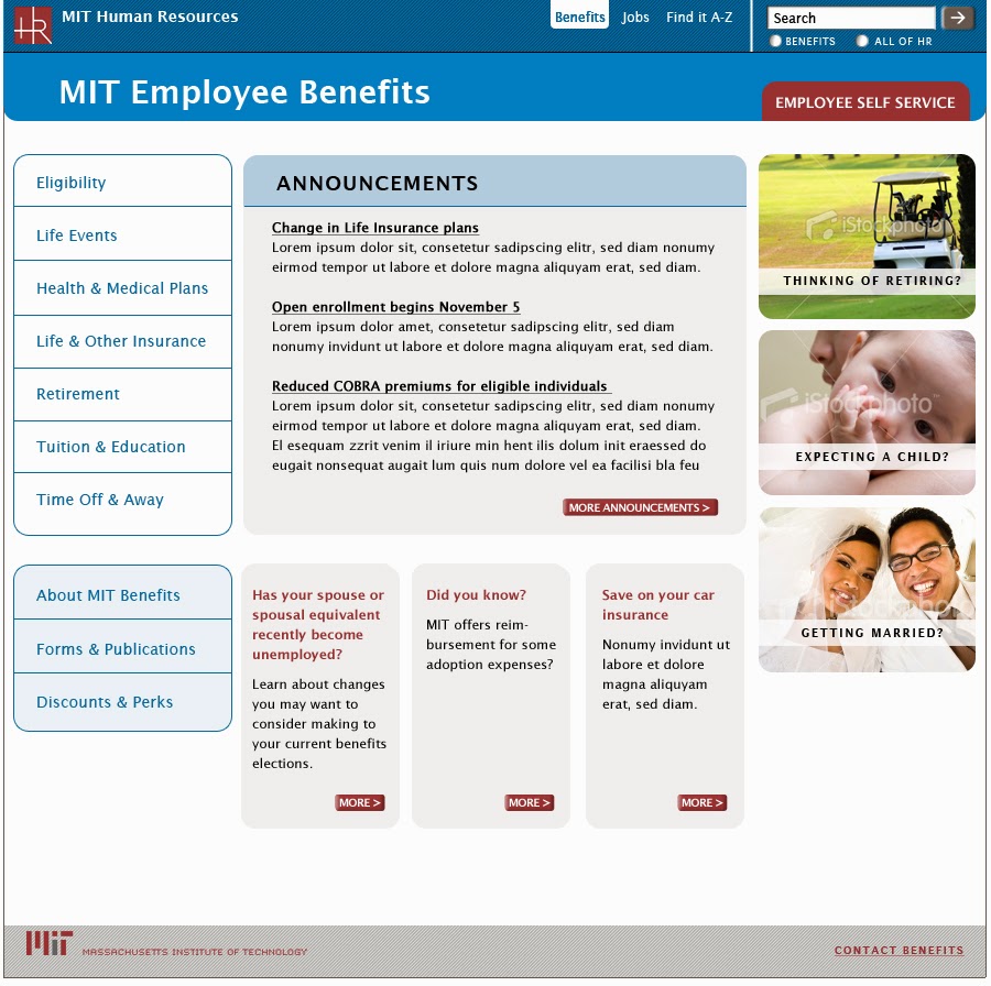
MIT Human Resources encompasses many groups, each with their own site and content and promotional needs. The Benefits Office, HR’s largest and most frequently used website, needed a template system they could use to provide structure for the vast amount of content they publish. The system had to be flexible enough to allow Benefits to promote time-sensitive news in multiple ways, while at the same time establish conventions for navigation and information hierarchy to improve usability.

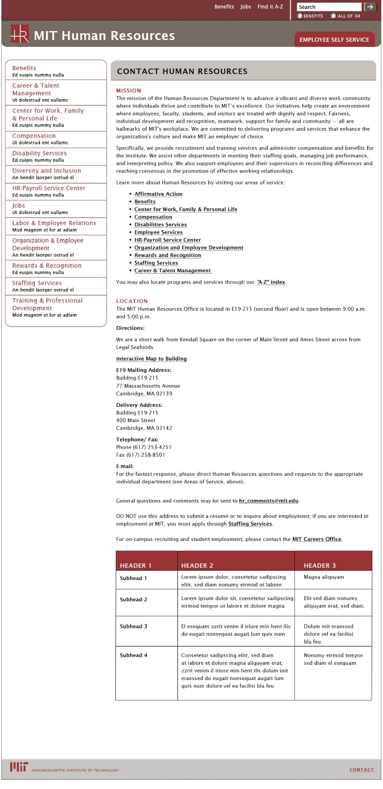
Nimble Partners designed a visual system that establishes conventions for all sites such as a grid, typography, and navigation. Each site uses its own color palette and can display unique elements, like logos, but still appears part of the HR family and can be easily edited in Drupal's CMS. As the HR Communications Manager said to us: "Hope you’re as pleased by your labors as we are!"

Benefits home page
Benefits Office home page

Benefits lower-level page
Benefits Office lower-level page

HR home page
Human Resources home page

HR lower-level pages
Human Resources lower-level page

color palette
color palette applied to subsite templates
Human Resources site color palette (top); palette applied to subsite templates (bottom)