seen + learned
Showing posts with label visual design. Show all posts

Visual design tips for app developers – consistency in the big picture: beyond where to place the button

Posted: Thursday, June 26, 2014 | Posted by Tania Schlatter | Labels: , , , , , 0 comments

In the book Visual Usability, we introduce what we call the "meta-principles" – three principles that are fundamental to the success of user interfaces. Consistency, hierarchy, and personality are not new to UI design. Considered primarily, however, they provide a structure for assessing and making decisions about the large and small visual characteristics of a UI design. When designing, keeping these principles in mind helps focus thinking about the effect of visual characteristics on how people interpret what they see from both the functional and aesthetic standpoints.

Interfaces have a big job to do. They need to provide information on multiple levels – convey content, communicate interactivity, and provide feedback. Before they can do that, they need to help someone know, or reinforce expectations of, what they are looking at. In Visual Usability, we go into detail about how visual characteristics of layout, type, color, imagery, and controls affect perception of consistency. Our goal is to raise awareness of these details and their effects. We want to help teams understand how people perceive visual characteristics, and make conscious decisions about them.

This post begins to address consistency in the big picture – as a principle for considering the approach to an interface rather than its details – concepts on a different strategic plane than where to place a button. From this perspective, it helps frame thinking about UX, and align UX with how it is represented through UI.

Internal consistency
Humans are wired to identify patterns in what we see and assign meaning to them. When establishing consistency within an application, lack of attention to consistent placement, color, styling, imagery (including symbols and icons), and typography can indicate difference to users, breaking the patterns they've perceived, and making them "stop and think."


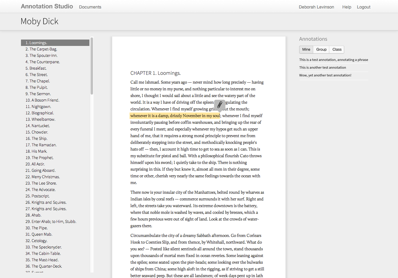
This version of an older application had three separate ways of closing a window, forcing users to remember different paradigms every time they interacted with it.

Making sure a UI is internally consistent – that all the close buttons are styled similarly and placed similarly within a screen and from screen to screen within an application, for example – is familiar territory. Making sure that the patterns you choose to adopt and make consistent are in line with your users’ expectations is also familiar territory. What is different is calling out and thinking about the role consistency plays in affecting perception at the UI framework level.

External consistency
When Google created and launched Google Docs, the interface adopted symbols and patterns familiar to people who use desktop word-processing programs. This was a smart move strategically; consistent symbols reinforced similarities between the desktop and cloud word processing experiences, making Google Docs seem familiar and approachable. This helped Google transition users to word processing in the cloud. Consistency across platforms or applications is external consistency.


Google Docs UI, top; Microsoft Word 2010, bottom.

750words.com is also an application used for writing, but it has a different goal, and targets different users. Its tag line is "Private, unfiltered, spontaneous, daily," and the site focuses on people who want to write regularly. The UI provides only essential visual information – where to type – and the number of words written. The screen shows optional visual feedback for how often people are writing. UI elements and design characteristics do not say "word processing," but still encourage people to write. The decision to design the UI framework to be inconsistent with word processing applications helps the app show how it is different from – and better suited to – helping people write regularly.

750words
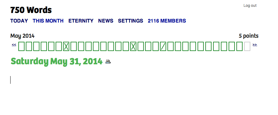
750words.com only indicates where to write, and supports writing regularly.

Consistency and novelty
Advertising and promotional media in general rely on inconsistency – or novelty, as it's known in communication theory – to get people's attention. Novelty can be a differentiator. Novelty as an approach can succeed when it’s authentic and effectively represents and reflects a difference that people find valuable. 750words.com takes a novel approach to writing online, and the choices made in its interface reflect that. Novelty can make visual information more memorable, as several studies,including this October 2013 one [PDF], have found.

While there’s nothing wrong with using platform standards as the initial foundation for a design, relying on them for the final design inevitably results in an app that lacks unique visual appeal. An app designed this way may get to market more quickly than an app that doesn’t, and provides interface characteristics consistent with other apps, rendering it easy to pick up and use. But without key visual differentiators that distinguish it from its competitors and help audiences build affinity, it risks falling behind the pack by not standing out.

For example, compare OpenMBTA (below left), an app for Boston’s public transportation system, to Grocery Gadget (below right), a grocery shopping app:

OpenMBTAGrocery Gadget

The apps serve completely different purposes, but because both rely almost entirely on iOS 6 visual conventions, they look so similar that they might as well be the same app. Even the custom “prepare/shop” toggle at the top of the Grocery Gadget screen isn’t enough to visually distinguish it from OpenMBTA.

By contrast, public transportation app CG Transit, while basing some of its look and feel on iOS 7 flat design standards, applies simple visual upgrades that push it beyond the base set of rules. Color bullet points connect a list of stops, a gradated map gives a high-level overview of the subway line’s path through the city, and a side menu with icons and color highlights combine to create classic visual appeal that make CG Transit feel fresher and friendlier than OpenMBTA.

CG Transit subway line screenCG Transit side menu

Striking a balance between consistency and novelty is at the heart of designing an effective and desirable user experience and interface. As one of the key visual principles behind what people notice and why, we hope you'll reconsider consistency, be aware of it, and use it when making decisions about how to approach and design visual interfaces.

Deborah A. Levinson also contributed to writing this blog post.

Using semantic differentials to evaluate visual design preferences

Posted: Monday, June 9, 2014 | Posted by Debby Levinson | Labels: , , , 0 comments

We recently completed a redesign for LoveToKnow, a site that provides advice on everything from beauty tips and pet health to travel recommendations and party-planning. LoveToKnow wanted a clean, clear design that welcomed users while also feeling believable and authoritative. The new designs had to reveal the site’s wealth of content without being overwhelming, encouraging people to spend more time browsing relevant articles, and ultimately, turning to LoveToKnow as a trusted source for help with all kinds of topics.

LoveToKnow wanted to test designs before finalizing them for launch. A/B testing was our first choice, but wasn’t an option for technical reasons. How could we confirm whether users preferred the new look and feel?

Visual design preferences are by definition subjective. However, tools like semantic differentials and Likert scales give people the terms they need to describe subjective opinions by choosing from a range of possible answers between two opposing statements. With this data, researchers can quantify what otherwise seems unquantifiable.

semantic differential scales
Sample semantic differential scales

Designing the test
LoveToKnow had questions they were hoping testing would help answer. We knew who our audience was: primarily middle- to upper-income women with some college education and moderate internet experience. We then broke the tests into three groups: one that set a baseline by evaluating the current designs before the new ones, and two that only saw the new designs, albeit in different orders in case viewing order affected preference.

We began by setting up a scenario so that test participants would all approach the designs with the same mindset: Imagine you have a puppy, and are wondering how much bigger it will get. You type “is my dog full-grown?” into a search engine, and click through to this page. Beginning with a scenario familiar to the dog owners we recruited immediately made the article page designs relevant, and a more realistic scenario is more likely to yield honest results.

Once users had the right mindset, we asked open-ended questions to gather general impressions of the page and website: what did people think the page offered? What did they think the site offered? What would they click on?

We also provided three semantic differential scales:

  • credible / not believable
  • inviting / unappealing
  • helpful / waste of time

Finally, we provided the same scales for three home page design options to help us choose a winner.

Building the test
Designing the questions, as it happened, was the easy part. The much trickier part was creating a test that would help us get answers through remote testing. We’ve had good experiences with usertesting.com before and believed we could make it work here, too; it was just a matter of linking our questions and designs to guarantee that users would proceed in a straight line instead of accidentally meandering off into the woods.

We settled on a split-screen approach: the questions would be coded in SurveyMonkey and show up in a left-hand frame. In a larger, right-hand frame, we’d display the page designs so that people would have them to refer to as they answered the questions. We also set things up so that clicking anywhere on a design would take people to the next one to review.

Over and over through our dry runs, though, we found that people got off-track immediately. They couldn’t help but click on what looked like a real web page to them, and no amount of written instructions stopped that basic behavior. (A real-life reminder of the usability truism that people often ignore written instructions!)

What did eventually curb the clicks was presenting test participants with a thumbnail of the appropriate page design in the survey, and asking them to confirm they were looking at the right design before answering questions. The colorful image broke up the survey’s wall of text and grabbed enough attention for people to stop, read, and understand.

split-screen test image

After that, it was just a matter of watching test videos and analyzing our SurveyMonkey data, which the site helpfully provides as charts and free text.

The final results
Some of what we discovered:

  • The new article page design was slightly more likely to encourage exploring the site. While participants found both old and pages credible, design had little to no effect on perception of credibility, and there was scant difference in design appeal.
  • However, the new design unquestionably helped people understand that LoveToKnow provided information far beyond just dog content, an important improvement.
  • Results for all three home pages were largely positive and equal, but our second design had an edge over the others, particularly in terms of credibility.

Big data UX, UI and IA

Posted: Friday, June 6, 2014 | Posted by Debby Levinson | Labels: , , , , , 0 comments

For the past three and a half years, Nimble Partners has worked with a big data company to design two suites of web and mobile-friendly applications investigating multiple aspects of the labor market, including demand, supply, job posting, job search, and career exploration. The applications serve a wide user base: job seekers of all ages and backgrounds, the state and local government officials assisting them, public- and private-sector employees researching labor market opportunities, and others.
We worked directly with customers, product management, and developers to redesign some applications, while building others entirely from scratch. Our work included both the customer-facing user experience as well as the tools administrators rely on daily to help job seekers and manage the applications. Customers were delighted with the results: one said we’d “nailed Jell-O to a tree.”

We provided:

  • User experience conceptualization and design
  • Information architecture
  • User interface design
  • Visual design
  • User testing

We can't show this work publicly. Contact us for access to samples via our demo site.

Speaking the Language of Meta-Principles: Consistency, Hierarchy, and Personality

Posted: Wednesday, May 14, 2014 | Posted by Debby Levinson | Labels: , , , 0 comments

I recently returned from beautiful Portland, Oregon, where I spoke as part of the Computer-Human Interaction Forum of Oregon (CHIFOO) annual lecture series. The 2014 series focuses on storytelling, which can take many forms in user experience, user interface, and visual design.

My talk, "Speaking the Language of Meta-Principles: Consistency, Hierarchy, and Personality," covered how to use the meta-principles described in Visual Usability to effectively "tell a story" by using good design to guide users through their desired pathways and tasks in an application. We think of these meta-principles as if they’re part of a language. Consistency and hierarchy are the grammar people learn while using an application: the basic elements that define how a language is spoken. The “words” we speak – that is, the visual design characteristics we choose to convey a message – create an application’s personality. These principles are so fundamental to creating successful interfaces that we call them “meta-principles.” While technology that affects interfaces changes, the underlying meta-principles hold true.

I'd like to thank Emily Mahood Bowman, Clodine Mallinckrodt, Fellene Gaylord, and everyone else at CHIFOO for bringing me to Portland and giving me such a warm welcome. I'll be happy to return anytime!

Redesigning Northeastern University's College of Professional Studies B.S. in Graphic Design Degree

Posted: Tuesday, May 13, 2014 | Posted by Tania Schlatter | Labels: , , , 0 comments


Founded to advance the careers of working students, Northeastern University's College of Professional Studies (CPS) grants doctoral, master's and undergraduate degrees. I've enjoyed teaching Interactive Information Design 2 and advising CPS graduate digital media students for the past few years.

I love systems and design, and am anxious to help higher ed better prepare students for the complex design work that we do today. I was excited to be asked to participate in a review of CPS' BS in Graphic Design degree last summer, followed by a redesign effort in the fall. The review was required for accreditation purposes, and the redesign was long overdue.

While the accreditation process was written in academic language, much of the work involved what I think of as design thinking. I (re)defined a clear mission for the program based on graphic design skills that are needed today, outlined desired outcomes for students and a system for measuring results, reviewed current courses in a structured way for strengths and weaknesses against goals, and analyzed student performance data over time to understand trends and gaps. Once the required accreditation materials were complete, it was great to take all I had learned and defined and work on redesigning the degree program overall.

The result of the effort is a roadmap for a revised BS in Graphic Design degree program. There are six new courses and six revised courses, which will begin to be phased in this fall. The new program maintains its practical focus and provides a stronger foundation in the traditional "roots" of graphic design, such as typography. When in place, courses and course projects will help prepare students by beginning in black and white and two-dimensional design principles, and carry through to using visual design principles to help people understand, enjoy and use visual information in static and interactive applications.

Increasing appeal for LoveToKnow

Posted: Tuesday, April 1, 2014 | Posted by Debby Levinson | Labels: , , , , , , , , 0 comments

LoveToKnow provides advice on everything from beauty tips and pet health to travel recommendations and party-planning. We helped LoveToKnow provide more consistency and a better user experience by first analyzing their taxonomy as part of a larger search engine marketing project with Nine By Blue. LoveToKnow returned to us to redesign their site to improve its appeal and apply the new taxonomy to an updated, easier-to-use menu system.

As we translated wireframes into visual design, we ran remote usability tests to determine whether our approach resonated with the target audience. LoveToKnow's revenue model is ad-driven, and we paid close attention to this as we wireframed possible design approaches and feature refinements. Test results confirmed that the new designs helped people better understand the breadth of LoveToKnow's content, and that the new article page design better achieved the goal of site exploration.

Work included:

  • Taxonomy analysis
  • Visual redesign
  • Heuristic review
  • Usability testing

Usability test screenshot

Usability test screenshot
Remote usability tests used a split screen to display a survey and relevant page designs (top: current design; bottom: new design).


Original home page page design.


New home page design.


New article page and fat navigation.

Apple iOS 7.1 - getting closer to a graphic design/usability showdown

Posted: Tuesday, January 14, 2014 | Posted by Tania Schlatter | Labels: , , , , , 1 comments

Early images of Apple's iOS 7.1 UI changes show Apple making aesthetic decisions that affect usability. In particular, changes involve making key buttons (end call, answer call) smaller.
iOS comparison images
Left: iOS 7. Right: 7.1 beta.

From a graphic design standpoint, the changes elevate screens to the level of mini-Swiss posters – they are sharp and clean. Differentiating the end call button with color and white (black) space sets it apart from the other buttons, as it should. Is the phone icon clear to users under 30? Is it easy enough to hit the smaller "end" button? What about colorblind users? Is Apple betting that the design is so lovely everyone will just adapt, as with the early iPod touch?

A lot more people use the iPhone than the early iPod touch, however, and rely on it to get things done, including making calls. Judging from the comments on the TechCrunch article, not everyone finds the changes lovely. Some Apple fans are having a hard time – first Apple took away the gradients that helped make buttons look tappable, and now the buttons are smaller. Where will it end? I'm enjoying the battle.

Talking with health communications students about visual design for healthcare site and app UX

Posted: Tuesday, November 19, 2013 | Posted by Tania Schlatter | Labels: , , , , , , 0 comments

This week I presented updated thinking about visual design in digital health communications to Emerson and Tufts health communications students in Lisa Gualtieri's Online Consumer Health course. It was a chance for me to test three frameworks for discussing what design can do for digital heath communications, and hear if they were helpful for students. We evaluated parts of these sites:


Our evaluation included discussing the meta-principles consistency, hierarchy, and personality – how and if they were evident on the pages we reviewed and to what effect. We used the terms expressive and classical to evaluate each site's general visual approach, as well as individual details such as logos. We also looked for evidence of desirable qualities for healthcare communications by asking the following questions:

Credible

Is it professional?

  • Is it organized? Are there visible systems for use, styling, and behavior of navigation, type, color, and controls?
  • Is the up-front value proposition clear? Can I quickly see what the site or app is about and what can I do?
  • Are the visual characteristics appropriate? Do stylistic decisions fit the topic? Do they fit the organization of origin?

Do I trust it?

  • Who is this organization? Are the professional identity and any credentials presented appropriately?
  • What is the organization's goal? Is the emphasis on information or advertising?
  • Does it feel specific or generic? Do the photos feel real or generic? Are colors and styles appropriate for the content and organization of origin?

Helpful

Does it help me understand the site or application purpose?

  • Can I read/use it? Is the type appropriate? Do colors contrast sufficiently with the background?
  • Can I skim and get the gist to help me decide if I want to read?
  • Does it show and tell? Are there images or video that help explain the content?

Does it make sense?

  • Can I see where I am?
  • Can I see where to click? Are the actions and links clear?
  • Can I tell what will happen if I click? Do control designs indicate what will happen? Can I see feedback from what I did?


Error messaging – avoiding visual spankings

Posted: Friday, October 11, 2013 | Posted by Debby Levinson | Labels: , , , 0 comments

Error messaging is visual discipline. It has to walk a fine line: drawing attention to problems without doing more harm than good. Designing effective error display is about more than providing clearly worded messages describing what went wrong and how to fix the problem; it's an opportunity to express the voice of the system, and show your app's personality. Successful error messages combine wording and design to be noticeable, actionable, and appropriately expressive.

WordPress.com CSS warning message
When the user rolls over a warning symbol in wordpress.com's CSS panel, the software provides a polite, in-context warning about thoughtful use of the !important declaration to force a style override.

Converse error messaging
Error messaging from an older version of Converse's custom shoe-design application is playful and whimsical, in keeping with the funky, independent personality of their brand.

How do you know when you have too much error messaging, or that your messaging is too strong? Is it this?
Orbitz error message
Orbitz's flight search interface

Or these form errors?
Qualtrics survey error message

Yelp! signup error
Yelp! signup error

And surely it's this:
SuperTracker limits exceeded
USDA SuperTracker food- and fitness-tracking application warnings displayed if a user exceeds daily limits for calories, fats, and sodium.

Color, a critical part of a site's visual language, is often tied to error messaging interface patterns. Using red for errors makes sense conceptually; an error is the right place to take advantage of contrast to attract the eye. However, use of this pattern can be heavy-handed and jarring, interrupting an application’s personality. Too much contrast in a warning that isn’t life-threatening or data-erasing can feel like a “visual spanking” – like the two form error screens, or SuperTracker's alert that a user has exceeded daily calorie, fat, and sodium limits. Calling so much attention to an error overwhelms the design and tells the user, "You've been very naughty. Go sit in a corner and think about what you've done."

Instead of overusing red, consider a small amount of a different contrasting hue to draw the eye, or a pale tint for your message instead of a solid, saturated color. In an urgent situation, such as a hospital setting, two levels of contrast, such as a light background tint and contrasting text style, may be necessary.

form error message
Polite error messaging on a login form

Your goal is the visual equivalent of a polite tap on the shoulder to provide guidance and redirection – not a spanking.

October 5 workshop with UXPA Boston – Visual Design Principles and Practices for Creating Great Web and Mobile Apps

Posted: Monday, September 16, 2013 | Posted by Debby Levinson | Labels: , , , , 0 comments

Everyone wants to design a great user experience, but how do you define a great visual UI for your app? Join us and the Boston UXPA for a fun and informative day Saturday, October 5, 2013 at Bentley University, and learn how to use visual design principles to improve the UX of your apps. We'll cover:

  • how to evaluate visual UI design for use and appeal
  • how to develop a sound rationale for your app's visual interface design
  • how to avoid common design mistakes, make informed decisions, and elevate the ordinary
If you work on UX, coding, or product or project management for digital applications, or you're a designer who wants to create more effective interfaces, this workshop is for you. Register at https://bostonuxpaworkshopoct52013.eventbrite.com.

Goodbye, Delicious

Posted: Wednesday, September 11, 2013 | Posted by Debby Levinson | Labels: , , , , , 1 comments

Social bookmarking service Delicious has just turned ten, and to celebrate their anniversary, the company is launching a beta redesign at next.delicious.com.

Unfortunately, this is the redesign that's convinced me Delicious and I have to finally part ways.

I've used multiple accounts on Delicious for more than six years. While I never took advantage of its social features even before AVOS acquired the company from Yahoo! in April 2011, I liked how easy it was to store and track bookmarks of all sorts, and how clean and usable its interface was.

Yahoo! made some half-hearted attempts at redesigning Delicious before selling it off; the last Yahoo! design is still active at previous.delicious.com.
ETA: Last paragraph stricken, as we heard from AVOS that previous.delicious.com's design was their initial one, not Yahoo!'s last one. My mistake.
previous.delicious.com
previous.delicious.com (UI prior to September 2011)

This design is a little too boxy for my taste, but at least my bookmarks and the date I bookmarked them take center stage, and the search finds numerous relevant results. The current design, however, puts far too much emphasis on a previewing area, throwing off the visual hierarchy:

current delicious.com
delicious.com (UI after September 2011)

I don't like it, but I was able to live with it, at least until I discovered how badly the new application architecture had broken search – which no longer returns as many relevant results as the old search on previous.delicious.com – and that you could no longer edit a bookmark to fix an out-of-date or incorrect link – an astonishing omission for a bookmarking application.

So when I heard Delicious was being redesigned for its anniversary, I hoped these major usability issues would be addressed, along with its disappointing visuals.

Nope.

next.delicious.com
next.delicious.com (beta UI, launch date TBD as of this blog post)

What's working:

  • The simple typography in blue and shades of gray is easy on the eyes.
  • Delicious' corporate blue has always been a particularly pretty shade of the color.
  • Links get an appropriate amount of space in the layout relative to their importance in the visual hierarchy.
  • And ... no, that's it.

What's not working:
  • The vibrant blue in the left column is too strong, drawing attention away from the link area.
  • The mysterious histogram below the user's name, which presumably represents activity over time, but which is wholly non-interactive and therefore utterly useless. (It's presumably an attempt to call back to Yahoo!-era Delicious' history graph feature.)
  • Equally mysterious dual numbers (not shown in this screenshot) that may accompany a bookmark identify whether you were the first user to save a specific link – not that anyone will guess that's what the extra number means without rolling over it for a tooltip.
  • Contrast of the "search" type in its form field is so poor – a mere 1.3:1 ratio, according to Colour Contrast Analyser, when 5:1 is the minimum to hit AA accessibility ratings – that even I, with my 20/20 corrected vision, nearly couldn't tell I was looking at a search box. Heaven help a user who's actually visually impaired but can generally get by without a screen reader.
  • And the unforgivable sins: search still doesn't work as well as it did on previous.delicious.com, and you still can't edit a link.

Worse, there are new usability problems with this design. Consider the tag cloud for a user like me, with 147 tags I can display above my links:

tag cloud with 147 tags
Small tag cloud on next.delicious.com

versus the default view of a tag cloud for another longtime user, with over 2,000 tags:
tag cloud with many tags
Default next.delicious.com tag cloud size for a user with many tags

I hope this user likes scrolling to see his bookmarks.

Presumably the product team assumes that users with this many tags will simply search for a tag rather than relying on their tag cloud to locate things. This would be a fair assumption, except that I'm willing to bet that there are many users who have similarly named tags after years of Delicious autocomplete suggestions (for example, I have "knit," "knitting," and "knitting_patterns"), and being able to browse your tag library is handy for locating bookmarks that may not be filed quite where you expect.

Tag bundles, introduced before Yahoo! sold off the company, were one way of dealing with that problem: they allowed users to create groups of related tags, so if I wanted, I could quickly see just my knitting- or CSS-related tags. To create a bundle in the previous.delicious.com interface, you were shown a list of tags to choose from, which eliminated guesswork and ensured you were likely to catch all the tags related to a given concept.
tag bundle interface on previous.delicious.com
previous.delicious.com's tag bundle creation interface

The beta Delicious UI unfortunately replicates the current one: the tag selection interface relies purely on autocomplete, and while this makes for an uncluttered interface, it's useless for people with long lists of tags. Without the list of tags to rely on, you're bound to miss tags you would want to include in the bundle.
tag bundle interface on next.delicious.com
next.delicious.com's tag bundle interface

I give up. It's my job to help organizations use good design to enhance usability, and this design is neither good nor usable – in fact, it's so anti-usability I'm switching entirely to Pinboard, which has virtually no visual design, but does what I need it to do quickly and intuitively.

I doubt I'll be the only one to finally pack up and go.

Thoughts on Flat UIs – the science and history behind the trend

Posted: Monday, August 5, 2013 | Posted by Debby Levinson | Labels: , 0 comments


The "flat UI" trend demonstrated by the evolution of Google's icons (from Google's Visual Assets guidelines).

This post was also published on publisher Elsevier's SciTech blog August 6, 2013.
The current "flat UI" kerfuffle provoked by Microsoft's Metro UI and Apple's beta release of iOS 7's interface seems largely to be about change, and whether or not people who write commentary on the web like flat graphics.

They miss the point. There is science and history behind the flat UI trend. Let's take a look.

Gestalt theories of visual perception were defined in the 1920s by psychologists. These theories underlie most professional visual design. Gestalt principles are what graphic design students learn to employ to:

  • create visual impact 
  • direct the eye
  • create visual tone – balance or discord, for example

The principles coincided with advances in printing in Germany and the rise of the Constructivist movement in art. These were the "seeds" from which the Bauhaus design movement developed. The philosophy of the Bauhaus was reactionary to the prevailing trend of the time (Art Deco) and called for objects and built environments to serve their use: form should follow function, and be true to materials.

The Bauhaus influenced important graphic and product designers such as Josef Muller Brockmann, Dieter Rams, Paul Rand, and Armin Hofmann, as well as information designer Edward Tufte. All of these designers believe that what is represented should express the message or use; no more, no less. This can be summed up in Tufte's "data-ink ratio" and Dieter Rams' 10th good design principle: "Good design is as little design as possible." This history and approach is what many trained designers draw from. The rise of user experience design as a profession has put more trained designers than ever before in the position of influencing applications.

The perceptual and cognitive psychology research and theories that underpin Colin Ware's book Visual Thinking for Design and Jeff Johnson's Designing with the Mind in Mind are mostly ignored by graphic design BFA programs and thus are not particularly familiar to trained visual designers. However, they are familiar to many usability practitioners and UI designers from technical backgrounds. This research helps explain part of the current issue: why people like skeuomorphic design.

Skeuomorphism is the use of visual qualities to suggest or artificially imitate a physical characteristic, like faux wood textures printed on countertop surfaces or embellishing the side of old station wagons. In digital interfaces, Apple's address book software uses skeuomorphs. It renders pixel illustrations of seamed binding and paper "pages." In the early days of the Apple Macintosh computer, dragging unwanted files to the pixel-rendered trashcan helped people learn a completely new visual and interaction language through the use of familiar icons and symbols, and familiarity makes people feel comfortable.


Sample of Apple’s use of skeuomorphs – the address book app in OSX.

Many designers trained in Bauhaus philosophies (including my business partner, Tania Schlatter, who drafted this post) and who work on UX and interfaces often find skeuomorphs absurd for two reasons. First, in our Apple address book example, the "pages" create a false interaction cue. The dimensional rendering makes it look as if the pages might be clickable to advance, but they are not. Second, entering a contact on a digital device with rendered "paper" and "binding" feels untrue to the qualities of the digital material being manipulated.

Few interfaces designed these days need to rely on skeuomorphs to make users feel comfortable with the UI. The time is right to leave those visual "crutches" behind. Doing so, however, has launched "flat UI" as a trend, which can cause more harm than good. When employed as style rather than philosophy to underpin the entire user experience, designers may strip out what they see as distracting decoration in the interface without leaving enough visual data for people to understand what they see.

The subjective "flat UI" debates distract from the real issues, which are the same as always: designers and product managers need to look deeply before adopting or disavowing a trend. Remember that the last big web design trend – "fat footers" – came about to improve search engine rankings in the wake of changes to Google's results algorithm. Even though our tools change, methods hold true. Designers and project managers need to (re)focus on their users, content, and organizations to design interfaces that promote understanding, are appropriate for the medium and context of use, and help differentiate their products for businesses and their customers in meaningful ways.

Additional references:

  • Video documentary: Dieter Rams on his design principles
  • Jon Kolko's slides on Tufte (slide 16 is on data-ink ratio)
  • Hofmann, A. Graphic Design Manual: Principles and Practices, Arthur Niggli
  • Meggs, P., Purvis, A. Meggs' History of Graphic Design, Wiley
  • Muller-Brockmann, J. Grid Systems in Graphic Design
  • Tufte, E. The Visual Display of Quantitative Information, Graphics Press

Join us for a visual usability tutorial at the UXPA national conference in July!

Posted: Thursday, June 20, 2013 | Posted by Debby Levinson | Labels: , , , , 0 comments

Looking for guidance addressing functionality and aesthetics in complex applications? Join us on Tuesday, July 9, for an all-day tutorial, "Visual Usability: Visual Design Principles and Practices for Creating Great Web and Mobile Application Interfaces," at the UXPA national conference in Washington, DC.

Through lectures, guidelines, examples, and hands-on exercises, we'll show you our approach for making visual design decisions that reinforce usability best practices and provide interfaces people value. You’ll learn the characteristics of “visually usable” apps so you’ll know what to shoot for. You'll also get an introduction to the visual design “tools” for digital apps – layout, type, color, imagery, and controls and affordances – and learn how to use them to help people understand and enjoy what they see.

Visit our tutorial page to find out more, and hope to see you in July!

Visual Usability: Principles and Practices for Designing Digital Applications

Posted: Thursday, June 6, 2013 | Posted by Debby Levinson | Labels: , , , , 0 comments

Our work involves constantly reconciling use and appearance. This isn't a new or novel struggle; it's inherent to designing, and evident in the gap between applications that look great and those that are highly functional.

Digital interfaces rely on common visual design tools to communicate – layout, type, color, and imagery, along with controls and affordances. We've written Visual Usability: Principles and Practices for Designing Digital Applications to provide a common language for defining and evaluating visual user interfaces that's grounded in how people perceive and interpret what they see.

Visual Usability provides simple, clear frameworks for designing web and mobile interfaces for meaning and appeal. It helps application design and development teams make interface decisions by focusing on three "meta-principles" we believe form the foundation of great application visual design: consistency, hierarchy, and personality. Each chapter offers guidance on how to make strategic decisions about layout, type, color, imagery, and controls and affordances that will bridge the gap between beautiful and useful applications.

We're thrilled to announce that the book is now available on Amazon, bn.com, Elsevier.com, and elsewhere! We hope you check it out, and that it provides value to your team.

We are blogging examples of visual usability regularly via Tumblr at visualusability.tumblr.com, and tweeting them at @VisualUsability. We hope to see you there!


Science Festival Alliance website refresh

Posted: Thursday, April 18, 2013 | Posted by Debby Levinson | Labels: , , , 0 comments

The Science Festival Alliance supports the development and promotion of science festivals worldwide. We worked with the SFA to reorganize their existing website, design a new home page, and extend elements of the redesign throughout the site. We also improved their dynamic map to display member and non-member science festivals around the world, and designed a downloadable calendar widget anyone could install on their own site to keep up with where and when the latest festivals take place.

We provided:

  • Information architecture
  • Visual design

SFA home page
SFA home page

Festival map page
Map of member and non-member festivals worldwide

News page
SFA news page

MIT Annotation Studio UI

Posted: Monday, April 8, 2013 | Posted by Debby Levinson | Labels: , , , 0 comments

Annotation Studio is a set of collaborative online annotation tools developed by MIT’s HyperStudio program. The software allows students to annotate literary texts and other documents with text, video, audio, and hyperlinks. Students may also view and build upon each other’s notes, allowing for a more participatory experience than traditional solo book review and annotations.

MIT approached us to refine Annotation Studio’s color palette, typography, iconography, and visual approach to displaying annotations and other metadata. To meet technical requirements, we designed styles and visual elements that could quickly be implemented within Twitter Bootstrap.

Work included:

  • Heuristic review
  • Visual design refinement

Annotation Studio documents list
List of documents

Highlighting text to annotate

Saving an annotation

MIT Hyperstudio US-Iran document archive UX and visual design

Posted: Monday, December 12, 2011 | Posted by Debby Levinson | Labels: , , , , 0 comments

MIT’s Hyperstudio developed a faceted database that archived correspondence between the United States and Iran from the 1980s through the late 2000s. Nimble Partners designed an appealing, usable, and culture-neutral interface to help scholars search the database, view documents, and make online annotations.

Home page

Faceted search interface

Document detail view, including annotations area

4INFO admin UI design

Posted: Tuesday, October 11, 2011 | Posted by Debby Levinson | Labels: , , , , , 0 comments

4INFO, a mobile ad delivery and analytics company, needed help evaluating a mobile ad campaign management platform's alpha interface for potential UX design issues. Nimble Partners reviewed the interface in progress and honed its feature set and application flow through multiple rounds of discussion and wireframing. We also designed visuals for the application and consulted with the development team as they applied the new look and feel.

Work included:

  • UI and UX analysis and design
  • Wireframing
  • Visual design

campaign page wireframe
Campaign edit flow wireframe
Wireframes for campaign page (top) and campaign edit flow (bottom)

campaign page visuals
campaign edit flow visuals
Visual designs for campaign page (top) and campaign edit flow (bottom)

color usage guide
Application color usage guide

Improving the usability of Google Flights' Limits tool

Posted: Wednesday, September 21, 2011 | Posted by Debby Levinson | Labels: , , 0 comments

Recently, Google launched its new Flights service. It's got a nice, clean UI that falls in line with Google's new design approach for all its applications: crisper typography and bolder colors that guide the eye and enhance readability, and layouts that work smoothly across multiple web and mobile platforms.

Google Flights home page

For the most part, I like the interface. The map interactions are obvious, and there's a refreshing simplicity to the few controls on the page. But there's one part that's still suffering from Google's classically engineer-driven approach: the Levels widget meant to help you optimize flight time vs. price.

Levels icon

Levels widget

Problem #1: A name like "Limits" is no incentive to click. I clicked only because I was looking around the interface for the first time and had professional curiosity about what Google was up to here. At minimum, the tooltip should use a verb to encourage clicking: "Set flight limits." Better: "Limit flight times and prices."

Problem #2: What the heck is it? Okay, the little icon implies I'm going to get a chart of some kind, and sure enough, it's a scatter plot. But I spent longer staring at this chart trying to figure out how to use it than I should have, and I believe most people will have this same huge "stop and think" moment. Highly informal polling of my Twitter followers, most of whom are in the 25-45 age range and comfortable enough with computers to be regular Twitter, Facebook, and Google application users, confirmed that my most nontechnical followers had "no idea" (a direct quote) what they were looking at. Only the two friends who were heavy Google tool users figured out the widget and its interactions immediately.

In fairness, this tool may have been designed for a more technically minded audience. But a few simple fixes could open it up to a wider audience and help make it indispensable.

Problem #3: How do I use it? Where do I start? The slider handles that don't even look like clickable, draggable slider handles until you roll over them? The dots that only give you information on rollover if they're inactive? The badly written, almost invisible help text that implies you're filtering to find the longest, most expensive flights? My two Google-veteran followers knew what to do, but everyone else was stymied at least for a little while.

Possible fixes:

  • Rewriting the help text. For example, "Drag Duration and Price bars to filter your results below."
  • Make the Duration and Price bars feel inviting and clickable. Change the color to the Google blue and/or add a little dimensionality to them; both design choices look valid under Google's new design scheme.
  • While you're at it, make the blue bars draggable, too.
  • Add rollovers for the active dots – even just the airline name, flight duration, and price would be enough to reinforce the dots' relationship to the results below.

Flights is a very young Google product. I'm sure Google plans to keep updating it, and hopefully future versions of the Limit tool will be revised to improve its ease of use. I know I'll be keeping an eye on it.