Our work involves constantly reconciling use and appearance. This
isn't a new or novel struggle; it's inherent to designing, and
evident in the gap between applications that look great and those
that are highly functional.
Digital interfaces rely on common visual design tools to
communicate – layout, type, color, and imagery, along with
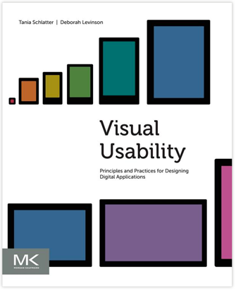
controls and affordances. We've written Visual Usability:
Principles and Practices for Designing Digital Applications
to provide a common language for defining and evaluating visual
user interfaces that's grounded in how people perceive and
interpret what they see.
Visual Usability provides simple, clear frameworks for
designing web and mobile interfaces for meaning and appeal. It
helps application design and development teams make interface
decisions by focusing on three "meta-principles" we believe form
the foundation of great application visual design: consistency,
hierarchy, and personality. Each chapter offers guidance on how to
make strategic decisions about layout, type, color, imagery, and
controls and affordances that will bridge the gap between
beautiful and useful applications.
We're thrilled to announce that the book is now available on Amazon, bn.com, Elsevier.com, and elsewhere! We hope you check it
out, and that it provides value to your team.
We are blogging examples of visual usability regularly via Tumblr
at visualusability.tumblr.com, and tweeting them at
@VisualUsability. We hope to see you there!

Visual Usability: Principles and Practices for Designing Digital Applications
Posted:
Thursday, June 6, 2013 |
Posted by
Debby Levinson
|
Labels:
design education,
design tips for web app developers,
usability,
visual design,
visual usability
Subscribe to:
Post Comments (Atom)
About seen + learned
An archived blog by Deborah Levinson and Tania Schlatter, formerly of Nimble Partners, about what we learned and did as user experience designers (creating human-centered websites and applications: information architecture, prototyping, usability and visual design) from 2008-2014.
Labels
Monthly Archive
- Nov 2014 (2)
- Jun 2014 (3)
- May 2014 (3)
- Apr 2014 (1)
- Mar 2014 (1)
- Jan 2014 (2)
- Nov 2013 (1)
- Oct 2013 (1)
- Sep 2013 (2)
- Aug 2013 (2)
- Jul 2013 (1)
- Jun 2013 (2)
- May 2013 (2)
- Apr 2013 (3)
- Jan 2013 (1)
- Oct 2012 (1)
- Sep 2012 (1)
- Dec 2011 (1)
- Oct 2011 (2)
- Sep 2011 (1)
- Jul 2011 (2)
- Jun 2011 (1)
- May 2011 (1)
- Mar 2011 (1)
- Jan 2011 (1)
- Nov 2010 (1)
- Oct 2010 (6)
- Sep 2010 (2)
- Jul 2010 (3)
- Apr 2010 (1)
- Mar 2010 (2)
- Feb 2010 (1)
- Nov 2009 (2)
- Sep 2009 (2)
- Aug 2009 (1)
- Jul 2009 (1)
- Mar 2009 (4)
- Jul 2008 (1)


0 comments:
Post a Comment
Note: Only a member of this blog may post a comment.