seen + learned

Quickie "Valued Features" Prototype Test

Posted: Wednesday, July 13, 2011 | Posted by Tania Schlatter | Labels: , , , 0 comments

We were recently part of a team redesigning a student services department website for MIT. A lot of ideas for home page features were discussed at the kickoff meeting. The question quickly became, which of these features, if any, would students value?

Since it was the end of the semester, we had limited access to students. The client team suggested that a lot of students would be at an upcoming event, so we designed a test that they could take in a few minutes at a table near the event entrance.

We created a very simple prototype using OmniGraffle that included a simple black and white mockup of a bare home page frame, and several cutouts of proposed paper features and content elements.


For the test, students selected the paper elements that interested them most and placed them on the paper home page frame while telling us why they'd chosen those elements. We photographed each student's selections as documentation and asked two direct questions from our test plan. With two test facilitators each conducting one-on-one tests, we had 15 responses in less than 20 minutes!


The students got the idea of the paper prototype right away and had no problems understanding the test or the interactivity suggested by the paper features. We heard stories of how they imagined using the new site and the proposed features. The test provided simple data for the "what" and the "why," which helped the group make decisions.

One test gem was that about half of the participants interpreted one of the features differently than intended – they saw a pair of small photos as staff member photos rather than student photos. Since they commented about how nice it would be to see a staff member and click on their contact information, we learned they valued a feature that we hadn't anticipated.

After the test, we tallied which features were selected most, reviewed the reasons students gave us for their choices, and created OmniGraffle wireframes showing proposed content and features based on what we learned.

This test could be adapted to be run remotely via screen-sharing software, such as GoToMeeting. Hand over the keyboard and mouse, and participants can place content and feature elements on an onscreen frame. Either way, it was a quick and effective method to determine what users value.

Adding NOT selections to checkbox interfaces

Posted: Friday, July 1, 2011 | Posted by Debby Levinson | Labels: , 0 comments

We've recently come across questions online and in our own work about how to deal with negative selections in a checkbox UI. Usually, a checkbox's on/off status in something like faceted nav is enough to convey that you're not interested in seeing results from the unselected items. But what if you specifically want to select items to exclude?

Grafting NOT functionality into a checkbox UI can make the UI feel overly complicated and unintuitive. But a couple days ago, quite by chance, I found a site that's doing it well.

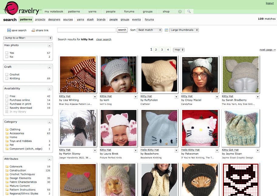
I was searching for a knitting pattern on Ravelry, an online community for people interested in fiber arts. Ravelry's search uses a standard faceted UI to help narrow results:

Ravelry search results

Since I don't crochet, I clicked on "knitting" in the Craft box to limit the number of patterns. That's when this additional dropdown appeared:

Ravelry faceted UI dropdown

I pulled it down to explore further:

Ravelry faceted UI dropdown

Ravelry's use of simple Venn diagrams to convey what can be confusing search concepts to nontechnical users is a great idea, and using soft colors and a light gradient to help the dropdown feel friendly and accessible is also a smart choice. But I was especially pleased to see them take things one step further once you actually select an item in a NOT search:

Ravelry NOT selection

Putting the "do not" icon in the checkbox reinforces the choice the user made from the dropdown, and makes it crystal-clear how search results will be affected.

For most Ravelry searches, you won't need this additional UI feature. But it's there if you do, and it's the best solution I've seen for this complicated problem.