I've worked with Adjunct Clinical Professor at Tufts University School of Medicine and Editor-in-Chief of eLearn Magazine Lisa Neal Gualtieri on a variety of projects for a number of years. Lisa sees the big picture and works to make all aspects of a site its best – the content, design and overall user experience. I was honored that Lisa asked to interview me about design and health-related sites.
The following was published on Lisa's blog on September 25, 2010.
Lisa: How is the design of health websites different than for other types of sites?
 Tania:
 The design of any site goes back to the goals of an organization and what people coming to a site need. Healthcare consumers can be overwhelmed and are in need of highly credible information. While every individual has different issues, healthcare consumers are similar in their need to conduct research and apply what they find to their situation.
Lisa: What are some examples of successful sites in your opinion?
 Tania:
 I like
Patientslikeme and
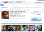
WegoHealth in part because they use different models to help people manage their health better. The new
Mass Generalsite puts information first and has a navigation scheme that does a pretty good job of making that information findable. Healthcare websites overall do not have inspirational visual design, although
AthenaHealth is very nice.
Lisa: Why aren’t health websites inspirational? What would happen to consumer health if they were?
Tania: From the practical perspective, healthcare is about people, and it is very hard to show health-related vignettes that are real. Health-related stories and imagery slip into being sentimental or sanitized, neither of which are inspirational. No one wants to show or tell the real moments in healthcare. There are privacy issues, and anything staged looks and sounds that way.
Change – and inspiration – is only going to come from consumers. They own their stories, fortunately. I have a friend who is a breast cancer survivor and who has ovarian cancer. She posts photos of herself on Facebook. She is incredibly beautiful and strong throughout it all – truly inspirational. Fortunately her images are private, and they should stay that way unless she decides otherwise. I hate to imagine patients selling their stories to help any site – other than one that they control or that is truly for the common good – look good.
Sites that provide accurate information in a findable way with enough depth and context to be helpful are doing what they can, given the circumstances. There are a lot of content-rich heath-related sites out there. More can be done on these sites to improve visual and information presentation hierarchy. There are a lot of exciting developments that can help. Designers now have many more fonts available to use (see
typekit.com) and HTML 5 and CSS3 are enabling more layout options and greater control. On information-rich sites typography and layout can be designed to highlight higher-level information visually, break up detailed information and provide video that aid in the explanation of content.
Lisa: Speaking of imagery, many sites use stock images of smiling people, yet the sites are often about serious diseases. What makes imagery appropriate for a health site?
Tania: Appropriate imagery related to health helps inform, so while not visually appealing, photos that show what the text is describing are appropriate. These images need to make sense visually for the audience, so it is important that they are accurate and informative. One way to deal with photos that are informative but not so nice to look at is to use them small and allow the user to click to see them larger.
Photos of caregivers/providers are appropriate and helpful, both as headshots with biographical information and showing people in their working situations. Showing healthcare workers on the job can be an effective way to help site visitors know what to expect from an unfamiliar situation. For example, seeing practitioners with a patient in the care setting can help people imagine themselves in the situation and manage anxiety about an upcoming visit. Patients need not be shown – their back can be to the camera – but it is great to see both the provider in action and the environment. Sometimes organizations are resistant to using pictures of staff to help set the tone on a website because they do not want to show people who might leave the organization. If the images are used to set a general tone (as opposed to identify specific personnel) then the concern is purely an internal one. Site visitors are not that literal in their reading of photos, and the photos can still be effective.
Lisa: Color is one of the most noticeable things in a site and, I imagine, one of the areas where a designer is dealing with opinions, taste, trends, and recognizable branding both from colors that are associated with companies or with diseases (like purple for Alzheimer’s disease). What is the best way to select colors and a color palette? How does a site color scheme work with advertising? I ask this because I just saw
MyDr.com.au where the advertisements are by far the most vivid parts of the home page.
 Tania:
 Color is a tool that helps set a tone and create visual relationships. Color needs to be selected based on strategic goals, not subjective preferences. For example, it is a great tool for helping information-rich sites be more legible and navigable. The
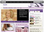
BBC Health site uses color to consistently distinguish navigation from content, which both looks great and helps the user.
If an organization has colors that it uses in non-web communications, the designer and client team need to consider if it is desirable to link the website to other communications visually. If it is, then using the same color palette is an excellent way to do that.
MyDr.com.au looks like it is trying to balance the need to convey useful information with the need to make money from advertisements. If the site is more colorful the ads will be less prominent, which could be a problem for the site’s bottom line. The site’s use of blue with a little brown is consistent which helps the user distinguish editorial content from promotions and which may help visitors focus on content.
Lisa: When do features like the slideshow used by WebMD and countless other sites, or the less ubiquitous Ask the Expert column, work well for a site?
Tania: Slideshows are a way of marketing or conveying topical information. They don’t work for conveying important content because it is unlikely that a user will see all the slides. Ask the Expert can be valuable especially when a qualified person provides answers. But is all comes back to site goals.
Lisa: Describe the process of defining clear goals.
Tania: Goals come down to knowing who you are speaking to and their needs. Site owners need to know this, segment their users, and then use all the tools they can – from site analytics to in-person usability testing to understand how effective their site is. My biggest recommendation is to be close enough to users to know if you’re hitting the mark through processes like regular usability testing and an advisory council used to help inform feature or other strategic decisions a few times a year.
Lisa: I know from experience how few organizations actually do that. Is that your experience as well?
Tania: There is a lot of resistance to having direct contact with site users. Communicators like the idea but many shy away from doing it. It is uncomfortable to open your work to the people who use it. I think people worry that if they knew what their users wanted they would have to provide it, but that is not necessarily the case. Sometimes knowing what people prefer can help even if preferences are not in line with organizational goals. I was working on a logo redesign for an established organization. Designs were down to two options. One was modern and cutting-edge looking. It captured how the organization said they wanted to be perceived. The other was traditional – precisely what stakeholders said they wanted to avoid. However, the traditional design was favored by the majority of the audience – people who were considered to be “users” of the logo. We knew that going with the traditional logo would be a mistake for the organization, however there was significant pressure to go with the preferred option – it was what people liked. The bottom line is that you need to know what people like and why. When we thought about why the cutting edge logo was off-putting we realized that the organization had undergone several re-orgs in a short amount of time. People were not interested in change. They wanted stability, which is what the traditional logo represented. Once we figured out that change fatigue was behind the preference, we could push the cutting-edge logo with confidence because we could address their concerns in other ways. It takes some work to use user input in a way that is truly strategic. The thought is overwhelming to people who may feel that they have too much input already. It’s ironic since it’s the most helpful thing they can do.
Lisa: Can participatory design be successful, when users are involved from the start in the design?
Tania: Absolutely, it’s a great way to use people who are your audience or to get stakeholders directly involved in design issues. But again, having people participate in the process does not mean that they are designing the end result. Participatory design is a method for acquiring an understanding of end users’ (or stakeholders) situations, motivations and goals to inform the design, not create it.
Lisa: We worked on a Latino Alzheimer’s caregiver site together where there was significant expertise among the team but no representative users until the evaluation phase. Is that typical?
Tania: Yes, it is hard for people to understand that they don’t know their customers, or that they can learn more by having them closely involved.
 I interviewed Tania Schlatter, one of the best designers I know and a guest-lecturer for Web Strategies for Health Communication (pictured to the right), about color, imagery, and other aspects of health website design.
 Tania: The design of any site goes back to the goals of an organization and what people coming to a site need. Healthcare consumers can be overwhelmed and are in need of highly credible information. While every individual has different issues, healthcare consumers are similar in their need to conduct research and apply what they find to their situation.
 Tania: I like Patientslikeme and WegoHealth in part because they use different models to help people manage their health better. The new
Mass Generalsite puts information first and has a navigation scheme that does a pretty good job of making that information findable. Healthcare websites overall do not have inspirational visual design, although AthenaHealth is very nice.
 Tania: Color is a tool that helps set a tone and create visual relationships. Color needs to be selected based on strategic goals, not subjective preferences. For example, it is a great tool for helping information-rich sites be more legible and navigable. The BBC Health site uses color to consistently distinguish navigation from content, which both looks great and helps the user.


