seen + learned
Showing posts with label wireframes. Show all posts

Mind and Life Institute information architecture and UX design

Posted: Monday, November 17, 2014 | Posted by Debby Levinson | Labels: , , , , , 0 comments

The Mind and Life Institute researches and supports interest in contemplative science, bringing together scientists and scholars from contemplative traditions to investigate topics such as addiction, ethics, and emotions. As part of repositioning itself based on a new set of initiatives (ethics, education, and human development; craving, desire, and addiction; and mapping the mind), MLI wanted to redesign its website to promote deep investigation into the wealth of research the organization has funded and encouraged.

We began by drafting scenarios for the three primary audiences – scientists, scholars, and "interested laymen" – relying on MLI's experience with those groups, as well as our own interviews with interested laymen, to define desired interactions. Based on those scenarios, we developed a site structure and wireframes for a responsive experience that used curated promotions to expose relationships between multiple types of site content, allowing visitors a complete picture of the latest insights in contemplative science. We consulted with the visual designer and the development team through site launch to ensure that our layouts were accurately translated to the final site.

Services provided:

  • User experience conceptualization and design
  • Information architecture
  • User interface design
  • Visual design consultation


MLI home page wireframe


MLI initiative page wireframe with related content links at right


MLI featured editorial page wireframe with related content links and fat navigation dropdown


MLI home page. Visual design by John Hall Design Group; development by pixelslam.


Mobile phone view of home page


Featured editorial page

Big data UX, UI and IA

Posted: Friday, June 6, 2014 | Posted by Debby Levinson | Labels: , , , , , 0 comments

For the past three and a half years, Nimble Partners has worked with a big data company to design two suites of web and mobile-friendly applications investigating multiple aspects of the labor market, including demand, supply, job posting, job search, and career exploration. The applications serve a wide user base: job seekers of all ages and backgrounds, the state and local government officials assisting them, public- and private-sector employees researching labor market opportunities, and others.
We worked directly with customers, product management, and developers to redesign some applications, while building others entirely from scratch. Our work included both the customer-facing user experience as well as the tools administrators rely on daily to help job seekers and manage the applications. Customers were delighted with the results: one said we’d “nailed Jell-O to a tree.”

We provided:

  • User experience conceptualization and design
  • Information architecture
  • User interface design
  • Visual design
  • User testing

We can't show this work publicly. Contact us for access to samples via our demo site.

Increasing appeal for LoveToKnow

Posted: Tuesday, April 1, 2014 | Posted by Debby Levinson | Labels: , , , , , , , , 0 comments

LoveToKnow provides advice on everything from beauty tips and pet health to travel recommendations and party-planning. We helped LoveToKnow provide more consistency and a better user experience by first analyzing their taxonomy as part of a larger search engine marketing project with Nine By Blue. LoveToKnow returned to us to redesign their site to improve its appeal and apply the new taxonomy to an updated, easier-to-use menu system.

As we translated wireframes into visual design, we ran remote usability tests to determine whether our approach resonated with the target audience. LoveToKnow's revenue model is ad-driven, and we paid close attention to this as we wireframed possible design approaches and feature refinements. Test results confirmed that the new designs helped people better understand the breadth of LoveToKnow's content, and that the new article page design better achieved the goal of site exploration.

Work included:

  • Taxonomy analysis
  • Visual redesign
  • Heuristic review
  • Usability testing

Usability test screenshot

Usability test screenshot
Remote usability tests used a split screen to display a survey and relevant page designs (top: current design; bottom: new design).


Original home page page design.


New home page design.


New article page and fat navigation.

Focusing on the future – website planning for the International Development Innovation Network

Posted: Monday, March 31, 2014 | Posted by Debby Levinson | Labels: , , , , , , , 0 comments

The International Development Innovation Network, led by MIT’s D-Lab, provides training and resources for innovators worldwide to create new processes and products that improve the lives of people in poverty. IDIN works from the ground up by serving local innovators; community members are most familiar with their own situation, and most motivated to improve it.

We helped the IDIN team organize and narrow down its goals for a new site by developing user scenarios with the team and mapping goals to specific audience needs. Through an interview with the program's sponsors at USAID, as well as a paper prototype review session with summit alumni, we gathered audience feedback on valuable features and expected usage, which provided further insights into how to structure the site and design key interactions.

Moving from audience and feature analysis into information architecture, we led a collaborative workshop with IDIN staff to map content and features into page types and a high-level site organization. This groundwork helped prepare IDIN for usability testing and a full site redesign.

Work included:

  • stakeholder and user interviews
  • user scenarios – based on real people and interactions
  • prototype development
  • site map
  • content inventory and planning
  • high-level wireframes

whiteboard noteswhiteboard notes
Whiteboard notes from content mapping session.

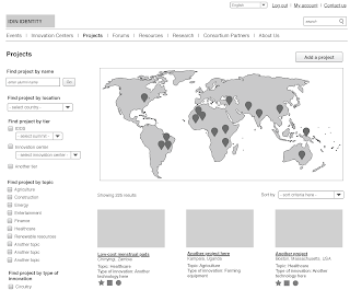
home page wireframe (mobile view)project page wireframe (desktop view)
Left: home page wireframe (mobile view). Right: project page wireframe (desktop view).

Evidence for Action – UX & IA for MamaYe websites

Posted: Wednesday, September 19, 2012 | Posted by Tania Schlatter | Labels: , , , , 0 comments

Evidence for Action (E4A) is a five-year program designed to improve maternal and newborn survival in Ethiopia, Ghana, Malawi, Nigeria, Sierra Leone, and Tanzania.

We worked with E4A to develop the user experience for six country sites and one umbrella site, defining content and interactions to serve NGOs, local advocacy workers, and pregnant women, among others. Since some audiences would primarily access the site through mobile phones with slow connections, the sites had to keep performance and usability in mind while providing critical features, such as publishing tools and a dynamic catalog of downloadable advocacy materials.

Wireframe for MamaYe "parent" site home page, left, and country home page, right. The parent site provides an overview of the initiative and aggregates downloadable resources from all six countries.

Final parent site home page, left, and Sierra Leone home page, right. Designed by Georgia Lee and Jordan Chatwin of Advocacy International and developed by Catch Digital based on our wireframes and information architecture.

4INFO admin UI design

Posted: Tuesday, October 11, 2011 | Posted by Debby Levinson | Labels: , , , , , 0 comments

4INFO, a mobile ad delivery and analytics company, needed help evaluating a mobile ad campaign management platform's alpha interface for potential UX design issues. Nimble Partners reviewed the interface in progress and honed its feature set and application flow through multiple rounds of discussion and wireframing. We also designed visuals for the application and consulted with the development team as they applied the new look and feel.

Work included:

  • UI and UX analysis and design
  • Wireframing
  • Visual design

campaign page wireframe
Campaign edit flow wireframe
Wireframes for campaign page (top) and campaign edit flow (bottom)

campaign page visuals
campaign edit flow visuals
Visual designs for campaign page (top) and campaign edit flow (bottom)

color usage guide
Application color usage guide

MIT Biology information design and user testing

Posted: Wednesday, June 1, 2011 | Posted by Debby Levinson | Labels: , , , , , , 0 comments

MIT’s Biology Department wanted to redesign its website to offer prospective and current students a better overview of the research, collaborative mentoring, and career skills the program provides. Having already completed a survey of its students, faculty, and staff, the department had an initial sense of the most urgent problems they needed to solve in the site; specifically, how to drive people to the right content in a site comprising more than 150 pages.

Nimble Partners identified key scenarios of use for the site, analyzed its content, and developed a new information architecture that addressed key user priorities like identifying deadlines and locating faculty and staff. We also designed several rounds of wireframes to dive deeper into content and feature needs. The wireframes served as the foundation for an interactive prototype we reviewed in talking-protocol usability tests with students, faculty, and staff to confirm assumptions and refine site organization and features before visual design began.

Work included:

  • Content inventory and analysis
  • Scenario development
  • Information architecture
  • Usability testing


Home page wireframe


Interior page wireframes for category home (top) and degrees (bottom)


Faculty and staff directory with faceted search


Biology website visual design by Stoltze Design. Development by Indigo Digital and Common Media.

MIT Sloan Faculty Expertise Guide UX, usability testing, and visual design

Posted: Tuesday, October 26, 2010 | Posted by Debby Levinson | Labels: , , , , , , , 0 comments

The MIT Sloan Office of Media Relations connects reporters and members of the media with appropriate Sloan School of Management faculty, researchers, and noteworthy School news and events. To help Media Relations move its printed expertise guide online, we designed an HTML prototype that included faceted search as well as multiple paths into the guide content. We also talked with reporters as they used the prototype and designed features that supported their work habits.

The final site allows reporters to search and browse for experts in multiple ways. Visually, it incorporates elements of the parent Sloan site while serving as a useful and appealing stand-alone application for reporters who go directly to the Guide on a frequent basis.

A year later, as Media Relations launched a blog to support their public relations efforts, we extended the Expertise Guide visual design to a WordPress theme.

Work included:

  • User research and usability testing
  • User interface and user experience design
  • Visual design


Guide home page


Expert detail page


Categories by discipline

Endeca (now Oracle) product admin UI design

Posted: Wednesday, September 1, 2010 | Posted by Debby Levinson | Labels: , , , , , 0 comments

Endeca, a search and business intelligence software company, wanted interface and user experience design expertise to ensure a new set of administrative features was both easy to learn and effective for complex tasks.

We collaborated with Endeca's engineers to define new features, flows, and interface options that serve the client and partner engineers who develop reporting and analytics applications for business users. Working on-site and participating in Endeca's Agile development cycle, we iterated and refined options and pathways through paper prototypes, and created final annotated wireframes, visuals, and design standards for the developers to implement using Flex.

Work included:

  • User interface and user experience design
  • Wireframing
  • Visual design and design standards
  • Usability test plan

Challenging the convention of starting with content

Posted: Tuesday, November 10, 2009 | Posted by Tania Schlatter | Labels: , , , 0 comments

When we were recently designing a new site for ourselves, the effort started with content. We thought that once we had an idea about the content, we'd to do the design. We developed a rough draft of the things we wanted to say, worked with a great writer and came up with a final draft.


Visual designs were based on the content. After a few rounds, we liked the design. The problem was, we were no longer satisfied with the words. What was it about reading the words in the design that made us want to change them? Everything had looked good in Word. If we had been just the web design team and not also the client we would have probably been annoyed: "Don't they know what they want? It's about to launch!" We had fallen into a trap we had seen but not experienced, the inability to visualize something without seeing it complete.

We were reminded that it takes two to tango – content and design go hand in hand to communicate, and should be developed simultaneously (along with behaviors if designing an app) as much as possible to create a cohesive experience. We should have recognized it sooner and prescribed one of our own solutions – using schematic page diagrams (aka wireframes) from the beginning to define content and layout at a high level. Schematics show the types of content without showing actual writing, and the hierarchy of the layout without showing visual design. If we had done them, once the wireframes felt right we could have moved the writing and the visual design along simultaneously, which would have saved a lot of time.

When moving fast slows you down or, one more reason why prototypes rule

Posted: Wednesday, March 11, 2009 | Posted by Tania Schlatter | Labels: , , 2 comments

Sometimes, we go right from creating schematic, or wireframe sketches on paper to visual design. There are often several rounds of sketches before they are approved and visual design begins in earnest. On complex applications, this is a mistake. Paper-based wireframes, even several rounds of them, do not give the team a chance to test drive the application. This leads to lots of "oh, yeah" changes when the team sees a working build with "final" graphics in place, even if the visual design and the wireframing have gone through several rounds.


"Everything is changeable on the web - what's the problem?" Creating visual design for complex web applications involves layers, lots and lots of graphic layers per page template. For each button, for example, there are several states. For each state, there are vector (working, editable) layers, and final, "raster" layers for the same button. Four layers, easy, per button. Finding the right layer and changing it to match all the other buttons, even in well-organized files is time consuming and error-prone.

Add all the files from all the rounds of design, the passage of time from final graphics to working staged site, and the problem grows. Changes to complex web applications once the graphics are in place are time-consuming and lead to messy, hard to manage files. Often the change needs to be made right away, and a designer (no one I know ;) might edit a flat .jpg rather than the original layered file. While this seems harmless at the time and gets the problem solved quickly, what happens when the same item or similar item needs the change again - another "oh, yeah"? More time to find, edit, make the same as all the others, for a word change that everyone thought could be changed easily later.

Maintainability and integrity of a UI design suffers when the design is picked apart for the sake of wording and functionality edits once complete. Web application visual design is often about subtle juxtapositions. When features are unexpectedly added or changed, the details of the design can fall apart, reducing the overall impact and effectiveness of the design that was labored over and approved.

What to do? Prototype. We know prototyping helps interaction design and feature definition. We know prototypes (limited functionality, no design) are easy and helpful to test. The news is that it helps visual design, too. When prototypes are vetted, "oh yeah" changes are dramatically fewer, allowing the design to be its best.