seen + learned
Showing posts with label usability. Show all posts

Using semantic differentials to evaluate visual design preferences

Posted: Monday, June 9, 2014 | Posted by Debby Levinson | Labels: , , , 0 comments

We recently completed a redesign for LoveToKnow, a site that provides advice on everything from beauty tips and pet health to travel recommendations and party-planning. LoveToKnow wanted a clean, clear design that welcomed users while also feeling believable and authoritative. The new designs had to reveal the site’s wealth of content without being overwhelming, encouraging people to spend more time browsing relevant articles, and ultimately, turning to LoveToKnow as a trusted source for help with all kinds of topics.

LoveToKnow wanted to test designs before finalizing them for launch. A/B testing was our first choice, but wasn’t an option for technical reasons. How could we confirm whether users preferred the new look and feel?

Visual design preferences are by definition subjective. However, tools like semantic differentials and Likert scales give people the terms they need to describe subjective opinions by choosing from a range of possible answers between two opposing statements. With this data, researchers can quantify what otherwise seems unquantifiable.

semantic differential scales
Sample semantic differential scales

Designing the test
LoveToKnow had questions they were hoping testing would help answer. We knew who our audience was: primarily middle- to upper-income women with some college education and moderate internet experience. We then broke the tests into three groups: one that set a baseline by evaluating the current designs before the new ones, and two that only saw the new designs, albeit in different orders in case viewing order affected preference.

We began by setting up a scenario so that test participants would all approach the designs with the same mindset: Imagine you have a puppy, and are wondering how much bigger it will get. You type “is my dog full-grown?” into a search engine, and click through to this page. Beginning with a scenario familiar to the dog owners we recruited immediately made the article page designs relevant, and a more realistic scenario is more likely to yield honest results.

Once users had the right mindset, we asked open-ended questions to gather general impressions of the page and website: what did people think the page offered? What did they think the site offered? What would they click on?

We also provided three semantic differential scales:

  • credible / not believable
  • inviting / unappealing
  • helpful / waste of time

Finally, we provided the same scales for three home page design options to help us choose a winner.

Building the test
Designing the questions, as it happened, was the easy part. The much trickier part was creating a test that would help us get answers through remote testing. We’ve had good experiences with usertesting.com before and believed we could make it work here, too; it was just a matter of linking our questions and designs to guarantee that users would proceed in a straight line instead of accidentally meandering off into the woods.

We settled on a split-screen approach: the questions would be coded in SurveyMonkey and show up in a left-hand frame. In a larger, right-hand frame, we’d display the page designs so that people would have them to refer to as they answered the questions. We also set things up so that clicking anywhere on a design would take people to the next one to review.

Over and over through our dry runs, though, we found that people got off-track immediately. They couldn’t help but click on what looked like a real web page to them, and no amount of written instructions stopped that basic behavior. (A real-life reminder of the usability truism that people often ignore written instructions!)

What did eventually curb the clicks was presenting test participants with a thumbnail of the appropriate page design in the survey, and asking them to confirm they were looking at the right design before answering questions. The colorful image broke up the survey’s wall of text and grabbed enough attention for people to stop, read, and understand.

split-screen test image

After that, it was just a matter of watching test videos and analyzing our SurveyMonkey data, which the site helpfully provides as charts and free text.

The final results
Some of what we discovered:

  • The new article page design was slightly more likely to encourage exploring the site. While participants found both old and pages credible, design had little to no effect on perception of credibility, and there was scant difference in design appeal.
  • However, the new design unquestionably helped people understand that LoveToKnow provided information far beyond just dog content, an important improvement.
  • Results for all three home pages were largely positive and equal, but our second design had an edge over the others, particularly in terms of credibility.

Increasing appeal for LoveToKnow

Posted: Tuesday, April 1, 2014 | Posted by Debby Levinson | Labels: , , , , , , , , 0 comments

LoveToKnow provides advice on everything from beauty tips and pet health to travel recommendations and party-planning. We helped LoveToKnow provide more consistency and a better user experience by first analyzing their taxonomy as part of a larger search engine marketing project with Nine By Blue. LoveToKnow returned to us to redesign their site to improve its appeal and apply the new taxonomy to an updated, easier-to-use menu system.

As we translated wireframes into visual design, we ran remote usability tests to determine whether our approach resonated with the target audience. LoveToKnow's revenue model is ad-driven, and we paid close attention to this as we wireframed possible design approaches and feature refinements. Test results confirmed that the new designs helped people better understand the breadth of LoveToKnow's content, and that the new article page design better achieved the goal of site exploration.

Work included:

  • Taxonomy analysis
  • Visual redesign
  • Heuristic review
  • Usability testing

Usability test screenshot

Usability test screenshot
Remote usability tests used a split screen to display a survey and relevant page designs (top: current design; bottom: new design).


Original home page page design.


New home page design.


New article page and fat navigation.

Apple iOS 7.1 - getting closer to a graphic design/usability showdown

Posted: Tuesday, January 14, 2014 | Posted by Tania Schlatter | Labels: , , , , , 1 comments

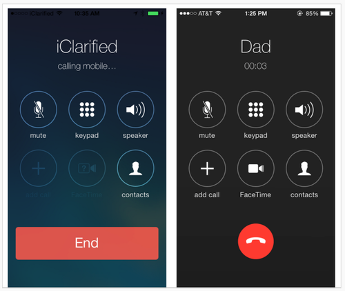
Early images of Apple's iOS 7.1 UI changes show Apple making aesthetic decisions that affect usability. In particular, changes involve making key buttons (end call, answer call) smaller.
iOS comparison images
Left: iOS 7. Right: 7.1 beta.

From a graphic design standpoint, the changes elevate screens to the level of mini-Swiss posters – they are sharp and clean. Differentiating the end call button with color and white (black) space sets it apart from the other buttons, as it should. Is the phone icon clear to users under 30? Is it easy enough to hit the smaller "end" button? What about colorblind users? Is Apple betting that the design is so lovely everyone will just adapt, as with the early iPod touch?

A lot more people use the iPhone than the early iPod touch, however, and rely on it to get things done, including making calls. Judging from the comments on the TechCrunch article, not everyone finds the changes lovely. Some Apple fans are having a hard time – first Apple took away the gradients that helped make buttons look tappable, and now the buttons are smaller. Where will it end? I'm enjoying the battle.

Goodbye, Delicious

Posted: Wednesday, September 11, 2013 | Posted by Debby Levinson | Labels: , , , , , 1 comments

Social bookmarking service Delicious has just turned ten, and to celebrate their anniversary, the company is launching a beta redesign at next.delicious.com.

Unfortunately, this is the redesign that's convinced me Delicious and I have to finally part ways.

I've used multiple accounts on Delicious for more than six years. While I never took advantage of its social features even before AVOS acquired the company from Yahoo! in April 2011, I liked how easy it was to store and track bookmarks of all sorts, and how clean and usable its interface was.

Yahoo! made some half-hearted attempts at redesigning Delicious before selling it off; the last Yahoo! design is still active at previous.delicious.com.
ETA: Last paragraph stricken, as we heard from AVOS that previous.delicious.com's design was their initial one, not Yahoo!'s last one. My mistake.
previous.delicious.com
previous.delicious.com (UI prior to September 2011)

This design is a little too boxy for my taste, but at least my bookmarks and the date I bookmarked them take center stage, and the search finds numerous relevant results. The current design, however, puts far too much emphasis on a previewing area, throwing off the visual hierarchy:

current delicious.com
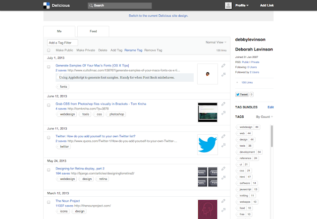
delicious.com (UI after September 2011)

I don't like it, but I was able to live with it, at least until I discovered how badly the new application architecture had broken search – which no longer returns as many relevant results as the old search on previous.delicious.com – and that you could no longer edit a bookmark to fix an out-of-date or incorrect link – an astonishing omission for a bookmarking application.

So when I heard Delicious was being redesigned for its anniversary, I hoped these major usability issues would be addressed, along with its disappointing visuals.

Nope.

next.delicious.com
next.delicious.com (beta UI, launch date TBD as of this blog post)

What's working:

  • The simple typography in blue and shades of gray is easy on the eyes.
  • Delicious' corporate blue has always been a particularly pretty shade of the color.
  • Links get an appropriate amount of space in the layout relative to their importance in the visual hierarchy.
  • And ... no, that's it.

What's not working:
  • The vibrant blue in the left column is too strong, drawing attention away from the link area.
  • The mysterious histogram below the user's name, which presumably represents activity over time, but which is wholly non-interactive and therefore utterly useless. (It's presumably an attempt to call back to Yahoo!-era Delicious' history graph feature.)
  • Equally mysterious dual numbers (not shown in this screenshot) that may accompany a bookmark identify whether you were the first user to save a specific link – not that anyone will guess that's what the extra number means without rolling over it for a tooltip.
  • Contrast of the "search" type in its form field is so poor – a mere 1.3:1 ratio, according to Colour Contrast Analyser, when 5:1 is the minimum to hit AA accessibility ratings – that even I, with my 20/20 corrected vision, nearly couldn't tell I was looking at a search box. Heaven help a user who's actually visually impaired but can generally get by without a screen reader.
  • And the unforgivable sins: search still doesn't work as well as it did on previous.delicious.com, and you still can't edit a link.

Worse, there are new usability problems with this design. Consider the tag cloud for a user like me, with 147 tags I can display above my links:

tag cloud with 147 tags
Small tag cloud on next.delicious.com

versus the default view of a tag cloud for another longtime user, with over 2,000 tags:
tag cloud with many tags
Default next.delicious.com tag cloud size for a user with many tags

I hope this user likes scrolling to see his bookmarks.

Presumably the product team assumes that users with this many tags will simply search for a tag rather than relying on their tag cloud to locate things. This would be a fair assumption, except that I'm willing to bet that there are many users who have similarly named tags after years of Delicious autocomplete suggestions (for example, I have "knit," "knitting," and "knitting_patterns"), and being able to browse your tag library is handy for locating bookmarks that may not be filed quite where you expect.

Tag bundles, introduced before Yahoo! sold off the company, were one way of dealing with that problem: they allowed users to create groups of related tags, so if I wanted, I could quickly see just my knitting- or CSS-related tags. To create a bundle in the previous.delicious.com interface, you were shown a list of tags to choose from, which eliminated guesswork and ensured you were likely to catch all the tags related to a given concept.
tag bundle interface on previous.delicious.com
previous.delicious.com's tag bundle creation interface

The beta Delicious UI unfortunately replicates the current one: the tag selection interface relies purely on autocomplete, and while this makes for an uncluttered interface, it's useless for people with long lists of tags. Without the list of tags to rely on, you're bound to miss tags you would want to include in the bundle.
tag bundle interface on next.delicious.com
next.delicious.com's tag bundle interface

I give up. It's my job to help organizations use good design to enhance usability, and this design is neither good nor usable – in fact, it's so anti-usability I'm switching entirely to Pinboard, which has virtually no visual design, but does what I need it to do quickly and intuitively.

I doubt I'll be the only one to finally pack up and go.

Visual Usability: Principles and Practices for Designing Digital Applications

Posted: Thursday, June 6, 2013 | Posted by Debby Levinson | Labels: , , , , 0 comments

Our work involves constantly reconciling use and appearance. This isn't a new or novel struggle; it's inherent to designing, and evident in the gap between applications that look great and those that are highly functional.

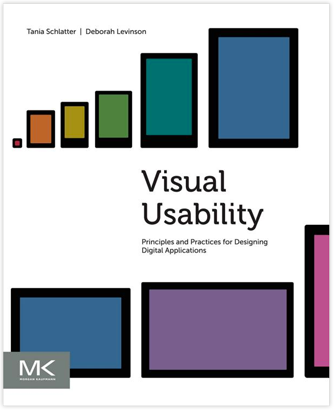
Digital interfaces rely on common visual design tools to communicate – layout, type, color, and imagery, along with controls and affordances. We've written Visual Usability: Principles and Practices for Designing Digital Applications to provide a common language for defining and evaluating visual user interfaces that's grounded in how people perceive and interpret what they see.

Visual Usability provides simple, clear frameworks for designing web and mobile interfaces for meaning and appeal. It helps application design and development teams make interface decisions by focusing on three "meta-principles" we believe form the foundation of great application visual design: consistency, hierarchy, and personality. Each chapter offers guidance on how to make strategic decisions about layout, type, color, imagery, and controls and affordances that will bridge the gap between beautiful and useful applications.

We're thrilled to announce that the book is now available on Amazon, bn.com, Elsevier.com, and elsewhere! We hope you check it out, and that it provides value to your team.

We are blogging examples of visual usability regularly via Tumblr at visualusability.tumblr.com, and tweeting them at @VisualUsability. We hope to see you there!


Improving the usability of Google Flights' Limits tool

Posted: Wednesday, September 21, 2011 | Posted by Debby Levinson | Labels: , , 0 comments

Recently, Google launched its new Flights service. It's got a nice, clean UI that falls in line with Google's new design approach for all its applications: crisper typography and bolder colors that guide the eye and enhance readability, and layouts that work smoothly across multiple web and mobile platforms.

Google Flights home page

For the most part, I like the interface. The map interactions are obvious, and there's a refreshing simplicity to the few controls on the page. But there's one part that's still suffering from Google's classically engineer-driven approach: the Levels widget meant to help you optimize flight time vs. price.

Levels icon

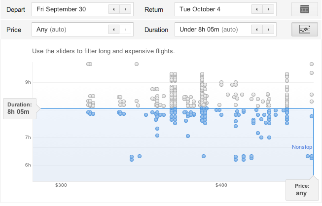
Levels widget

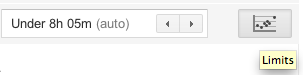
Problem #1: A name like "Limits" is no incentive to click. I clicked only because I was looking around the interface for the first time and had professional curiosity about what Google was up to here. At minimum, the tooltip should use a verb to encourage clicking: "Set flight limits." Better: "Limit flight times and prices."

Problem #2: What the heck is it? Okay, the little icon implies I'm going to get a chart of some kind, and sure enough, it's a scatter plot. But I spent longer staring at this chart trying to figure out how to use it than I should have, and I believe most people will have this same huge "stop and think" moment. Highly informal polling of my Twitter followers, most of whom are in the 25-45 age range and comfortable enough with computers to be regular Twitter, Facebook, and Google application users, confirmed that my most nontechnical followers had "no idea" (a direct quote) what they were looking at. Only the two friends who were heavy Google tool users figured out the widget and its interactions immediately.

In fairness, this tool may have been designed for a more technically minded audience. But a few simple fixes could open it up to a wider audience and help make it indispensable.

Problem #3: How do I use it? Where do I start? The slider handles that don't even look like clickable, draggable slider handles until you roll over them? The dots that only give you information on rollover if they're inactive? The badly written, almost invisible help text that implies you're filtering to find the longest, most expensive flights? My two Google-veteran followers knew what to do, but everyone else was stymied at least for a little while.

Possible fixes:

  • Rewriting the help text. For example, "Drag Duration and Price bars to filter your results below."
  • Make the Duration and Price bars feel inviting and clickable. Change the color to the Google blue and/or add a little dimensionality to them; both design choices look valid under Google's new design scheme.
  • While you're at it, make the blue bars draggable, too.
  • Add rollovers for the active dots – even just the airline name, flight duration, and price would be enough to reinforce the dots' relationship to the results below.

Flights is a very young Google product. I'm sure Google plans to keep updating it, and hopefully future versions of the Limit tool will be revised to improve its ease of use. I know I'll be keeping an eye on it.

Adding NOT selections to checkbox interfaces

Posted: Friday, July 1, 2011 | Posted by Debby Levinson | Labels: , 0 comments

We've recently come across questions online and in our own work about how to deal with negative selections in a checkbox UI. Usually, a checkbox's on/off status in something like faceted nav is enough to convey that you're not interested in seeing results from the unselected items. But what if you specifically want to select items to exclude?

Grafting NOT functionality into a checkbox UI can make the UI feel overly complicated and unintuitive. But a couple days ago, quite by chance, I found a site that's doing it well.

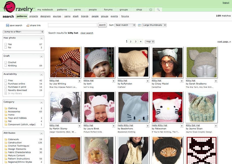
I was searching for a knitting pattern on Ravelry, an online community for people interested in fiber arts. Ravelry's search uses a standard faceted UI to help narrow results:

Ravelry search results

Since I don't crochet, I clicked on "knitting" in the Craft box to limit the number of patterns. That's when this additional dropdown appeared:

Ravelry faceted UI dropdown

I pulled it down to explore further:

Ravelry faceted UI dropdown

Ravelry's use of simple Venn diagrams to convey what can be confusing search concepts to nontechnical users is a great idea, and using soft colors and a light gradient to help the dropdown feel friendly and accessible is also a smart choice. But I was especially pleased to see them take things one step further once you actually select an item in a NOT search:

Ravelry NOT selection

Putting the "do not" icon in the checkbox reinforces the choice the user made from the dropdown, and makes it crystal-clear how search results will be affected.

For most Ravelry searches, you won't need this additional UI feature. But it's there if you do, and it's the best solution I've seen for this complicated problem.

MIT Biology information design and user testing

Posted: Wednesday, June 1, 2011 | Posted by Debby Levinson | Labels: , , , , , , 0 comments

MIT’s Biology Department wanted to redesign its website to offer prospective and current students a better overview of the research, collaborative mentoring, and career skills the program provides. Having already completed a survey of its students, faculty, and staff, the department had an initial sense of the most urgent problems they needed to solve in the site; specifically, how to drive people to the right content in a site comprising more than 150 pages.

Nimble Partners identified key scenarios of use for the site, analyzed its content, and developed a new information architecture that addressed key user priorities like identifying deadlines and locating faculty and staff. We also designed several rounds of wireframes to dive deeper into content and feature needs. The wireframes served as the foundation for an interactive prototype we reviewed in talking-protocol usability tests with students, faculty, and staff to confirm assumptions and refine site organization and features before visual design began.

Work included:

  • Content inventory and analysis
  • Scenario development
  • Information architecture
  • Usability testing


Home page wireframe


Interior page wireframes for category home (top) and degrees (bottom)


Faculty and staff directory with faceted search


Biology website visual design by Stoltze Design. Development by Indigo Digital and Common Media.

Visual Design Tips for Web Apps: 
#4 – Visual hierarchy and why it matters

Posted: Thursday, January 6, 2011 | Posted by Tania Schlatter | Labels: , , 1 comments

Note: As of June 2013, this post is out of date. To learn more about visual hierarchy and why it matters, we recommend chapter 2, "Hierarchy," of our book Visual Usability: Principles and Practices for Designing Digital Applications. You can find out more about Visual Usability in our blog post about the book.
This post is the fourth in an occasional series of tips for developers and other non-designers who don't have a designer to work with when needed, who want to improve the aesthetics (and usability) of their apps or who want insight into the designer's approach.

The single biggest issue we see in web application UI design is a lack of visual hierarchy – the arrangement and treatment of elements that represents their relative importance.

Developing a strong visual hierarchy is important because the presentation of elements will communicate to users whether you “design” those elements or not. Considering placement, treatment and use is essential to creating applications that make sense.


Left: lack of hierarchy – no clear direction is implied.
Right: variation in relative size, placement and treatment start to indicate a hierarchy.


When presented with a screen for the first time, users need to quickly grasp what they can do on the screen, how they can do it and why they might want to (i.e., what effect their actions will have). Establishing a visual system that outlines each element or group of elements’ relative importance will direct the eye, affecting the order of when elements are seen as well as user behavior – if form fields are filled out, if submit buttons are clicked, if links are found, and so on.

There are several factors that can be manipulated to establish visual hierarchy, with the main ones being placement on the screen, use of color, size of elements, font selection and treatment. We’ve already covered using type to establish a hierarchy, but now we’re going to review things at the higher level; future posts will address other factors individually and provide practical tips.

Super-brief introduction to the principles of visual hierarchy
Placing an element like a dot in a frame like a screen or a box creates a relationship between the element and the frame. The location of the element in the frame affects perception (Hofmann).


Left: Stable, static placement.
Right: Unstable, active placement. Movement is implied. Which dot looks more important? Which combination keeps the attention of the eye?


Placing more than one element in a frame creates relationships between the elements and between the elements and the frame. If shape, color and size are the same, relationships are based on proximity – how close the elements are to one another and the frame – which gives each object a perceived visual weight. Perceived visual weight is a key component of visual hierarchy – more weight equals more important.


Left: Which carries more visual weight? The single dot off-center or the four dots in the center?
Right: What about here? Less proximity (spacing) and upper placement create more visual weight than greater spacing and lower placement. This arrangement starts to suggest a hierarchy – that the group of dots in the upper left are more important yet somewhat related to the group in lower area.


The principles of perception hinted at in these dot/frame illustrations apply to web application elements as well.

Visual hierarchy on the web
In order to have a hierarchy, things need to be presented so that the more important things have more visual weight or prominence than less important things. Following are some ways to establish hierarchy.


In the Western world we read from left to right and top to bottom. This affects how we “read” screens as well. We know from eye tracking studies (Nielsen) that quadrant “1” is viewed more than the others. The “Inverted Pyramid” principle supports this as well (Lidwell, Holden and Butler).


Based on the principles of proximity and size, we know that small elements tucked very close to larger elements such as a border or edge – so that they appear as being inside the larger thing - are seen as less important than elements with more space all around them.


Elements with a lot of white space around them are viewed as important (take another look at the single dot in the center of a box).


Elements that are shown similarly to one another are seen as related. If one thing is more or less important than another thing, it should be treated differently – highlighted in some way.


A single element treated differently (highlighted) from similar elements nearby has greater visual weight and may be perceived as more important.


Large elements are seen as more important in comparison to smaller elements. Obvious, but only Apple seems to have mastered this consistently.

Defining a hierarchy
The main thing to consider when making decisions about where to place elements on a screen and how to treat them visually is to identify what most people need to do (or what an organization might want them to do) on the screen; and if that's more than one thing, the priority of the desired interactions. (For example, “we want everyone to sign up or log in, but if they don’t want to we at least want them to complete the checkout process.”) Ideally this effort is informed by 3-4 key user scenarios that have been defined with input from stakeholders or direct knowledge of user behavior.

An explicit way to define a hierarchy is to list the elements you need to have on your screen and number them from most to least important. An element is a unit of content or functionality. Your list may be something like this:

• search box
• submit/cancel buttons
• footer
• automatic update widget (for blog and twitter)
• latest 5 items
• featured content text
• promotional headline
• cart widget
• global navigation
• local navigation
• login area
• logout
• content areas

There can be more than one element with the same number – they will need to be treated in a way that suggests equal importance. The prioritized list serves as a blueprint for defining visual hierarchy, and can be used when making decisions about placement, size, color and treatment.

Next: Screen layout basics

References
1. Don’t Make Me Think by Steve Krug
2. "Communicating with Visual Hierarchy" by Luke Wroblewski
3. Graphic Design Manual by Armin Hofmann
4. Eyetracking research - findings from Nielsen Norman Group's usability studies using eye tracking technology
5. Universal Principles of Design by Lidwell, Holden & Butler

Visual Design Tips for Web App Developers:
#2 - Use a small set of UI affordances, and apply them consistently

Posted: Friday, October 29, 2010 | Posted by Debby Levinson | Labels: , , 0 comments

Note: As of June 2013, this post is out of date. To learn more about selecting affordances and using them consistently, we recommend chapter 1, "Consistency," and chapter 8, "Controls and affordances" of our book Visual Usability: Principles and Practices for Designing Digital Applications. You can find out more about Visual Usability in our blog post about the book.
When developing a complex application, using the fewest interface elements and behaviors consistently is critical to make your application look organized and behave as expected. For example, this version of an older application has three separate ways of closing a window:


Users must close the leftmost popup by mousing out of it, the center popup by clicking a link or a nearby button, and the top popup by clicking a link that looks completely different from the one in the center popup. Having one way to close a window rather than three would reduce the number of visual cues, improving the appearance, and would help the user know what to expect from the affordance, improving usability.

Here’s another example, the editing interface from the latest version of Microsoft's Photo Gallery software.


It looks like the design and development team tried to introduce some consistency by using an “x” icon for deletion. The problem is that not all the “x” icons do the same thing – the brushstroke icons at top left and bottom delete the photo, the heavily stroked red x at upper right closes the photo file without deleting it, and the small gray x at right closes the metadata pane. All of these actions have very different consequences – especially deletion and file closure! – so their icons should not feel so closely related, or should at least be more clearly identified than they are.

Consistency can be hard to achieve when different teams are working on different parts of an application, and when features are in flux. Set logical rules for where and how interface elements appear based on knowledge of how most people will use the application and existing conventions of any related application UIs. Work to maintain the consistent language as features gel. The payoff will be an application that looks and feels professionally designed, and rules that when documented can serve to guide further development.

For more information:

MIT Sloan Faculty Expertise Guide UX, usability testing, and visual design

Posted: Tuesday, October 26, 2010 | Posted by Debby Levinson | Labels: , , , , , , , 0 comments

The MIT Sloan Office of Media Relations connects reporters and members of the media with appropriate Sloan School of Management faculty, researchers, and noteworthy School news and events. To help Media Relations move its printed expertise guide online, we designed an HTML prototype that included faceted search as well as multiple paths into the guide content. We also talked with reporters as they used the prototype and designed features that supported their work habits.

The final site allows reporters to search and browse for experts in multiple ways. Visually, it incorporates elements of the parent Sloan site while serving as a useful and appealing stand-alone application for reporters who go directly to the Guide on a frequent basis.

A year later, as Media Relations launched a blog to support their public relations efforts, we extended the Expertise Guide visual design to a WordPress theme.

Work included:

  • User research and usability testing
  • User interface and user experience design
  • Visual design


Guide home page


Expert detail page


Categories by discipline

Gourmet Live: fun to read, a pain to use

Posted: Friday, October 8, 2010 | Posted by Debby Levinson | Labels: , , 0 comments

I subscribed to Gourmet magazine for nearly twenty years. My parents subscribed for forty. So when Condé Nast abruptly pulled the plug on the magazine a year ago, we, like many other subscribers, were upset about losing a connection to the food world we'd had for a very, very long time.

So I was thrilled when I discovered earlier this year that Gourmet Live would be released. If you haven't heard of Gourmet Live yet, it's a free iPad application that brings back key aspects of the Gourmet experience: the professional, engaging food writing; the crisp design and mouthwatering photography; and most important, the recipes. It also incorporates gameplay aspects – something I was initially dubious about, and remain so – that open up new content when readers finish looking at certain articles.

When I downloaded Gourmet Live last week and read my first issue, I was beside myself with joy. Here was my magazine, back from the dead! But the deeper I got into it, the more I began to notice the seams, the places where things didn't fit together perfectly or work the way I expected. In an early release – as of October 6th, they're up to a (buggy and iPad-crashing) version 1.02 – I expect there to be kinks to work out. But I don't expect basic user experience blunders.

Gameplay is fine for those who enjoy it, but I want my content.
I enjoy playing games and solving puzzles, but a pixel hunt isn't much of a game. And that's essentially what Gourmet Live requires you to do to unlock extra content – scroll to the end of the articles, which sometimes rewards you with new content, and sometimes doesn't. How do you know how many rewards you can win in a given issue? You don't. How can you guess which articles might offer a reward? You can't. "Gameplay" runs smack up against the basic usability principle of making it easy for people to figure out what they can do next, and there's nothing satisfying about being left wondering if you have to scroll through every article or recipe, even the ones you might not be interested in, for the possible hope of finding something you else you might or might not enjoy.

I've got my content – now, how do I find it again?
Content you download or unlock is displayed as cover thumbnails on "bookshelves" in a Library area. Given how terrific Gourmet's photography has always been, this is a visually appealing interface, but it makes finding information harder than it needs to be.

In the screenshot below, I've got two "issues": "Great Chefs, Great Ideas" and "Nouveau Cajun and More."


I've also got three problems:

  • Three of the recipe rewards are related to content in "Nouveau Cajun and More," but the only way to tell is to know that those items appear between their parent issue and "Great Chefs, Great Ideas."
  • What if I remember there was an interesting-looking pinto bean mole chili recipe in one of the rewards? How do I figure out which one? Without a search engine – which I sincerely hope is an upcoming feature – I must open "Soups" or "Fall Recipes," the most likely candidates, to see if one of them has the recipe. With Gourmet Live scheduled to publish new content at least once a week, this screen is going to fill up quickly, and the longer the app goes without a search feature, the less useful it becomes.
  • The substitute for a search feature, the "Your Favorites" area, too closely resembles an issue of the magazine, even with its yellow highlight. Although this solution was implemented to simplify the even clunkier Favorites navigation in a previous version of the software, it's still not quite right – it should be called out as secondary navigation, not masquerading as a content item.

Great recipes! I'd love to share them with my friends ... but I can't.
Gourmet Live connects to Facebook and Twitter, which makes perfect sense; after all, people are going to want to share recipes, articles, and restaurant reviews with their friends, right? I know it's what I did with the print version, and there are plenty of food sites out there now, including Condé Nast's own Epicurious, that offer this feature.

But what can you share on Gourmet Live? The fact that you've unlocked a reward. That's it. If you've set up the app to share reward information, it sends a banal, faux-cheerful message to your social network whenever you unlock something, and where does the link in the message take your friends? Not to an online version of the article you were reading (even an abridged one), but rather to a page encouraging people to download Gourmet Live. As implemented, sharing in Gourmet Live is a business-centered feature, not a user-centered one.

Where to next?
To the development team's credit, they're taking user feedback from social networks and iTunes reviews into account to help shape future software revisions. I can only hope that as the application matures, it addresses these basic usability issues and becomes as easy to use as the print version was.

I want to love Gourmet Live as much as I loved the original magazine. But right now, it feels like a pale imitation of what it used to be.

Tufts University Advancement usability & form design

Posted: Friday, April 16, 2010 | Posted by Debby Levinson | Labels: , , 0 comments

Tufts University’s Advancement group found that two-thirds of the visitors to its online giving form abandoned the page before completing a donation. Although online donations were steady and significant, they knew they needed to improve the form’s usability to encourage donors to pledge money.

We interviewed a cross-section of representative donors, asking open-ended questions to identify patterns of use and watching them interact with the form to determine barriers to making a donation. Based on these interviews, we illustrated and documented recommendations for improvements to the form. A second round of testing, this time on the redesigned form, confirmed that donors found the new interface easier to use.

Work included:

  • Usability tests and results analysis
  • User interface and user experience design recommendations

Original Tufts giving form
Inline observations and recommendations on the original giving form.

Revised giving form
Inline observations and recommendations on the revised giving form.

Texterity digital magazine reader design

Posted: Saturday, August 1, 2009 | Posted by Debby Levinson | Labels: , , , , , 0 comments

After designing digital magazine site coverleaf.com with Texterity, Inc. (now part of GTxcel), we worked with them to improve their e-Reader user experience and UI.

Keeping business goals and what we learned watching people use the Reader in mind, we defined a strategy for the redesign effort, and worked with the team through launch and beyond.

We provided:

  • Project charter
  • Visual and UI design
  • Specifications for developers
  • Usability testing advising


Magazine cover in Reader


Sharing content in Reader