seen + learned

Quickie "Valued Features" Prototype Test

Posted: Wednesday, July 13, 2011 | Posted by Tania Schlatter | Labels: , , , 0 comments

We were recently part of a team redesigning a student services department website for MIT. A lot of ideas for home page features were discussed at the kickoff meeting. The question quickly became, which of these features, if any, would students value?

Since it was the end of the semester, we had limited access to students. The client team suggested that a lot of students would be at an upcoming event, so we designed a test that they could take in a few minutes at a table near the event entrance.

We created a very simple prototype using OmniGraffle that included a simple black and white mockup of a bare home page frame, and several cutouts of proposed paper features and content elements.


For the test, students selected the paper elements that interested them most and placed them on the paper home page frame while telling us why they'd chosen those elements. We photographed each student's selections as documentation and asked two direct questions from our test plan. With two test facilitators each conducting one-on-one tests, we had 15 responses in less than 20 minutes!


The students got the idea of the paper prototype right away and had no problems understanding the test or the interactivity suggested by the paper features. We heard stories of how they imagined using the new site and the proposed features. The test provided simple data for the "what" and the "why," which helped the group make decisions.

One test gem was that about half of the participants interpreted one of the features differently than intended – they saw a pair of small photos as staff member photos rather than student photos. Since they commented about how nice it would be to see a staff member and click on their contact information, we learned they valued a feature that we hadn't anticipated.

After the test, we tallied which features were selected most, reviewed the reasons students gave us for their choices, and created OmniGraffle wireframes showing proposed content and features based on what we learned.

This test could be adapted to be run remotely via screen-sharing software, such as GoToMeeting. Hand over the keyboard and mouse, and participants can place content and feature elements on an onscreen frame. Either way, it was a quick and effective method to determine what users value.

Adding NOT selections to checkbox interfaces

Posted: Friday, July 1, 2011 | Posted by Debby Levinson | Labels: , 0 comments

We've recently come across questions online and in our own work about how to deal with negative selections in a checkbox UI. Usually, a checkbox's on/off status in something like faceted nav is enough to convey that you're not interested in seeing results from the unselected items. But what if you specifically want to select items to exclude?

Grafting NOT functionality into a checkbox UI can make the UI feel overly complicated and unintuitive. But a couple days ago, quite by chance, I found a site that's doing it well.

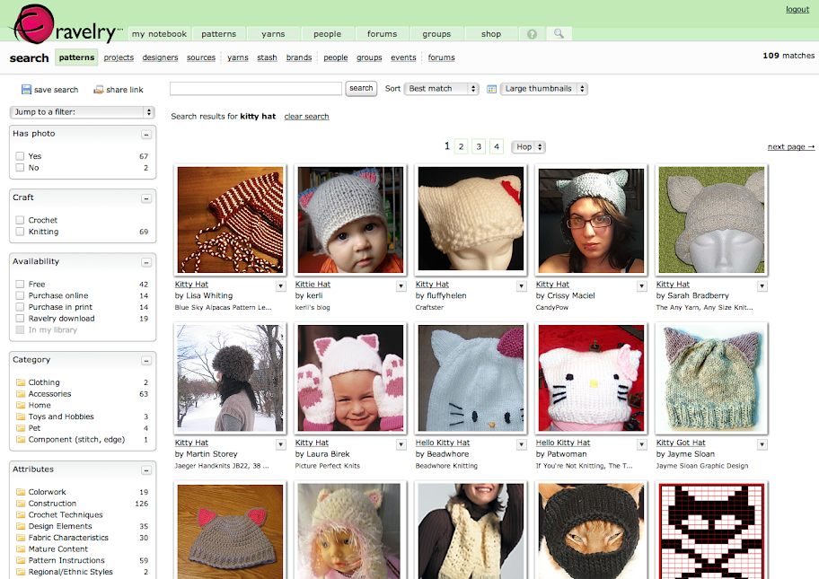
I was searching for a knitting pattern on Ravelry, an online community for people interested in fiber arts. Ravelry's search uses a standard faceted UI to help narrow results:

Ravelry search results

Since I don't crochet, I clicked on "knitting" in the Craft box to limit the number of patterns. That's when this additional dropdown appeared:

Ravelry faceted UI dropdown

I pulled it down to explore further:

Ravelry faceted UI dropdown

Ravelry's use of simple Venn diagrams to convey what can be confusing search concepts to nontechnical users is a great idea, and using soft colors and a light gradient to help the dropdown feel friendly and accessible is also a smart choice. But I was especially pleased to see them take things one step further once you actually select an item in a NOT search:

Ravelry NOT selection

Putting the "do not" icon in the checkbox reinforces the choice the user made from the dropdown, and makes it crystal-clear how search results will be affected.

For most Ravelry searches, you won't need this additional UI feature. But it's there if you do, and it's the best solution I've seen for this complicated problem.

MIT Biology information design and user testing

Posted: Wednesday, June 1, 2011 | Posted by Debby Levinson | Labels: , , , , , , 0 comments

MIT’s Biology Department wanted to redesign its website to offer prospective and current students a better overview of the research, collaborative mentoring, and career skills the program provides. Having already completed a survey of its students, faculty, and staff, the department had an initial sense of the most urgent problems they needed to solve in the site; specifically, how to drive people to the right content in a site comprising more than 150 pages.

Nimble Partners identified key scenarios of use for the site, analyzed its content, and developed a new information architecture that addressed key user priorities like identifying deadlines and locating faculty and staff. We also designed several rounds of wireframes to dive deeper into content and feature needs. The wireframes served as the foundation for an interactive prototype we reviewed in talking-protocol usability tests with students, faculty, and staff to confirm assumptions and refine site organization and features before visual design began.

Work included:

  • Content inventory and analysis
  • Scenario development
  • Information architecture
  • Usability testing


Home page wireframe


Interior page wireframes for category home (top) and degrees (bottom)


Faculty and staff directory with faceted search


Biology website visual design by Stoltze Design. Development by Indigo Digital and Common Media.

Slides and Summary of Web Application Visual Design Session for Boston CHI

Posted: Tuesday, May 3, 2011 | Posted by Tania Schlatter | 0 comments

Layout, type, color, imagery and identity are key to communicating in any medium. Because web apps are interactive and often need to help people get things done, these five elements have a big effect on usability – if they are present, they automatically communicate a message. They are the "tools" that the designer has to establish the UX goals of consistency, hierarchy and personality.

Our session at the Boston CHI Professional Development Day was designed to contextualize these core visual design principles for web applications. While there are tons of articles on the web and in print about web design and user experience, a lot of application interfaces are designed without visual expertise, and there are few resources that get into the nitty-gritty of applying these principles to complex web application design.

The session, like some of our blog posts, attempted to provide guidelines to help developers and non-designers avoid common mistakes, make informed decisions, and ideally, elevate the ordinary. When creating the session, I thought 5.5 hours of instructional time was a lot. In practice, I found it wasn't nearly enough to provide the kind of framework I'd hoped to. There's too much to talk about, and most of it takes practice to master the basics. In hindsight, I wish I'd kept the focus to common mistakes and ways to avoid them.


In the session exercises, participants started off with a simple dot exercise similar to what's shown in our post on Visual Hierarchy and Why It Matters, and moved to analyzing a sample scenario to tease out interface elements. Participants listed and prioritized the implied interface elements based on their reading of the scenario, and then sketched designs, applying the principles of proximity, alignment, grouping and nesting.

Mastering positioning and layout (not to mention color, type and imagery) takes a lot of trial and error. We could have used the whole session just creating simple prototyped layouts, testing them with each other and changing the layout (position of buttons, position and juxtaposition of features, etc.) to experience how seemingly small changes can affect perception and use.

Join us at Boston CHI for a day of visual design for web apps

Posted: Sunday, March 6, 2011 | Posted by Tania Schlatter | 0 comments

On March 25, we're delivering a seminar for Boston CHI's Professional Development Day on using visual design to create more effective web applications. There's still time to register – we'll be covering many of our tips for web developers in person, along with tips on page organization, use of color, and layout guidelines.

Click here for more details and registration.

Visual Design Tips for Web Apps: 
#4 – Visual hierarchy and why it matters

Posted: Thursday, January 6, 2011 | Posted by Tania Schlatter | Labels: , , 1 comments

Note: As of June 2013, this post is out of date. To learn more about visual hierarchy and why it matters, we recommend chapter 2, "Hierarchy," of our book Visual Usability: Principles and Practices for Designing Digital Applications. You can find out more about Visual Usability in our blog post about the book.
This post is the fourth in an occasional series of tips for developers and other non-designers who don't have a designer to work with when needed, who want to improve the aesthetics (and usability) of their apps or who want insight into the designer's approach.

The single biggest issue we see in web application UI design is a lack of visual hierarchy – the arrangement and treatment of elements that represents their relative importance.

Developing a strong visual hierarchy is important because the presentation of elements will communicate to users whether you “design” those elements or not. Considering placement, treatment and use is essential to creating applications that make sense.


Left: lack of hierarchy – no clear direction is implied.
Right: variation in relative size, placement and treatment start to indicate a hierarchy.


When presented with a screen for the first time, users need to quickly grasp what they can do on the screen, how they can do it and why they might want to (i.e., what effect their actions will have). Establishing a visual system that outlines each element or group of elements’ relative importance will direct the eye, affecting the order of when elements are seen as well as user behavior – if form fields are filled out, if submit buttons are clicked, if links are found, and so on.

There are several factors that can be manipulated to establish visual hierarchy, with the main ones being placement on the screen, use of color, size of elements, font selection and treatment. We’ve already covered using type to establish a hierarchy, but now we’re going to review things at the higher level; future posts will address other factors individually and provide practical tips.

Super-brief introduction to the principles of visual hierarchy
Placing an element like a dot in a frame like a screen or a box creates a relationship between the element and the frame. The location of the element in the frame affects perception (Hofmann).


Left: Stable, static placement.
Right: Unstable, active placement. Movement is implied. Which dot looks more important? Which combination keeps the attention of the eye?


Placing more than one element in a frame creates relationships between the elements and between the elements and the frame. If shape, color and size are the same, relationships are based on proximity – how close the elements are to one another and the frame – which gives each object a perceived visual weight. Perceived visual weight is a key component of visual hierarchy – more weight equals more important.


Left: Which carries more visual weight? The single dot off-center or the four dots in the center?
Right: What about here? Less proximity (spacing) and upper placement create more visual weight than greater spacing and lower placement. This arrangement starts to suggest a hierarchy – that the group of dots in the upper left are more important yet somewhat related to the group in lower area.


The principles of perception hinted at in these dot/frame illustrations apply to web application elements as well.

Visual hierarchy on the web
In order to have a hierarchy, things need to be presented so that the more important things have more visual weight or prominence than less important things. Following are some ways to establish hierarchy.


In the Western world we read from left to right and top to bottom. This affects how we “read” screens as well. We know from eye tracking studies (Nielsen) that quadrant “1” is viewed more than the others. The “Inverted Pyramid” principle supports this as well (Lidwell, Holden and Butler).


Based on the principles of proximity and size, we know that small elements tucked very close to larger elements such as a border or edge – so that they appear as being inside the larger thing - are seen as less important than elements with more space all around them.


Elements with a lot of white space around them are viewed as important (take another look at the single dot in the center of a box).


Elements that are shown similarly to one another are seen as related. If one thing is more or less important than another thing, it should be treated differently – highlighted in some way.


A single element treated differently (highlighted) from similar elements nearby has greater visual weight and may be perceived as more important.


Large elements are seen as more important in comparison to smaller elements. Obvious, but only Apple seems to have mastered this consistently.

Defining a hierarchy
The main thing to consider when making decisions about where to place elements on a screen and how to treat them visually is to identify what most people need to do (or what an organization might want them to do) on the screen; and if that's more than one thing, the priority of the desired interactions. (For example, “we want everyone to sign up or log in, but if they don’t want to we at least want them to complete the checkout process.”) Ideally this effort is informed by 3-4 key user scenarios that have been defined with input from stakeholders or direct knowledge of user behavior.

An explicit way to define a hierarchy is to list the elements you need to have on your screen and number them from most to least important. An element is a unit of content or functionality. Your list may be something like this:

• search box
• submit/cancel buttons
• footer
• automatic update widget (for blog and twitter)
• latest 5 items
• featured content text
• promotional headline
• cart widget
• global navigation
• local navigation
• login area
• logout
• content areas

There can be more than one element with the same number – they will need to be treated in a way that suggests equal importance. The prioritized list serves as a blueprint for defining visual hierarchy, and can be used when making decisions about placement, size, color and treatment.

Next: Screen layout basics

References
1. Don’t Make Me Think by Steve Krug
2. "Communicating with Visual Hierarchy" by Luke Wroblewski
3. Graphic Design Manual by Armin Hofmann
4. Eyetracking research - findings from Nielsen Norman Group's usability studies using eye tracking technology
5. Universal Principles of Design by Lidwell, Holden & Butler

Visual Design Tips for Web App Developers:
#3 - Use type to help establish and reinforce visual hierarchy

Posted: Thursday, November 11, 2010 | Posted by Debby Levinson | Labels: , 0 comments

Note: As of June 2013, this post is out of date. To learn more about using type appropriately in web and mobile apps, we recommend chapter 5, "Type," of our book Visual Usability: Principles and Practices for Designing Digital Applications. You can find out more about Visual Usability in our blog post about the book.
Like a newspaper, web apps may have multiple text elements at similar levels of importance throughout the layout. Unlike a newspaper, web apps might not have editors and designers to direct and define the information hierarchy on a daily basis.

Defining rules for type styles and applying them consistently provide the cues people need to quickly process and make decisions about where to read or what to do in a web app. Aside from aiding usability, typography can be what transforms your design from good to great. We don't expect you to be type geeks, but we do think that with a few tips and examples, you'll be able to create and use simple and effective type hierarchies and avoid common mistakes.

Choosing a font
This blog post covers choosing fonts for an application's content and features, not for its logo (visual identity). Selecting fonts for identities requires different criteria, and for that reason, we assume that a professional designer will be responsible for creating a memorable identity.

In a web application, typically one font family is enough as long as it has three weights: for example, roman, bold and italic; or roman, semibold and bold. You can get away with a font with two weights if you add the use of caps to the hierarchy, but this needs to be done with restraint. (See examples later in this post.)

A serif font will make your application feel more traditional and print-like, while a sans serif is more workman-like. Serifs create more visual activity and sans serifs typically create less, but this varies from font to font. Many aspects of a font contribute to (or detract from) its readability online. This, combined with the fact that you may need to complement an existing style or establish a visual style for brand purposes, means that you may have to try a few different options before you find one that feels right for your application and its audience.


Typetester is a great tool for selecting and comparing fonts.

Choosing a size and weight
Size and weight differences are one way to establish visual hierarchy with type. For example, larger, bolder text emphasizes more important headers, and small, italic text is better for captions or in-context help, places where you are providing supporting, not lead content.

Use boldface and italics sparingly. They're cues to highlight information, and when applied too often, make your text less readable. Reserve them for headers as much as possible, and never use underlines unless you're indicating hyperlinked text.

In general, you won't want to use type any smaller than 8 pixels high onscreen, and even at that size, some browsers may begin to render the type with jagged edges. Check your type across multiple browsers and platforms to ensure it's legible everywhere, and consider sizing your type with the more accessibility-friendly em units.

Sample type hierarchies
To illustrate some of what we've been talking about, here are some sample type hierarchies. The goal of these hierarchies is to create a set of type styles that show a visual progression from strongest to weakest in relation to one another.

Tahoma hierarchy:


Georgia hierarchy:


Myriad hierarchy:


Choosing a link style
As the web has evolved, people have learned that underlines aren't the only way to identify a hyperlink – but the problem is that there is no one convention to take its place. Color change and highlighting are two other conventions.


Links on the MIT Media Lab's website display a light blue background tint on rollover.


Blue headlines are underlined on rollover on The New York Times' website.

Color change is an appealing cue, but it's prone to contrast problems, and rollover effects can't help users who never figure out where to roll over in the first place. The New York Times can get away with using non-underlined discoverable links because the online newspaper format is a convention its readers understand. If you have an application that does not follow known patterns and/or people need to learn it quickly to get things done, underlining is the clearest way to convey "clickability."

Type hierarchies in practice
The hierarchies shown progress in visual importance from most to least. However, in practice, hierarchies are often not linear progressions. For example, Level 1 heads often need to be less visually prominent so as not to upstage more important content – a case of being more important from a semantic markup perspective, but less important from a visual one.

The illustration below shows one way a hierarchy might map to levels of heads in a web app. (Click image to enlarge.)


Getting your font online
There's been an explosion of tools available to move type on the web beyond common system fonts such as Arial, Verdana and Georgia (although these are fine choices for web app fonts). CSS and JavaScript-based options – the @font-face attribute, Typekit, Google Font Previewer, Cufón, etc. – offer simple and often free methods of incorporating other fonts into your web apps as HTML, not Flash or graphics. Our preference so far is Typekit, for its inexpensive access to a wide range of well-known and well-designed fonts.

Licensing, however, remains a thorny problem, with each type foundry having its own set of rules about font embedding or linking. No matter which option you choose to bring additional fonts into your app, be careful to check the fonts' licensing requirements to make sure your application stays nice and legal.

Basic rules of thumb
  1. Body text should be roman, with a limited column width (ideally no more than 600 pixels) to enhance readability.
  2. It's okay to use caps, but they create a lot of emphasis, and making text bold and all caps is the VISUAL EQUIVALENT OF SHOUTING. Don't do it unless you really need to or you reduce the visual volume by shrinking the font size slightly and/or adding letterspacing. (See the hierarchy examples for effective uses of all-caps headers.) 
  3. Just because you can use tons of fonts on the web now doesn't mean you should. Sticking with system fonts is better than using an unusual font that will distract from the content.

For more information