seen + learned

Doodle4 heuristic review and interface consultation

Posted: Monday, November 17, 2014 | Posted by Debby Levinson | Labels: , , , , 0 comments

Doodle4 is a new app for promoting causes through making and sharing doodles. Pitched at teen Facebook users, the app’s powerful doodling tool and easy sharing process make it simple and fun to build awareness of a cause by creating doodling “challenges” for friends to pass around.

Nimble Partners collaborated with the Doodle4 team to first provide a heuristic review of an alpha interface on web and mobile devices. We walked through the app as “Ione,” a lightweight persona we developed of a teen interested in banning styrofoam containers in her community. The walkthrough uncovered opportunities to improve the flow of use, wording, and engagement. We followed up the review with rapid iterations of sketches to provide specific recommendations for improvements. We remained on the team as iterations were made through beta launch.

Services provided:

  • Heuristic review
  • UI sketches
  • User experience consulting

Doodle4 designer Ryen Leung provides a great overview of this fun tool in the first five minutes of this video:

Mind and Life Institute information architecture and UX design

The Mind and Life Institute researches and supports interest in contemplative science, bringing together scientists and scholars from contemplative traditions to investigate topics such as addiction, ethics, and emotions. As part of repositioning itself based on a new set of initiatives (ethics, education, and human development; craving, desire, and addiction; and mapping the mind), MLI wanted to redesign its website to promote deep investigation into the wealth of research the organization has funded and encouraged.

We began by drafting scenarios for the three primary audiences – scientists, scholars, and "interested laymen" – relying on MLI's experience with those groups, as well as our own interviews with interested laymen, to define desired interactions. Based on those scenarios, we developed a site structure and wireframes for a responsive experience that used curated promotions to expose relationships between multiple types of site content, allowing visitors a complete picture of the latest insights in contemplative science. We consulted with the visual designer and the development team through site launch to ensure that our layouts were accurately translated to the final site.

Services provided:

  • User experience conceptualization and design
  • Information architecture
  • User interface design
  • Visual design consultation


MLI home page wireframe


MLI initiative page wireframe with related content links at right


MLI featured editorial page wireframe with related content links and fat navigation dropdown


MLI home page. Visual design by John Hall Design Group; development by pixelslam.


Mobile phone view of home page


Featured editorial page

Visual design tips for app developers – consistency in the big picture: beyond where to place the button

Posted: Thursday, June 26, 2014 | Posted by Tania Schlatter | Labels: , , , , , 0 comments

In the book Visual Usability, we introduce what we call the "meta-principles" – three principles that are fundamental to the success of user interfaces. Consistency, hierarchy, and personality are not new to UI design. Considered primarily, however, they provide a structure for assessing and making decisions about the large and small visual characteristics of a UI design. When designing, keeping these principles in mind helps focus thinking about the effect of visual characteristics on how people interpret what they see from both the functional and aesthetic standpoints.

Interfaces have a big job to do. They need to provide information on multiple levels – convey content, communicate interactivity, and provide feedback. Before they can do that, they need to help someone know, or reinforce expectations of, what they are looking at. In Visual Usability, we go into detail about how visual characteristics of layout, type, color, imagery, and controls affect perception of consistency. Our goal is to raise awareness of these details and their effects. We want to help teams understand how people perceive visual characteristics, and make conscious decisions about them.

This post begins to address consistency in the big picture – as a principle for considering the approach to an interface rather than its details – concepts on a different strategic plane than where to place a button. From this perspective, it helps frame thinking about UX, and align UX with how it is represented through UI.

Internal consistency
Humans are wired to identify patterns in what we see and assign meaning to them. When establishing consistency within an application, lack of attention to consistent placement, color, styling, imagery (including symbols and icons), and typography can indicate difference to users, breaking the patterns they've perceived, and making them "stop and think."


This version of an older application had three separate ways of closing a window, forcing users to remember different paradigms every time they interacted with it.

Making sure a UI is internally consistent – that all the close buttons are styled similarly and placed similarly within a screen and from screen to screen within an application, for example – is familiar territory. Making sure that the patterns you choose to adopt and make consistent are in line with your users’ expectations is also familiar territory. What is different is calling out and thinking about the role consistency plays in affecting perception at the UI framework level.

External consistency
When Google created and launched Google Docs, the interface adopted symbols and patterns familiar to people who use desktop word-processing programs. This was a smart move strategically; consistent symbols reinforced similarities between the desktop and cloud word processing experiences, making Google Docs seem familiar and approachable. This helped Google transition users to word processing in the cloud. Consistency across platforms or applications is external consistency.


Google Docs UI, top; Microsoft Word 2010, bottom.

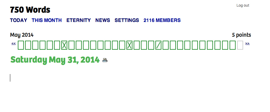
750words.com is also an application used for writing, but it has a different goal, and targets different users. Its tag line is "Private, unfiltered, spontaneous, daily," and the site focuses on people who want to write regularly. The UI provides only essential visual information – where to type – and the number of words written. The screen shows optional visual feedback for how often people are writing. UI elements and design characteristics do not say "word processing," but still encourage people to write. The decision to design the UI framework to be inconsistent with word processing applications helps the app show how it is different from – and better suited to – helping people write regularly.
750words
750words.com only indicates where to write, and supports writing regularly.

Consistency and novelty
Advertising and promotional media in general rely on inconsistency – or novelty, as it's known in communication theory – to get people's attention. Novelty can be a differentiator. Novelty as an approach can succeed when it’s authentic and effectively represents and reflects a difference that people find valuable. 750words.com takes a novel approach to writing online, and the choices made in its interface reflect that. Novelty can make visual information more memorable, as several studies,including this October 2013 one [PDF], have found.

While there’s nothing wrong with using platform standards as the initial foundation for a design, relying on them for the final design inevitably results in an app that lacks unique visual appeal. An app designed this way may get to market more quickly than an app that doesn’t, and provides interface characteristics consistent with other apps, rendering it easy to pick up and use. But without key visual differentiators that distinguish it from its competitors and help audiences build affinity, it risks falling behind the pack by not standing out.

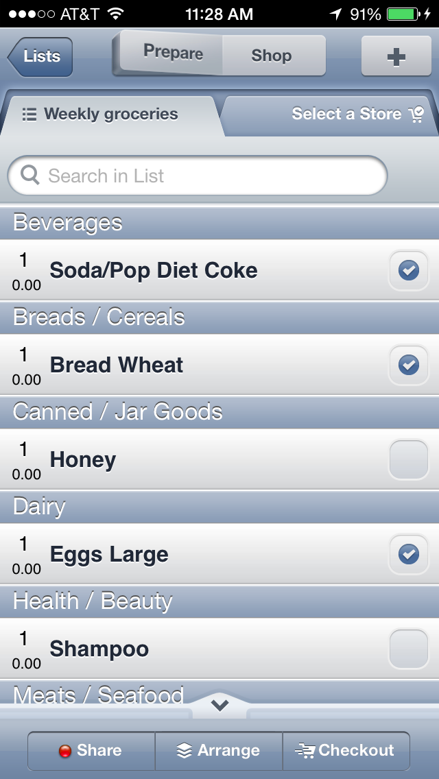
For example, compare OpenMBTA (below left), an app for Boston’s public transportation system, to Grocery Gadget (below right), a grocery shopping app:

OpenMBTAGrocery Gadget

The apps serve completely different purposes, but because both rely almost entirely on iOS 6 visual conventions, they look so similar that they might as well be the same app. Even the custom “prepare/shop” toggle at the top of the Grocery Gadget screen isn’t enough to visually distinguish it from OpenMBTA.

By contrast, public transportation app CG Transit, while basing some of its look and feel on iOS 7 flat design standards, applies simple visual upgrades that push it beyond the base set of rules. Color bullet points connect a list of stops, a gradated map gives a high-level overview of the subway line’s path through the city, and a side menu with icons and color highlights combine to create classic visual appeal that make CG Transit feel fresher and friendlier than OpenMBTA.

CG Transit subway line screenCG Transit side menu

Striking a balance between consistency and novelty is at the heart of designing an effective and desirable user experience and interface. As one of the key visual principles behind what people notice and why, we hope you'll reconsider consistency, be aware of it, and use it when making decisions about how to approach and design visual interfaces.

Deborah A. Levinson also contributed to writing this blog post.

Using semantic differentials to evaluate visual design preferences

Posted: Monday, June 9, 2014 | Posted by Debby Levinson | Labels: , , , 0 comments

We recently completed a redesign for LoveToKnow, a site that provides advice on everything from beauty tips and pet health to travel recommendations and party-planning. LoveToKnow wanted a clean, clear design that welcomed users while also feeling believable and authoritative. The new designs had to reveal the site’s wealth of content without being overwhelming, encouraging people to spend more time browsing relevant articles, and ultimately, turning to LoveToKnow as a trusted source for help with all kinds of topics.

LoveToKnow wanted to test designs before finalizing them for launch. A/B testing was our first choice, but wasn’t an option for technical reasons. How could we confirm whether users preferred the new look and feel?

Visual design preferences are by definition subjective. However, tools like semantic differentials and Likert scales give people the terms they need to describe subjective opinions by choosing from a range of possible answers between two opposing statements. With this data, researchers can quantify what otherwise seems unquantifiable.

semantic differential scales
Sample semantic differential scales

Designing the test
LoveToKnow had questions they were hoping testing would help answer. We knew who our audience was: primarily middle- to upper-income women with some college education and moderate internet experience. We then broke the tests into three groups: one that set a baseline by evaluating the current designs before the new ones, and two that only saw the new designs, albeit in different orders in case viewing order affected preference.

We began by setting up a scenario so that test participants would all approach the designs with the same mindset: Imagine you have a puppy, and are wondering how much bigger it will get. You type “is my dog full-grown?” into a search engine, and click through to this page. Beginning with a scenario familiar to the dog owners we recruited immediately made the article page designs relevant, and a more realistic scenario is more likely to yield honest results.

Once users had the right mindset, we asked open-ended questions to gather general impressions of the page and website: what did people think the page offered? What did they think the site offered? What would they click on?

We also provided three semantic differential scales:

  • credible / not believable
  • inviting / unappealing
  • helpful / waste of time

Finally, we provided the same scales for three home page design options to help us choose a winner.

Building the test
Designing the questions, as it happened, was the easy part. The much trickier part was creating a test that would help us get answers through remote testing. We’ve had good experiences with usertesting.com before and believed we could make it work here, too; it was just a matter of linking our questions and designs to guarantee that users would proceed in a straight line instead of accidentally meandering off into the woods.

We settled on a split-screen approach: the questions would be coded in SurveyMonkey and show up in a left-hand frame. In a larger, right-hand frame, we’d display the page designs so that people would have them to refer to as they answered the questions. We also set things up so that clicking anywhere on a design would take people to the next one to review.

Over and over through our dry runs, though, we found that people got off-track immediately. They couldn’t help but click on what looked like a real web page to them, and no amount of written instructions stopped that basic behavior. (A real-life reminder of the usability truism that people often ignore written instructions!)

What did eventually curb the clicks was presenting test participants with a thumbnail of the appropriate page design in the survey, and asking them to confirm they were looking at the right design before answering questions. The colorful image broke up the survey’s wall of text and grabbed enough attention for people to stop, read, and understand.

split-screen test image

After that, it was just a matter of watching test videos and analyzing our SurveyMonkey data, which the site helpfully provides as charts and free text.

The final results
Some of what we discovered:

  • The new article page design was slightly more likely to encourage exploring the site. While participants found both old and pages credible, design had little to no effect on perception of credibility, and there was scant difference in design appeal.
  • However, the new design unquestionably helped people understand that LoveToKnow provided information far beyond just dog content, an important improvement.
  • Results for all three home pages were largely positive and equal, but our second design had an edge over the others, particularly in terms of credibility.

Big data UX, UI and IA

Posted: Friday, June 6, 2014 | Posted by Debby Levinson | Labels: , , , , , 0 comments

For the past three and a half years, Nimble Partners has worked with a big data company to design two suites of web and mobile-friendly applications investigating multiple aspects of the labor market, including demand, supply, job posting, job search, and career exploration. The applications serve a wide user base: job seekers of all ages and backgrounds, the state and local government officials assisting them, public- and private-sector employees researching labor market opportunities, and others.
We worked directly with customers, product management, and developers to redesign some applications, while building others entirely from scratch. Our work included both the customer-facing user experience as well as the tools administrators rely on daily to help job seekers and manage the applications. Customers were delighted with the results: one said we’d “nailed Jell-O to a tree.”

We provided:

  • User experience conceptualization and design
  • Information architecture
  • User interface design
  • Visual design
  • User testing

We can't show this work publicly. Contact us for access to samples via our demo site.

Product strategy vs. UX strategy – thoughts from UXPA Boston 2014

Posted: Friday, May 16, 2014 | Posted by Tania Schlatter | Labels: , , , , 0 comments

Note: this post was updated June 10, 2014. I read Jeff Gothelf's post "There is no such thing as UX strategy" after seeing tweets about it a while ago, and didn't think too much about it. Recently, however, I've been thinking about how (and if) UX strategy manifests in UI design decisions, so I decided to attend the UXPA Boston 2014 conference session "UX Strategy exists, but what is it?" with this in mind.

Gothelf's post, which claims "[T]here is no such thing as UX strategy. There is only product strategy," inspired the session, moderated by Diana DeMarco Brown. It was great to hear stories from panelists Sarah Bloomer, Eva Kaniasty, and Lori Landesman. During Q&A, one attendee said he agreed with Gothelf, but unfortunately, there was not much time left to explore the statement. With a night to sleep on it, I realized that statement was crucial to helping me define my own thoughts on the topic.

To me, UX strategy is the goals and plan established for helping and delighting end-users, as well as meeting the needs of stakeholders, and in the case of enterprise applications, purchasers. Stakeholders and purchasers are types of users. My bias as a designer is to go the extra mile for end users – the people who use what I design. In the case of a consumer app, the user and the purchaser are the same, so in these situations I agree that product and UX strategy are the same. In the case of enterprise applications, user and purchaser goals and needs are often vastly different. Like so many answers to UX design questions, the answer to the question of whether UX strategy is different from product strategy is, "it depends." It depends on who your users are, who the organization is, and what the goals for the product are.

Focusing on the purchaser has led to dreadful and compromised enterprise application experiences. I've worked on enterprise applications for ATG (now Oracle), Endeca, (also now Oracle), and Curaspan, to name a few. In those cases, UX was part of product strategy, both functionally and conceptually. That in itself was not a problem. However, while stakeholders and product managers believed in UX, when it came down to coding and shipping, their focus was on meeting the needs of buyers. This makes sense given how enterprise product management success is measured – in sales, obviously. Like an oldest child in a family, enterprise product strategy takes up a disproportionate amount of stakeholders' time and attention. UX is the younger sibling, wanted and adored, but left to its own devices due to the focus on the oldest child. With intermittent support, UX for enterprise applications often lacks the resources it needs to sustain it and help it thrive.

Follow up note - June 10, 2014: With more thought and reading, I want to add that I think enterprise product strategy can be the same as UX strategy, it is just that it often isn't. If/when enterprise product strategy focuses on providing value to purchasers by developing software that is designed to succeed by helping the people who use the applications do so effectively, efficiently, and with appropriate delight, product strategy is aligned with and subsumes UX strategy.

This brings up more questions: are stakeholder and purchaser needs for enterprise applications really so different from end users, and if so, why? Also, if business stakeholders and product purchasers are types of users (as I consider them to be), then is the discussion of UX vs. product strategy really about end user-focused strategy vs. stakeholder and purchaser-focused strategy specifically in the realm of enterprise applications?


Speaking the Language of Meta-Principles: Consistency, Hierarchy, and Personality

Posted: Wednesday, May 14, 2014 | Posted by Debby Levinson | Labels: , , , 0 comments

I recently returned from beautiful Portland, Oregon, where I spoke as part of the Computer-Human Interaction Forum of Oregon (CHIFOO) annual lecture series. The 2014 series focuses on storytelling, which can take many forms in user experience, user interface, and visual design.

My talk, "Speaking the Language of Meta-Principles: Consistency, Hierarchy, and Personality," covered how to use the meta-principles described in Visual Usability to effectively "tell a story" by using good design to guide users through their desired pathways and tasks in an application. We think of these meta-principles as if they’re part of a language. Consistency and hierarchy are the grammar people learn while using an application: the basic elements that define how a language is spoken. The “words” we speak – that is, the visual design characteristics we choose to convey a message – create an application’s personality. These principles are so fundamental to creating successful interfaces that we call them “meta-principles.” While technology that affects interfaces changes, the underlying meta-principles hold true.

I'd like to thank Emily Mahood Bowman, Clodine Mallinckrodt, Fellene Gaylord, and everyone else at CHIFOO for bringing me to Portland and giving me such a warm welcome. I'll be happy to return anytime!

Redesigning Northeastern University's College of Professional Studies B.S. in Graphic Design Degree

Posted: Tuesday, May 13, 2014 | Posted by Tania Schlatter | Labels: , , , 0 comments


Founded to advance the careers of working students, Northeastern University's College of Professional Studies (CPS) grants doctoral, master's and undergraduate degrees. I've enjoyed teaching Interactive Information Design 2 and advising CPS graduate digital media students for the past few years.

I love systems and design, and am anxious to help higher ed better prepare students for the complex design work that we do today. I was excited to be asked to participate in a review of CPS' BS in Graphic Design degree last summer, followed by a redesign effort in the fall. The review was required for accreditation purposes, and the redesign was long overdue.

While the accreditation process was written in academic language, much of the work involved what I think of as design thinking. I (re)defined a clear mission for the program based on graphic design skills that are needed today, outlined desired outcomes for students and a system for measuring results, reviewed current courses in a structured way for strengths and weaknesses against goals, and analyzed student performance data over time to understand trends and gaps. Once the required accreditation materials were complete, it was great to take all I had learned and defined and work on redesigning the degree program overall.

The result of the effort is a roadmap for a revised BS in Graphic Design degree program. There are six new courses and six revised courses, which will begin to be phased in this fall. The new program maintains its practical focus and provides a stronger foundation in the traditional "roots" of graphic design, such as typography. When in place, courses and course projects will help prepare students by beginning in black and white and two-dimensional design principles, and carry through to using visual design principles to help people understand, enjoy and use visual information in static and interactive applications.

Increasing appeal for LoveToKnow

Posted: Tuesday, April 1, 2014 | Posted by Debby Levinson | Labels: , , , , , , , , 0 comments

LoveToKnow provides advice on everything from beauty tips and pet health to travel recommendations and party-planning. We helped LoveToKnow provide more consistency and a better user experience by first analyzing their taxonomy as part of a larger search engine marketing project with Nine By Blue. LoveToKnow returned to us to redesign their site to improve its appeal and apply the new taxonomy to an updated, easier-to-use menu system.

As we translated wireframes into visual design, we ran remote usability tests to determine whether our approach resonated with the target audience. LoveToKnow's revenue model is ad-driven, and we paid close attention to this as we wireframed possible design approaches and feature refinements. Test results confirmed that the new designs helped people better understand the breadth of LoveToKnow's content, and that the new article page design better achieved the goal of site exploration.

Work included:

  • Taxonomy analysis
  • Visual redesign
  • Heuristic review
  • Usability testing

Usability test screenshot

Usability test screenshot
Remote usability tests used a split screen to display a survey and relevant page designs (top: current design; bottom: new design).


Original home page page design.


New home page design.


New article page and fat navigation.

Focusing on the future – website planning for the International Development Innovation Network

Posted: Monday, March 31, 2014 | Posted by Debby Levinson | Labels: , , , , , , , 0 comments

The International Development Innovation Network, led by MIT’s D-Lab, provides training and resources for innovators worldwide to create new processes and products that improve the lives of people in poverty. IDIN works from the ground up by serving local innovators; community members are most familiar with their own situation, and most motivated to improve it.

We helped the IDIN team organize and narrow down its goals for a new site by developing user scenarios with the team and mapping goals to specific audience needs. Through an interview with the program's sponsors at USAID, as well as a paper prototype review session with summit alumni, we gathered audience feedback on valuable features and expected usage, which provided further insights into how to structure the site and design key interactions.

Moving from audience and feature analysis into information architecture, we led a collaborative workshop with IDIN staff to map content and features into page types and a high-level site organization. This groundwork helped prepare IDIN for usability testing and a full site redesign.

Work included:

  • stakeholder and user interviews
  • user scenarios – based on real people and interactions
  • prototype development
  • site map
  • content inventory and planning
  • high-level wireframes

whiteboard noteswhiteboard notes
Whiteboard notes from content mapping session.

home page wireframe (mobile view)project page wireframe (desktop view)
Left: home page wireframe (mobile view). Right: project page wireframe (desktop view).

Happy 2014!

Posted: Thursday, January 16, 2014 | Posted by Debby Levinson | Labels: 0 comments

Hello, all!
Click for a special greeting for our clients and friends in the spirit of the times.
Debby and Tania – Nimble Partners

Apple iOS 7.1 - getting closer to a graphic design/usability showdown

Posted: Tuesday, January 14, 2014 | Posted by Tania Schlatter | Labels: , , , , , 1 comments

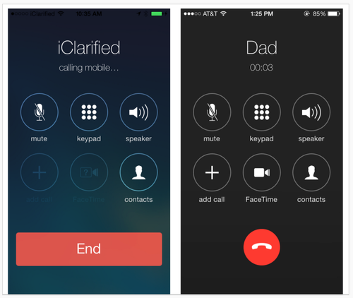
Early images of Apple's iOS 7.1 UI changes show Apple making aesthetic decisions that affect usability. In particular, changes involve making key buttons (end call, answer call) smaller.
iOS comparison images
Left: iOS 7. Right: 7.1 beta.

From a graphic design standpoint, the changes elevate screens to the level of mini-Swiss posters – they are sharp and clean. Differentiating the end call button with color and white (black) space sets it apart from the other buttons, as it should. Is the phone icon clear to users under 30? Is it easy enough to hit the smaller "end" button? What about colorblind users? Is Apple betting that the design is so lovely everyone will just adapt, as with the early iPod touch?

A lot more people use the iPhone than the early iPod touch, however, and rely on it to get things done, including making calls. Judging from the comments on the TechCrunch article, not everyone finds the changes lovely. Some Apple fans are having a hard time – first Apple took away the gradients that helped make buttons look tappable, and now the buttons are smaller. Where will it end? I'm enjoying the battle.

Talking with health communications students about visual design for healthcare site and app UX

Posted: Tuesday, November 19, 2013 | Posted by Tania Schlatter | Labels: , , , , , , 0 comments

This week I presented updated thinking about visual design in digital health communications to Emerson and Tufts health communications students in Lisa Gualtieri's Online Consumer Health course. It was a chance for me to test three frameworks for discussing what design can do for digital heath communications, and hear if they were helpful for students. We evaluated parts of these sites:


Our evaluation included discussing the meta-principles consistency, hierarchy, and personality – how and if they were evident on the pages we reviewed and to what effect. We used the terms expressive and classical to evaluate each site's general visual approach, as well as individual details such as logos. We also looked for evidence of desirable qualities for healthcare communications by asking the following questions:

Credible

Is it professional?

  • Is it organized? Are there visible systems for use, styling, and behavior of navigation, type, color, and controls?
  • Is the up-front value proposition clear? Can I quickly see what the site or app is about and what can I do?
  • Are the visual characteristics appropriate? Do stylistic decisions fit the topic? Do they fit the organization of origin?

Do I trust it?

  • Who is this organization? Are the professional identity and any credentials presented appropriately?
  • What is the organization's goal? Is the emphasis on information or advertising?
  • Does it feel specific or generic? Do the photos feel real or generic? Are colors and styles appropriate for the content and organization of origin?

Helpful

Does it help me understand the site or application purpose?

  • Can I read/use it? Is the type appropriate? Do colors contrast sufficiently with the background?
  • Can I skim and get the gist to help me decide if I want to read?
  • Does it show and tell? Are there images or video that help explain the content?

Does it make sense?

  • Can I see where I am?
  • Can I see where to click? Are the actions and links clear?
  • Can I tell what will happen if I click? Do control designs indicate what will happen? Can I see feedback from what I did?


Error messaging – avoiding visual spankings

Posted: Friday, October 11, 2013 | Posted by Debby Levinson | Labels: , , , 0 comments

Error messaging is visual discipline. It has to walk a fine line: drawing attention to problems without doing more harm than good. Designing effective error display is about more than providing clearly worded messages describing what went wrong and how to fix the problem; it's an opportunity to express the voice of the system, and show your app's personality. Successful error messages combine wording and design to be noticeable, actionable, and appropriately expressive.

WordPress.com CSS warning message
When the user rolls over a warning symbol in wordpress.com's CSS panel, the software provides a polite, in-context warning about thoughtful use of the !important declaration to force a style override.

Converse error messaging
Error messaging from an older version of Converse's custom shoe-design application is playful and whimsical, in keeping with the funky, independent personality of their brand.

How do you know when you have too much error messaging, or that your messaging is too strong? Is it this?
Orbitz error message
Orbitz's flight search interface

Or these form errors?
Qualtrics survey error message

Yelp! signup error
Yelp! signup error

And surely it's this:
SuperTracker limits exceeded
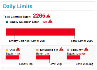
USDA SuperTracker food- and fitness-tracking application warnings displayed if a user exceeds daily limits for calories, fats, and sodium.

Color, a critical part of a site's visual language, is often tied to error messaging interface patterns. Using red for errors makes sense conceptually; an error is the right place to take advantage of contrast to attract the eye. However, use of this pattern can be heavy-handed and jarring, interrupting an application’s personality. Too much contrast in a warning that isn’t life-threatening or data-erasing can feel like a “visual spanking” – like the two form error screens, or SuperTracker's alert that a user has exceeded daily calorie, fat, and sodium limits. Calling so much attention to an error overwhelms the design and tells the user, "You've been very naughty. Go sit in a corner and think about what you've done."

Instead of overusing red, consider a small amount of a different contrasting hue to draw the eye, or a pale tint for your message instead of a solid, saturated color. In an urgent situation, such as a hospital setting, two levels of contrast, such as a light background tint and contrasting text style, may be necessary.

form error message
Polite error messaging on a login form

Your goal is the visual equivalent of a polite tap on the shoulder to provide guidance and redirection – not a spanking.

October 5 workshop with UXPA Boston – Visual Design Principles and Practices for Creating Great Web and Mobile Apps

Posted: Monday, September 16, 2013 | Posted by Debby Levinson | Labels: , , , , 0 comments

Everyone wants to design a great user experience, but how do you define a great visual UI for your app? Join us and the Boston UXPA for a fun and informative day Saturday, October 5, 2013 at Bentley University, and learn how to use visual design principles to improve the UX of your apps. We'll cover:

  • how to evaluate visual UI design for use and appeal
  • how to develop a sound rationale for your app's visual interface design
  • how to avoid common design mistakes, make informed decisions, and elevate the ordinary
If you work on UX, coding, or product or project management for digital applications, or you're a designer who wants to create more effective interfaces, this workshop is for you. Register at https://bostonuxpaworkshopoct52013.eventbrite.com.

Goodbye, Delicious

Posted: Wednesday, September 11, 2013 | Posted by Debby Levinson | Labels: , , , , , 1 comments

Social bookmarking service Delicious has just turned ten, and to celebrate their anniversary, the company is launching a beta redesign at next.delicious.com.

Unfortunately, this is the redesign that's convinced me Delicious and I have to finally part ways.

I've used multiple accounts on Delicious for more than six years. While I never took advantage of its social features even before AVOS acquired the company from Yahoo! in April 2011, I liked how easy it was to store and track bookmarks of all sorts, and how clean and usable its interface was.

Yahoo! made some half-hearted attempts at redesigning Delicious before selling it off; the last Yahoo! design is still active at previous.delicious.com.
ETA: Last paragraph stricken, as we heard from AVOS that previous.delicious.com's design was their initial one, not Yahoo!'s last one. My mistake.
previous.delicious.com
previous.delicious.com (UI prior to September 2011)

This design is a little too boxy for my taste, but at least my bookmarks and the date I bookmarked them take center stage, and the search finds numerous relevant results. The current design, however, puts far too much emphasis on a previewing area, throwing off the visual hierarchy:

current delicious.com
delicious.com (UI after September 2011)

I don't like it, but I was able to live with it, at least until I discovered how badly the new application architecture had broken search – which no longer returns as many relevant results as the old search on previous.delicious.com – and that you could no longer edit a bookmark to fix an out-of-date or incorrect link – an astonishing omission for a bookmarking application.

So when I heard Delicious was being redesigned for its anniversary, I hoped these major usability issues would be addressed, along with its disappointing visuals.

Nope.

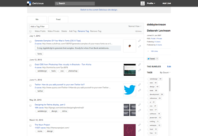
next.delicious.com
next.delicious.com (beta UI, launch date TBD as of this blog post)

What's working:

  • The simple typography in blue and shades of gray is easy on the eyes.
  • Delicious' corporate blue has always been a particularly pretty shade of the color.
  • Links get an appropriate amount of space in the layout relative to their importance in the visual hierarchy.
  • And ... no, that's it.

What's not working:
  • The vibrant blue in the left column is too strong, drawing attention away from the link area.
  • The mysterious histogram below the user's name, which presumably represents activity over time, but which is wholly non-interactive and therefore utterly useless. (It's presumably an attempt to call back to Yahoo!-era Delicious' history graph feature.)
  • Equally mysterious dual numbers (not shown in this screenshot) that may accompany a bookmark identify whether you were the first user to save a specific link – not that anyone will guess that's what the extra number means without rolling over it for a tooltip.
  • Contrast of the "search" type in its form field is so poor – a mere 1.3:1 ratio, according to Colour Contrast Analyser, when 5:1 is the minimum to hit AA accessibility ratings – that even I, with my 20/20 corrected vision, nearly couldn't tell I was looking at a search box. Heaven help a user who's actually visually impaired but can generally get by without a screen reader.
  • And the unforgivable sins: search still doesn't work as well as it did on previous.delicious.com, and you still can't edit a link.

Worse, there are new usability problems with this design. Consider the tag cloud for a user like me, with 147 tags I can display above my links:

tag cloud with 147 tags
Small tag cloud on next.delicious.com

versus the default view of a tag cloud for another longtime user, with over 2,000 tags:
tag cloud with many tags
Default next.delicious.com tag cloud size for a user with many tags

I hope this user likes scrolling to see his bookmarks.

Presumably the product team assumes that users with this many tags will simply search for a tag rather than relying on their tag cloud to locate things. This would be a fair assumption, except that I'm willing to bet that there are many users who have similarly named tags after years of Delicious autocomplete suggestions (for example, I have "knit," "knitting," and "knitting_patterns"), and being able to browse your tag library is handy for locating bookmarks that may not be filed quite where you expect.

Tag bundles, introduced before Yahoo! sold off the company, were one way of dealing with that problem: they allowed users to create groups of related tags, so if I wanted, I could quickly see just my knitting- or CSS-related tags. To create a bundle in the previous.delicious.com interface, you were shown a list of tags to choose from, which eliminated guesswork and ensured you were likely to catch all the tags related to a given concept.
tag bundle interface on previous.delicious.com
previous.delicious.com's tag bundle creation interface

The beta Delicious UI unfortunately replicates the current one: the tag selection interface relies purely on autocomplete, and while this makes for an uncluttered interface, it's useless for people with long lists of tags. Without the list of tags to rely on, you're bound to miss tags you would want to include in the bundle.
tag bundle interface on next.delicious.com
next.delicious.com's tag bundle interface

I give up. It's my job to help organizations use good design to enhance usability, and this design is neither good nor usable – in fact, it's so anti-usability I'm switching entirely to Pinboard, which has virtually no visual design, but does what I need it to do quickly and intuitively.

I doubt I'll be the only one to finally pack up and go.

Balancing the analytic and optimistic – the role of interface designer in interactive digital product teams

Posted: Monday, August 26, 2013 | Posted by Tania Schlatter | Labels: , , 0 comments

Photo courtesy of Graeme Maclean (Flickr: _gee_).

“Without exploration, interface design becomes uninspiring, falling prey to analytic acceptance
of utility.”

When consulting with teams on product interfaces, my role as a designer includes helping to define a shared understanding of the goals, providing insights into possibilities, and demonstrating those possibilities through visual representations. Because most of the teams I work with do not have designers, they are not sure what to expect. My business partner Debby and I are brought in for the following reasons:
1. The product manager wants a better looking interface to sell.
2. Product use/sales are not where the business team wants them to be.
3. An organization has a big idea for an app and wants help realizing it.
In all of these situations there are similar, familiar constraints and requirements, which usually define the scope of the work from the outset; for example:
  • time
  • budget
  • business goal (improved sales, fewer tech support calls, securing funding, etc.)
  • technology
  • engineering resources
  • topic or content space
In addition, there is context of use, where constraints and requirements get less straightforward:
  • target user
  • situation of use
  • user expectations
(There are a host of other “soft” requirements and constraints in team members’ biases, but other than mentioning that they exist and play a role, this post will not examine them.)
No matter the organization or goals, my role is to help define something that the team can stand behind. They will need to make it work, sell it, explain it, defend it, and ultimately profit from it, either financially or professionally. For some clients, I work on interfaces and interactions people need to use; for others, I work on interfaces and interactions people need to want to use. I am a designer because even as a child I felt the power and pleasure of some products (Massimo Vignelli’s colorful stacking melamine tableware, for example), and the disappointment of others. I believe everything can and should be better. This optimism fuels my work.
It is easier to realize these feelings in the design of apps that people need to want to use, such as applications to help people find and fund initiatives for women and children, or apps allowing them to read, save, clip, and share magazines. These apps provide the opportunity for expression in the visual interface, brand, features, and interactions. On these teams, my role can involve bringing teams down to earth – for example, insisting that accessibility does matter and explaining why the latest trend is not appropriate. In these situations I work to help define informed criteria to ground design decisions. This typically means calling for more information from or about users to inform a design rationale.
I play a different role on teams designing apps people need to use. While both product types require a passion for making something wonderful, teams developing productivity apps typically think analytically. Designing to fit constraints seems straightforward in these situations; however, even with constraints, there are always design possibilities to explore. Without exploration, interface design becomes uninspiring, falling prey to analytic acceptance of utility.
The ability to work comfortably with the tension between optimism and practicality, and to define best case interfaces, is what defines being a designer for me. When issues arise in your interface projects, ask yourself if the work suffers from lack of optimism and inspiration, or lack of analytical thinking. To gain inspiration, more exploration of possibilities may be necessary. If the team is unable to make decisions and come to consensus, more or re-prioritized constraints grounded in what is known from and about users will help.
Endnote:
Kolko, J. “The Optimism of Design,” Interactions July/August 2013
Buxton, B. Sketching User Experiences: Getting the Design Right and the Right Design, 2007, Morgan Kaufmann
This post was originally published Aug. 6, 2013 on SciTechConnect: http://scitechconnect.elsevier.com/balancing-the-analytic-and-optimistic-the-role-of-interface-designer-in-interactive-digital-product-teams/