seen + learned

Talking with health communications students about visual design for healthcare site and app UX

Posted: Tuesday, November 19, 2013 | Posted by Tania Schlatter | Labels: , , , , , , 0 comments

This week I presented updated thinking about visual design in digital health communications to Emerson and Tufts health communications students in Lisa Gualtieri's Online Consumer Health course. It was a chance for me to test three frameworks for discussing what design can do for digital heath communications, and hear if they were helpful for students. We evaluated parts of these sites:


Our evaluation included discussing the meta-principles consistency, hierarchy, and personality – how and if they were evident on the pages we reviewed and to what effect. We used the terms expressive and classical to evaluate each site's general visual approach, as well as individual details such as logos. We also looked for evidence of desirable qualities for healthcare communications by asking the following questions:

Credible

Is it professional?

  • Is it organized? Are there visible systems for use, styling, and behavior of navigation, type, color, and controls?
  • Is the up-front value proposition clear? Can I quickly see what the site or app is about and what can I do?
  • Are the visual characteristics appropriate? Do stylistic decisions fit the topic? Do they fit the organization of origin?

Do I trust it?

  • Who is this organization? Are the professional identity and any credentials presented appropriately?
  • What is the organization's goal? Is the emphasis on information or advertising?
  • Does it feel specific or generic? Do the photos feel real or generic? Are colors and styles appropriate for the content and organization of origin?

Helpful

Does it help me understand the site or application purpose?

  • Can I read/use it? Is the type appropriate? Do colors contrast sufficiently with the background?
  • Can I skim and get the gist to help me decide if I want to read?
  • Does it show and tell? Are there images or video that help explain the content?

Does it make sense?

  • Can I see where I am?
  • Can I see where to click? Are the actions and links clear?
  • Can I tell what will happen if I click? Do control designs indicate what will happen? Can I see feedback from what I did?


Error messaging – avoiding visual spankings

Posted: Friday, October 11, 2013 | Posted by Debby Levinson | Labels: , , , 0 comments

Error messaging is visual discipline. It has to walk a fine line: drawing attention to problems without doing more harm than good. Designing effective error display is about more than providing clearly worded messages describing what went wrong and how to fix the problem; it's an opportunity to express the voice of the system, and show your app's personality. Successful error messages combine wording and design to be noticeable, actionable, and appropriately expressive.

WordPress.com CSS warning message
When the user rolls over a warning symbol in wordpress.com's CSS panel, the software provides a polite, in-context warning about thoughtful use of the !important declaration to force a style override.

Converse error messaging
Error messaging from an older version of Converse's custom shoe-design application is playful and whimsical, in keeping with the funky, independent personality of their brand.

How do you know when you have too much error messaging, or that your messaging is too strong? Is it this?
Orbitz error message
Orbitz's flight search interface

Or these form errors?
Qualtrics survey error message

Yelp! signup error
Yelp! signup error

And surely it's this:
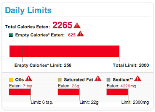
SuperTracker limits exceeded
USDA SuperTracker food- and fitness-tracking application warnings displayed if a user exceeds daily limits for calories, fats, and sodium.

Color, a critical part of a site's visual language, is often tied to error messaging interface patterns. Using red for errors makes sense conceptually; an error is the right place to take advantage of contrast to attract the eye. However, use of this pattern can be heavy-handed and jarring, interrupting an application’s personality. Too much contrast in a warning that isn’t life-threatening or data-erasing can feel like a “visual spanking” – like the two form error screens, or SuperTracker's alert that a user has exceeded daily calorie, fat, and sodium limits. Calling so much attention to an error overwhelms the design and tells the user, "You've been very naughty. Go sit in a corner and think about what you've done."

Instead of overusing red, consider a small amount of a different contrasting hue to draw the eye, or a pale tint for your message instead of a solid, saturated color. In an urgent situation, such as a hospital setting, two levels of contrast, such as a light background tint and contrasting text style, may be necessary.

form error message
Polite error messaging on a login form

Your goal is the visual equivalent of a polite tap on the shoulder to provide guidance and redirection – not a spanking.

October 5 workshop with UXPA Boston – Visual Design Principles and Practices for Creating Great Web and Mobile Apps

Posted: Monday, September 16, 2013 | Posted by Debby Levinson | Labels: , , , , 0 comments

Everyone wants to design a great user experience, but how do you define a great visual UI for your app? Join us and the Boston UXPA for a fun and informative day Saturday, October 5, 2013 at Bentley University, and learn how to use visual design principles to improve the UX of your apps. We'll cover:

  • how to evaluate visual UI design for use and appeal
  • how to develop a sound rationale for your app's visual interface design
  • how to avoid common design mistakes, make informed decisions, and elevate the ordinary
If you work on UX, coding, or product or project management for digital applications, or you're a designer who wants to create more effective interfaces, this workshop is for you. Register at https://bostonuxpaworkshopoct52013.eventbrite.com.

Goodbye, Delicious

Posted: Wednesday, September 11, 2013 | Posted by Debby Levinson | Labels: , , , , , 1 comments

Social bookmarking service Delicious has just turned ten, and to celebrate their anniversary, the company is launching a beta redesign at next.delicious.com.

Unfortunately, this is the redesign that's convinced me Delicious and I have to finally part ways.

I've used multiple accounts on Delicious for more than six years. While I never took advantage of its social features even before AVOS acquired the company from Yahoo! in April 2011, I liked how easy it was to store and track bookmarks of all sorts, and how clean and usable its interface was.

Yahoo! made some half-hearted attempts at redesigning Delicious before selling it off; the last Yahoo! design is still active at previous.delicious.com.
ETA: Last paragraph stricken, as we heard from AVOS that previous.delicious.com's design was their initial one, not Yahoo!'s last one. My mistake.
previous.delicious.com
previous.delicious.com (UI prior to September 2011)

This design is a little too boxy for my taste, but at least my bookmarks and the date I bookmarked them take center stage, and the search finds numerous relevant results. The current design, however, puts far too much emphasis on a previewing area, throwing off the visual hierarchy:

current delicious.com
delicious.com (UI after September 2011)

I don't like it, but I was able to live with it, at least until I discovered how badly the new application architecture had broken search – which no longer returns as many relevant results as the old search on previous.delicious.com – and that you could no longer edit a bookmark to fix an out-of-date or incorrect link – an astonishing omission for a bookmarking application.

So when I heard Delicious was being redesigned for its anniversary, I hoped these major usability issues would be addressed, along with its disappointing visuals.

Nope.

next.delicious.com
next.delicious.com (beta UI, launch date TBD as of this blog post)

What's working:

  • The simple typography in blue and shades of gray is easy on the eyes.
  • Delicious' corporate blue has always been a particularly pretty shade of the color.
  • Links get an appropriate amount of space in the layout relative to their importance in the visual hierarchy.
  • And ... no, that's it.

What's not working:
  • The vibrant blue in the left column is too strong, drawing attention away from the link area.
  • The mysterious histogram below the user's name, which presumably represents activity over time, but which is wholly non-interactive and therefore utterly useless. (It's presumably an attempt to call back to Yahoo!-era Delicious' history graph feature.)
  • Equally mysterious dual numbers (not shown in this screenshot) that may accompany a bookmark identify whether you were the first user to save a specific link – not that anyone will guess that's what the extra number means without rolling over it for a tooltip.
  • Contrast of the "search" type in its form field is so poor – a mere 1.3:1 ratio, according to Colour Contrast Analyser, when 5:1 is the minimum to hit AA accessibility ratings – that even I, with my 20/20 corrected vision, nearly couldn't tell I was looking at a search box. Heaven help a user who's actually visually impaired but can generally get by without a screen reader.
  • And the unforgivable sins: search still doesn't work as well as it did on previous.delicious.com, and you still can't edit a link.

Worse, there are new usability problems with this design. Consider the tag cloud for a user like me, with 147 tags I can display above my links:

tag cloud with 147 tags
Small tag cloud on next.delicious.com

versus the default view of a tag cloud for another longtime user, with over 2,000 tags:
tag cloud with many tags
Default next.delicious.com tag cloud size for a user with many tags

I hope this user likes scrolling to see his bookmarks.

Presumably the product team assumes that users with this many tags will simply search for a tag rather than relying on their tag cloud to locate things. This would be a fair assumption, except that I'm willing to bet that there are many users who have similarly named tags after years of Delicious autocomplete suggestions (for example, I have "knit," "knitting," and "knitting_patterns"), and being able to browse your tag library is handy for locating bookmarks that may not be filed quite where you expect.

Tag bundles, introduced before Yahoo! sold off the company, were one way of dealing with that problem: they allowed users to create groups of related tags, so if I wanted, I could quickly see just my knitting- or CSS-related tags. To create a bundle in the previous.delicious.com interface, you were shown a list of tags to choose from, which eliminated guesswork and ensured you were likely to catch all the tags related to a given concept.
tag bundle interface on previous.delicious.com
previous.delicious.com's tag bundle creation interface

The beta Delicious UI unfortunately replicates the current one: the tag selection interface relies purely on autocomplete, and while this makes for an uncluttered interface, it's useless for people with long lists of tags. Without the list of tags to rely on, you're bound to miss tags you would want to include in the bundle.
tag bundle interface on next.delicious.com
next.delicious.com's tag bundle interface

I give up. It's my job to help organizations use good design to enhance usability, and this design is neither good nor usable – in fact, it's so anti-usability I'm switching entirely to Pinboard, which has virtually no visual design, but does what I need it to do quickly and intuitively.

I doubt I'll be the only one to finally pack up and go.

Balancing the analytic and optimistic – the role of interface designer in interactive digital product teams

Posted: Monday, August 26, 2013 | Posted by Tania Schlatter | Labels: , , 0 comments

Photo courtesy of Graeme Maclean (Flickr: _gee_).

“Without exploration, interface design becomes uninspiring, falling prey to analytic acceptance
of utility.”

When consulting with teams on product interfaces, my role as a designer includes helping to define a shared understanding of the goals, providing insights into possibilities, and demonstrating those possibilities through visual representations. Because most of the teams I work with do not have designers, they are not sure what to expect. My business partner Debby and I are brought in for the following reasons:
1. The product manager wants a better looking interface to sell.
2. Product use/sales are not where the business team wants them to be.
3. An organization has a big idea for an app and wants help realizing it.
In all of these situations there are similar, familiar constraints and requirements, which usually define the scope of the work from the outset; for example:
  • time
  • budget
  • business goal (improved sales, fewer tech support calls, securing funding, etc.)
  • technology
  • engineering resources
  • topic or content space
In addition, there is context of use, where constraints and requirements get less straightforward:
  • target user
  • situation of use
  • user expectations
(There are a host of other “soft” requirements and constraints in team members’ biases, but other than mentioning that they exist and play a role, this post will not examine them.)
No matter the organization or goals, my role is to help define something that the team can stand behind. They will need to make it work, sell it, explain it, defend it, and ultimately profit from it, either financially or professionally. For some clients, I work on interfaces and interactions people need to use; for others, I work on interfaces and interactions people need to want to use. I am a designer because even as a child I felt the power and pleasure of some products (Massimo Vignelli’s colorful stacking melamine tableware, for example), and the disappointment of others. I believe everything can and should be better. This optimism fuels my work.
It is easier to realize these feelings in the design of apps that people need to want to use, such as applications to help people find and fund initiatives for women and children, or apps allowing them to read, save, clip, and share magazines. These apps provide the opportunity for expression in the visual interface, brand, features, and interactions. On these teams, my role can involve bringing teams down to earth – for example, insisting that accessibility does matter and explaining why the latest trend is not appropriate. In these situations I work to help define informed criteria to ground design decisions. This typically means calling for more information from or about users to inform a design rationale.
I play a different role on teams designing apps people need to use. While both product types require a passion for making something wonderful, teams developing productivity apps typically think analytically. Designing to fit constraints seems straightforward in these situations; however, even with constraints, there are always design possibilities to explore. Without exploration, interface design becomes uninspiring, falling prey to analytic acceptance of utility.
The ability to work comfortably with the tension between optimism and practicality, and to define best case interfaces, is what defines being a designer for me. When issues arise in your interface projects, ask yourself if the work suffers from lack of optimism and inspiration, or lack of analytical thinking. To gain inspiration, more exploration of possibilities may be necessary. If the team is unable to make decisions and come to consensus, more or re-prioritized constraints grounded in what is known from and about users will help.
Endnote:
Kolko, J. “The Optimism of Design,” Interactions July/August 2013
Buxton, B. Sketching User Experiences: Getting the Design Right and the Right Design, 2007, Morgan Kaufmann
This post was originally published Aug. 6, 2013 on SciTechConnect: http://scitechconnect.elsevier.com/balancing-the-analytic-and-optimistic-the-role-of-interface-designer-in-interactive-digital-product-teams/


Thoughts on Flat UIs – the science and history behind the trend

Posted: Monday, August 5, 2013 | Posted by Debby Levinson | Labels: , 0 comments


The "flat UI" trend demonstrated by the evolution of Google's icons (from Google's Visual Assets guidelines).

This post was also published on publisher Elsevier's SciTech blog August 6, 2013.
The current "flat UI" kerfuffle provoked by Microsoft's Metro UI and Apple's beta release of iOS 7's interface seems largely to be about change, and whether or not people who write commentary on the web like flat graphics.

They miss the point. There is science and history behind the flat UI trend. Let's take a look.

Gestalt theories of visual perception were defined in the 1920s by psychologists. These theories underlie most professional visual design. Gestalt principles are what graphic design students learn to employ to:

  • create visual impact 
  • direct the eye
  • create visual tone – balance or discord, for example

The principles coincided with advances in printing in Germany and the rise of the Constructivist movement in art. These were the "seeds" from which the Bauhaus design movement developed. The philosophy of the Bauhaus was reactionary to the prevailing trend of the time (Art Deco) and called for objects and built environments to serve their use: form should follow function, and be true to materials.

The Bauhaus influenced important graphic and product designers such as Josef Muller Brockmann, Dieter Rams, Paul Rand, and Armin Hofmann, as well as information designer Edward Tufte. All of these designers believe that what is represented should express the message or use; no more, no less. This can be summed up in Tufte's "data-ink ratio" and Dieter Rams' 10th good design principle: "Good design is as little design as possible." This history and approach is what many trained designers draw from. The rise of user experience design as a profession has put more trained designers than ever before in the position of influencing applications.

The perceptual and cognitive psychology research and theories that underpin Colin Ware's book Visual Thinking for Design and Jeff Johnson's Designing with the Mind in Mind are mostly ignored by graphic design BFA programs and thus are not particularly familiar to trained visual designers. However, they are familiar to many usability practitioners and UI designers from technical backgrounds. This research helps explain part of the current issue: why people like skeuomorphic design.

Skeuomorphism is the use of visual qualities to suggest or artificially imitate a physical characteristic, like faux wood textures printed on countertop surfaces or embellishing the side of old station wagons. In digital interfaces, Apple's address book software uses skeuomorphs. It renders pixel illustrations of seamed binding and paper "pages." In the early days of the Apple Macintosh computer, dragging unwanted files to the pixel-rendered trashcan helped people learn a completely new visual and interaction language through the use of familiar icons and symbols, and familiarity makes people feel comfortable.


Sample of Apple’s use of skeuomorphs – the address book app in OSX.

Many designers trained in Bauhaus philosophies (including my business partner, Tania Schlatter, who drafted this post) and who work on UX and interfaces often find skeuomorphs absurd for two reasons. First, in our Apple address book example, the "pages" create a false interaction cue. The dimensional rendering makes it look as if the pages might be clickable to advance, but they are not. Second, entering a contact on a digital device with rendered "paper" and "binding" feels untrue to the qualities of the digital material being manipulated.

Few interfaces designed these days need to rely on skeuomorphs to make users feel comfortable with the UI. The time is right to leave those visual "crutches" behind. Doing so, however, has launched "flat UI" as a trend, which can cause more harm than good. When employed as style rather than philosophy to underpin the entire user experience, designers may strip out what they see as distracting decoration in the interface without leaving enough visual data for people to understand what they see.

The subjective "flat UI" debates distract from the real issues, which are the same as always: designers and product managers need to look deeply before adopting or disavowing a trend. Remember that the last big web design trend – "fat footers" – came about to improve search engine rankings in the wake of changes to Google's results algorithm. Even though our tools change, methods hold true. Designers and project managers need to (re)focus on their users, content, and organizations to design interfaces that promote understanding, are appropriate for the medium and context of use, and help differentiate their products for businesses and their customers in meaningful ways.

Additional references:

  • Video documentary: Dieter Rams on his design principles
  • Jon Kolko's slides on Tufte (slide 16 is on data-ink ratio)
  • Hofmann, A. Graphic Design Manual: Principles and Practices, Arthur Niggli
  • Meggs, P., Purvis, A. Meggs' History of Graphic Design, Wiley
  • Muller-Brockmann, J. Grid Systems in Graphic Design
  • Tufte, E. The Visual Display of Quantitative Information, Graphics Press

Tutorial at UXPA 2013 – Visual Usability: principles & practices for designing great web and mobile application interfaces

Posted: Wednesday, July 17, 2013 | Posted by Tania Schlatter | Labels: , , , 0 comments

Last week, we presented a one-day tutorial based on the topics in our book Visual Usability: Principles and Practices for Designing Digital Applications at the User Experience Professionals Association conference in Washington, DC. We had a great time taking those ideas live with a dedicated group of participants who ripped paper, analyzed requirements, brainstormed design personas, and redesigned a sample application in a full, fun day.

The tutorial was a mix of lectures and activities designed to help participants:
  • understand the effect of "meta-principles" consistency, hierarchy, and personality on use and appeal of digital applications
  • define a target for UI design work that serves their users and their organization
  • learn how characteristics of visual design "tools" layout, type, color, images, and controls can help or hinder people in their interpretation and use of apps
We're working on more dates for this tutorial. Contact us if you'd like to know where we might be when!