seen + learned

Thoughts on "What great design can do for data"

Posted: Monday, May 20, 2013 | Posted by Tania Schlatter | Labels: , , 0 comments

A founder of the design firm Fjord wrote an insightful article for Fortune about design helping companies make sense of data. From the article:

Designers know how to take complex or disparate information and make it tangible, understandable, and importantly, more human. ...
Technologists on the other hand, tend to try to structure data in a flexible way. They analyze it, dashboard it, and cross-reference it to make it more efficient and intelligent.

Both approaches are needed. The data needs to be flexible enough to enable users to manipulate it to find the insights they seek.

Design of the data display and controls to manipulate data need to be clear enough to enable people to work with what they see. From the article:

Here are some ways that design can help companies make sense of their data and identify opportunities to turn it into a benefit for their customers:

  • Use data to guide, not dictate: Use data to build a backdrop of understanding and learning, but don't let data trump creative inspiration or minimize the importance of leaps of faith.
  • Obsess with your customers: Extend the data insights and value from your organization to your customers.
  • Mess up your data: We live in a messy world. How can you make your pure data fit a messy world? Use design to make it personal and emotional, and tell stories.
  • Instead of understanding data only, make sure you understand people: You're planning to hire another data scientist to make sense of the growing data mountain you've got? How about hiring a psychologist instead?
  • Major on elegance and simplicity: The science of data can be complex, abstract, and ugly. Design will help you simplify and bring clarity. Good design can also present data in elegant and beautiful ways, drawing people in where they were previously turned off.
  • Take creative leaps of faith: A creative process that uses intuition and imagination can give you innovations that data alone can't provide. This is crucial if you want to reimagine your business or invent something new.

This list speaks to the fact that data, even well-designed data, needs to have an editorial or curatorial layer that either guides people to the stories that are relevant to them, or otherwise helps to highlight the significance. Getting this right involves deep understanding of what the data can show, knowing who is likely to be interested in what, and using interface and information design to make sense of the display.

CafePress information architecture and user experience

Posted: Thursday, May 9, 2013 | Posted by Tania Schlatter | Labels: , , 0 comments

CafePress is an established custom printing e-tailer. We worked with the product marketing team to improve how people find products on their site. We conducted a heuristic review to identify IA, visual design, and usability issues, and showed options for changes that addressed UX in schematic layouts (visual wireframes).

Follow-on work included exploring identity options and visual site design.

CafePress' home page at the time (left) and our wireframed recommendations (right), which included simplifying the header area to highlight search, making main product navigation more prominent, and improving promotion display to spotlight new and hot products in a clean, uncluttered layout.


CafePress' existing search engine results page (left) and our wireframed recommendations (right). To help welcome shoppers and guide them effectively, we suggested eliminating redundant links and limiting the number of subcategories displayed.

Science Festival Alliance website refresh

Posted: Thursday, April 18, 2013 | Posted by Debby Levinson | Labels: , , , 0 comments

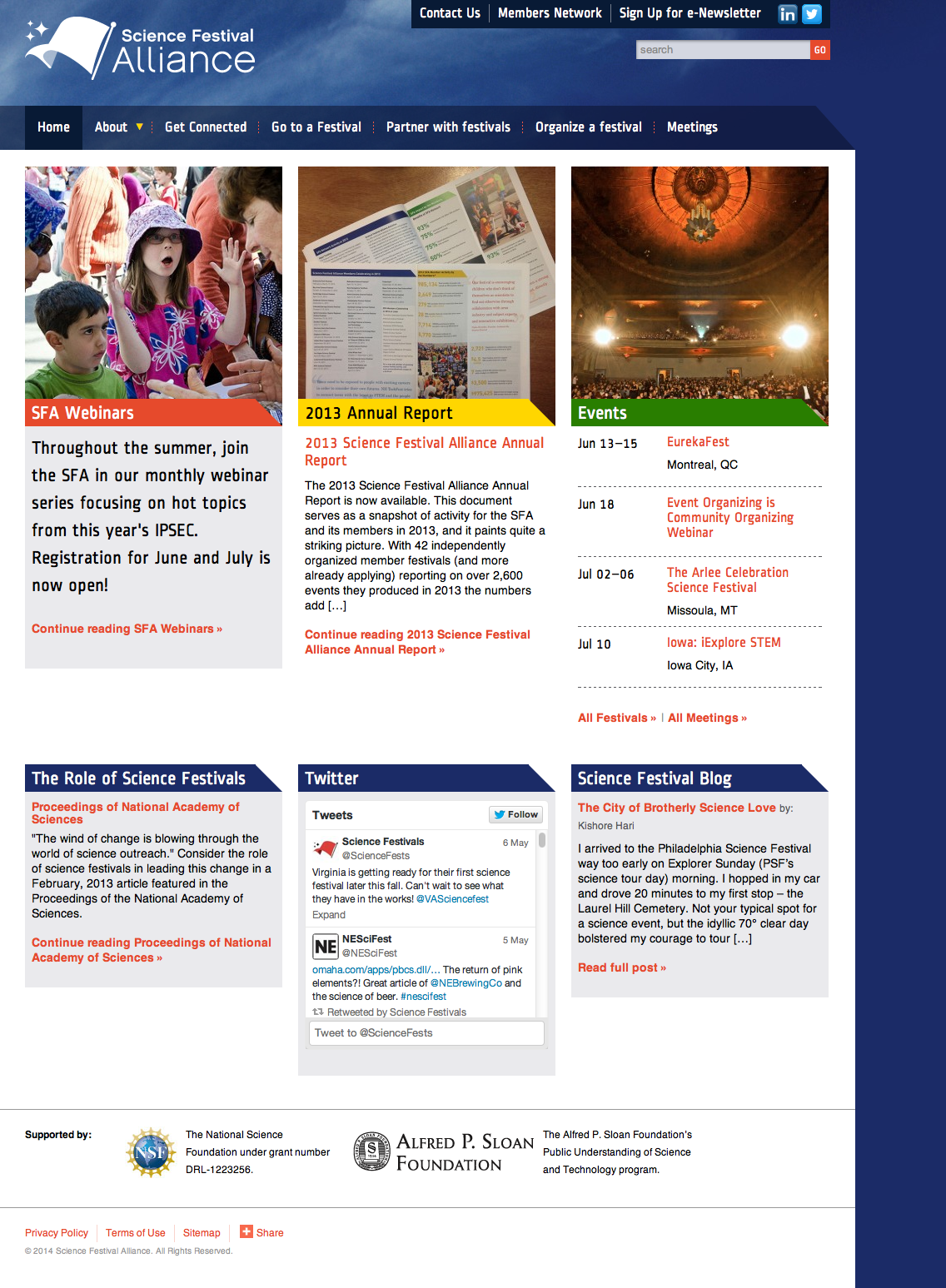
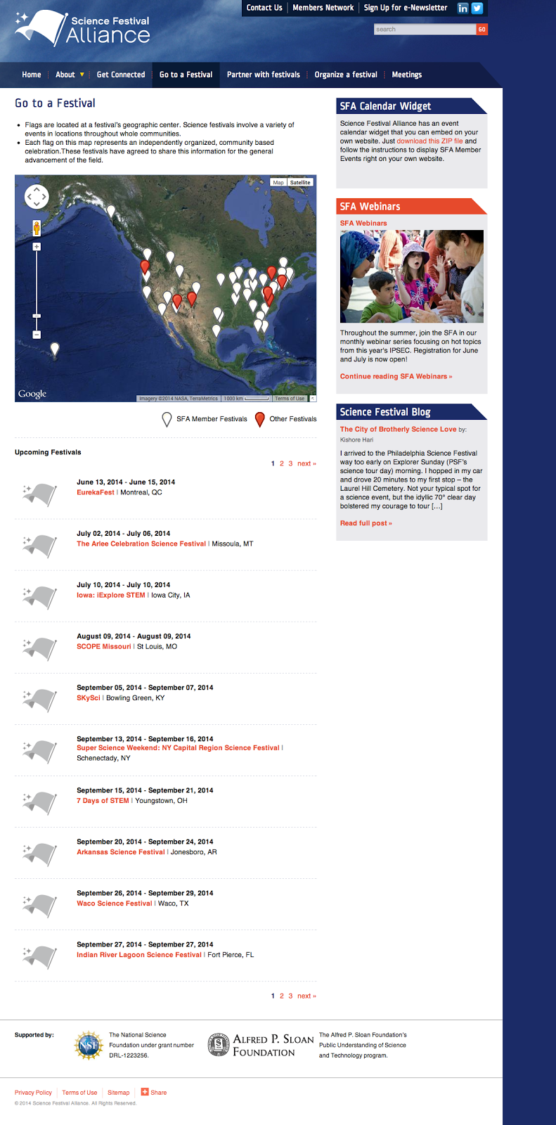
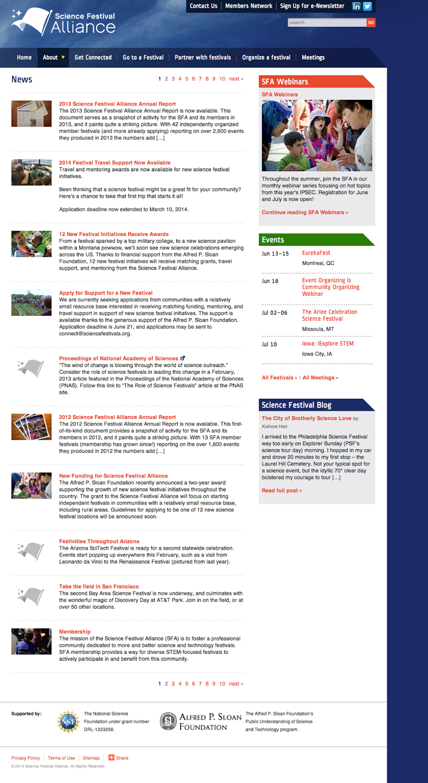
The Science Festival Alliance supports the development and promotion of science festivals worldwide. We worked with the SFA to reorganize their existing website, design a new home page, and extend elements of the redesign throughout the site. We also improved their dynamic map to display member and non-member science festivals around the world, and designed a downloadable calendar widget anyone could install on their own site to keep up with where and when the latest festivals take place.

We provided:

  • Information architecture
  • Visual design

SFA home page
SFA home page

Festival map page
Map of member and non-member festivals worldwide

News page
SFA news page

MIT Annotation Studio UI

Posted: Monday, April 8, 2013 | Posted by Debby Levinson | Labels: , , , 0 comments

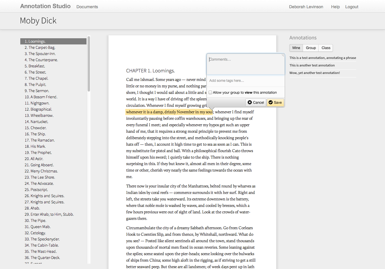
Annotation Studio is a set of collaborative online annotation tools developed by MIT’s HyperStudio program. The software allows students to annotate literary texts and other documents with text, video, audio, and hyperlinks. Students may also view and build upon each other’s notes, allowing for a more participatory experience than traditional solo book review and annotations.

MIT approached us to refine Annotation Studio’s color palette, typography, iconography, and visual approach to displaying annotations and other metadata. To meet technical requirements, we designed styles and visual elements that could quickly be implemented within Twitter Bootstrap.

Work included:

  • Heuristic review
  • Visual design refinement

Annotation Studio documents list
List of documents

Highlighting text to annotate

Saving an annotation

Juniper internal app research & concept

Posted: Wednesday, April 3, 2013 | Posted by Debby Levinson | Labels: , , , , 0 comments

Juniper Networks uses multiple internal tools to keep track of sales-related technical documentation. In an effort to consolidate those tools, Juniper approached us to design a proof-of-concept for a new, mobile-friendly application. We interviewed sales engineers as well as the people who manage and support them to understand the different situations and patterns of use. Based on those interviews, we designed multiple approaches for an intuitive, intelligent, and responsive search interface that guided users to the most recent and relevant information.

Work included:

  • User research
  • UX design

Happy 2013! UX & UI fortune teller

Posted: Wednesday, January 2, 2013 | Posted by Tania Schlatter | Labels: 0 comments

Hello all!
Wishing you good fortune in the new year
[fortune-teller image -- click me!]

from Debby and Tania at Nimble Partners
Directions for your fortune teller:
1. Click the image to download and print at 100% on letter paper.
2. With image facing down, fold corners to the center.
3. Flip over and fold corners to the center again.
4. Fold in half once each way.
5. Put fingers in "pockets."
Enjoy!

Catapult.org user experience

Posted: Wednesday, October 3, 2012 | Posted by Tania Schlatter | Labels: , , , 0 comments

Catapult.org is a Webby-nominated crowdfunding website devoted to projects that improve the lives of girls and women worldwide. Nimble Partners worked with Catapult's founding team from concept to launch to define the overall user experience, specify all content and interactions, and work with visual design and development.

UX work included exploring engaging ways to find projects, testing an interactive prototype, and specifying all administration features for the site.

We're thrilled that in the first year 286 projects were funded, and that the site is going strong!

Home page wireframe:


Home page, designed by Hyperakt and developed by Mindgrub based on our wireframes and information architecture.


Working out content and features for the project page:


Project page, designed by Hyperakt and coded by Mindgrub:


Teams page wireframe:


Teams page, designed by Hyperakt and coded by Mindgrub:


Sample administrative interface screens: